Looking for something?

Email
Sale!

Beverly Drive Right – Retro Script Font

$29.00$24,360.00

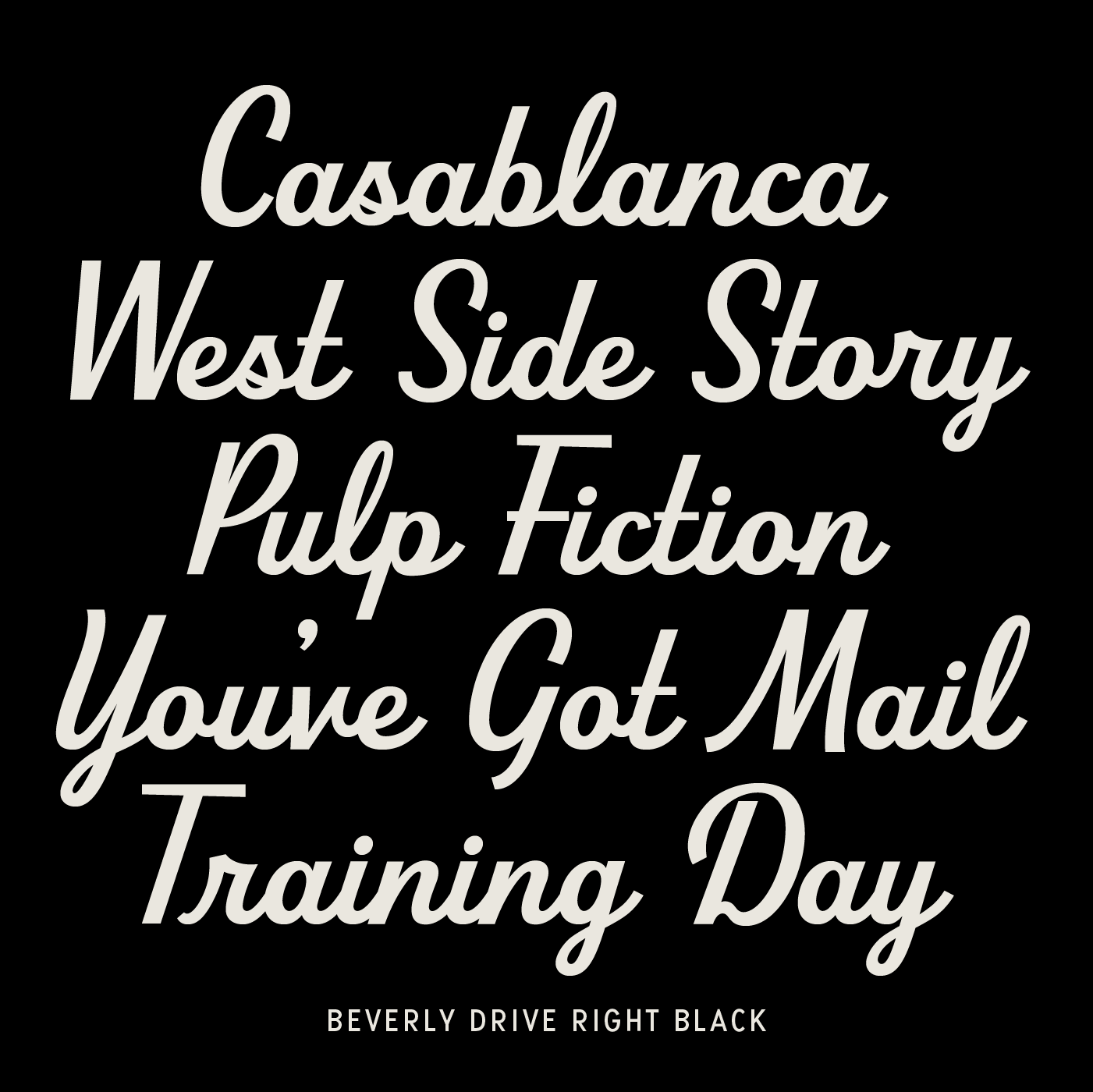
Beverly Drive Right is a retro script font based on the original Beverly Drive left lean.

Purchase includes:
— OTF and/or WOFF and WOFF2 files
— Link to How to Use PDF
License EULA PDF

Purchase Options

Select Styles

Select License Type

Beverly Drive Right – Retro Script Font

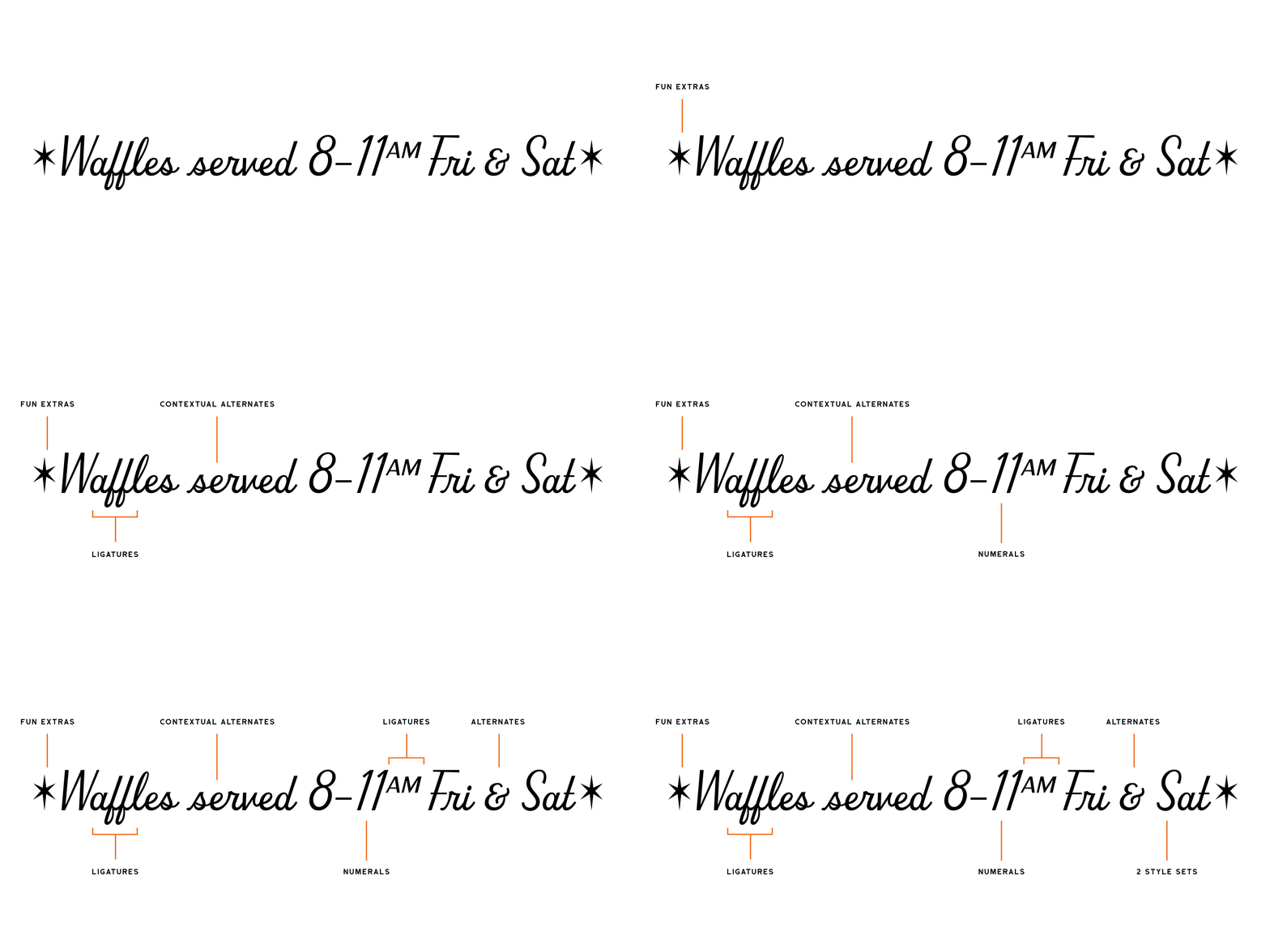
beverly Drive features highlights 2000px
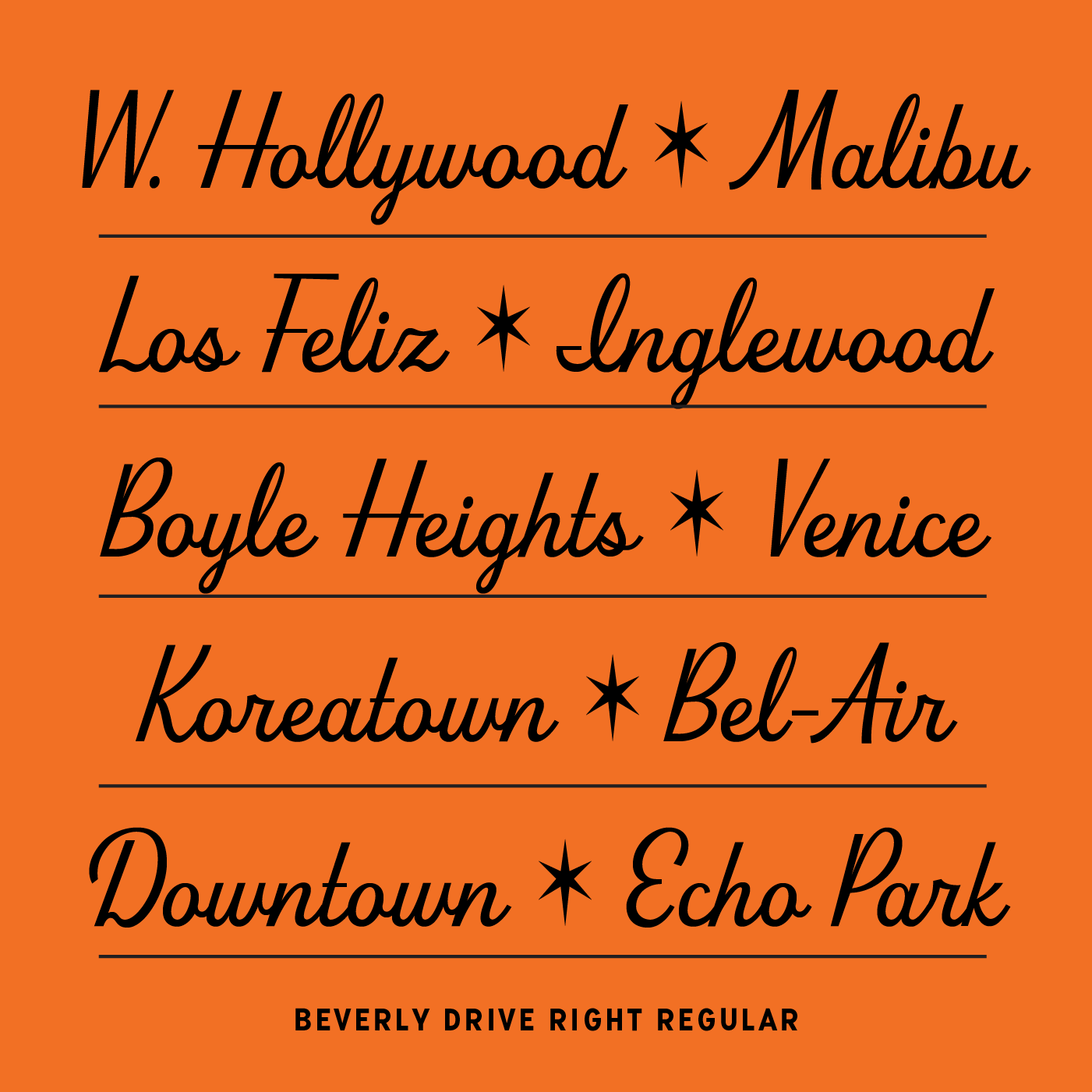
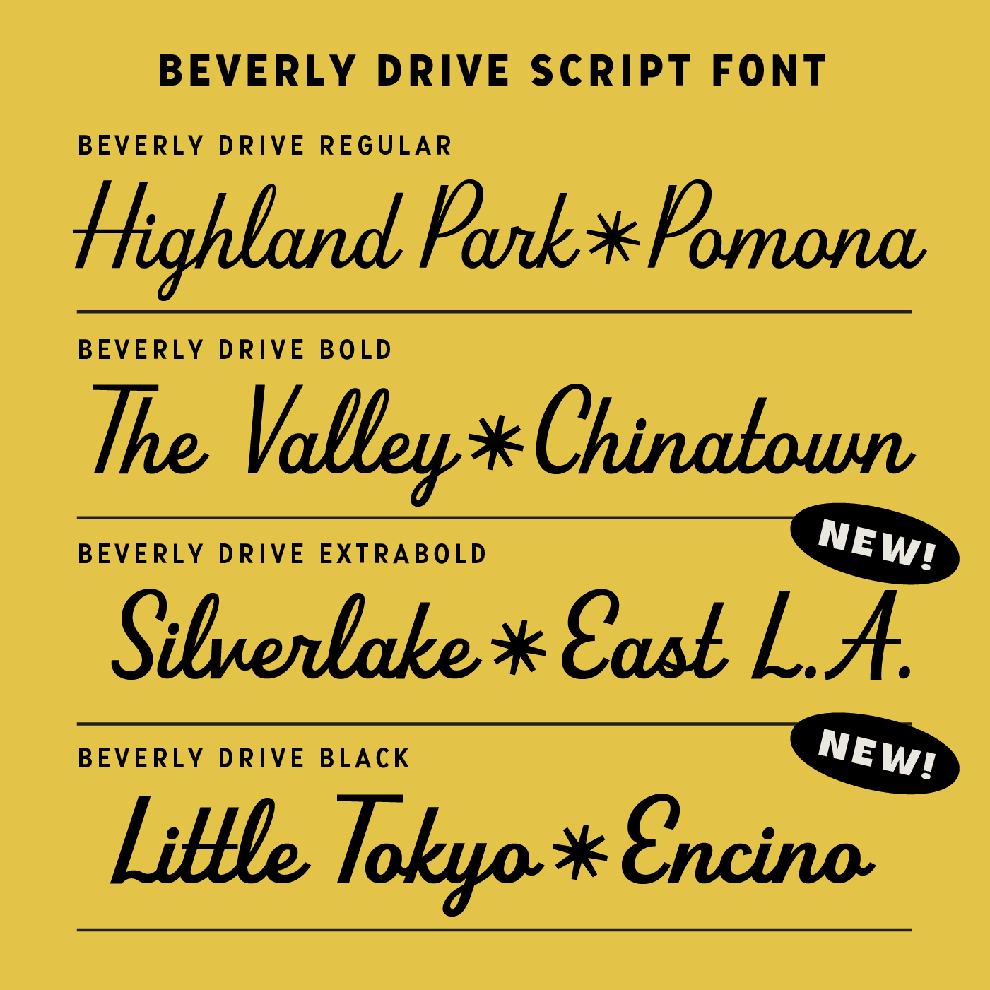
Beverly Drive Right Cover regular
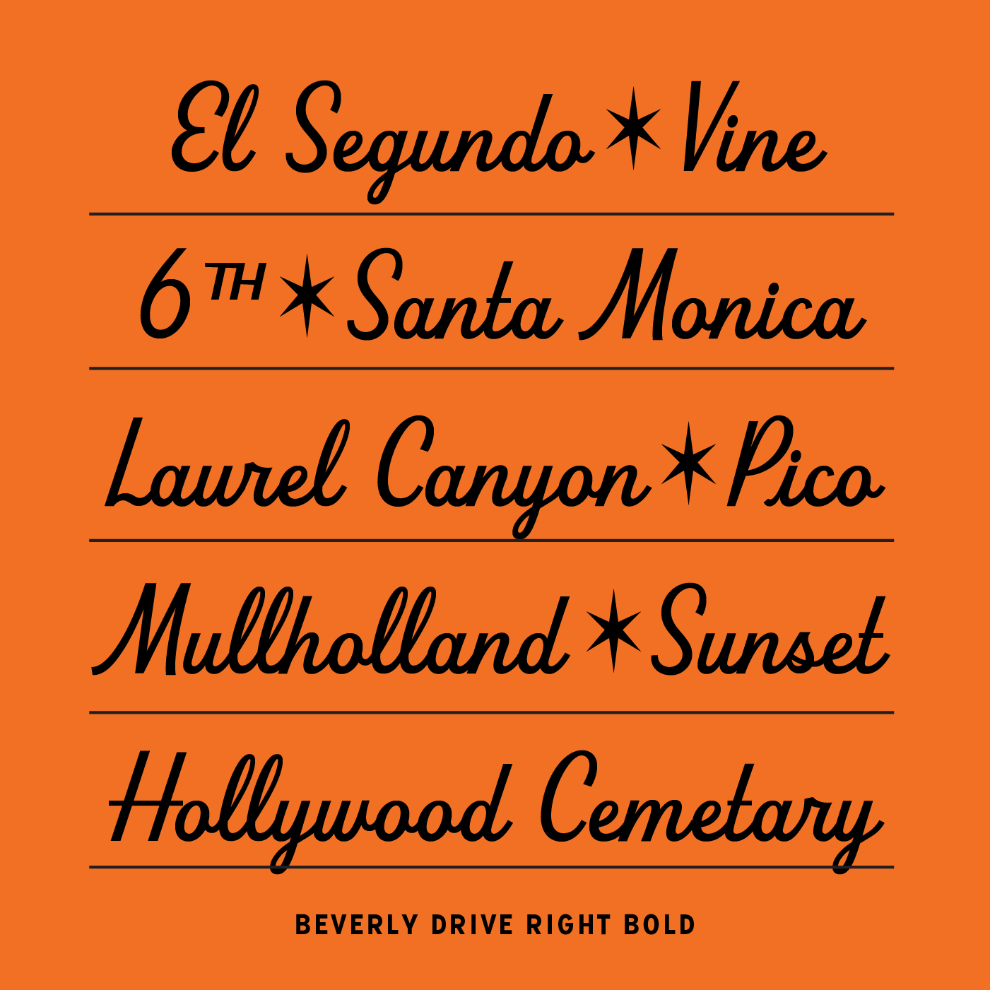
Beverly Drive Right Cover bold
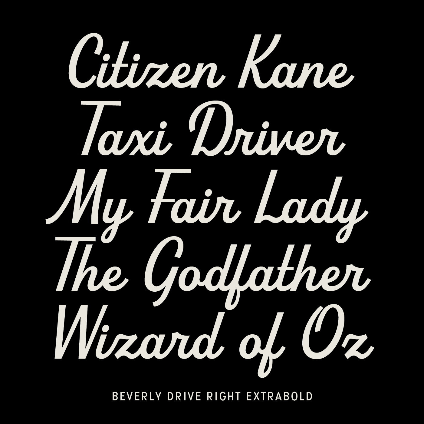
introducing Beverly Drive Right extrabold
introducing Beverly Drive Right black
Beverly Drive Right weights 1400px gif v3
Beverly Drive Right 20220606 style set 2 1000px
Beverly Drive Right 20220606 cover 2000px
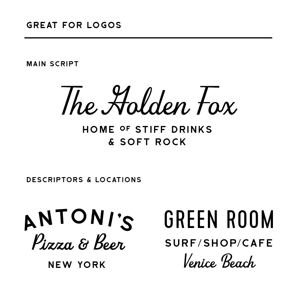
Beverly Drive Right 20220606 logo usage
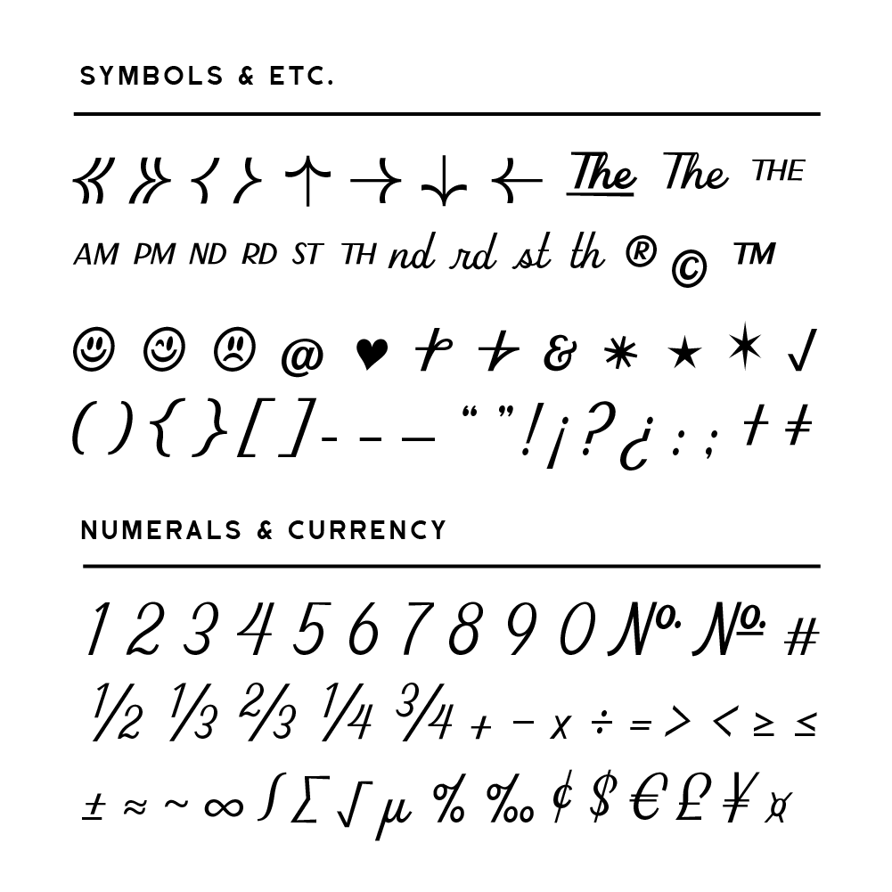
Beverly Drive Right 20220606 symbols numerals 1000px
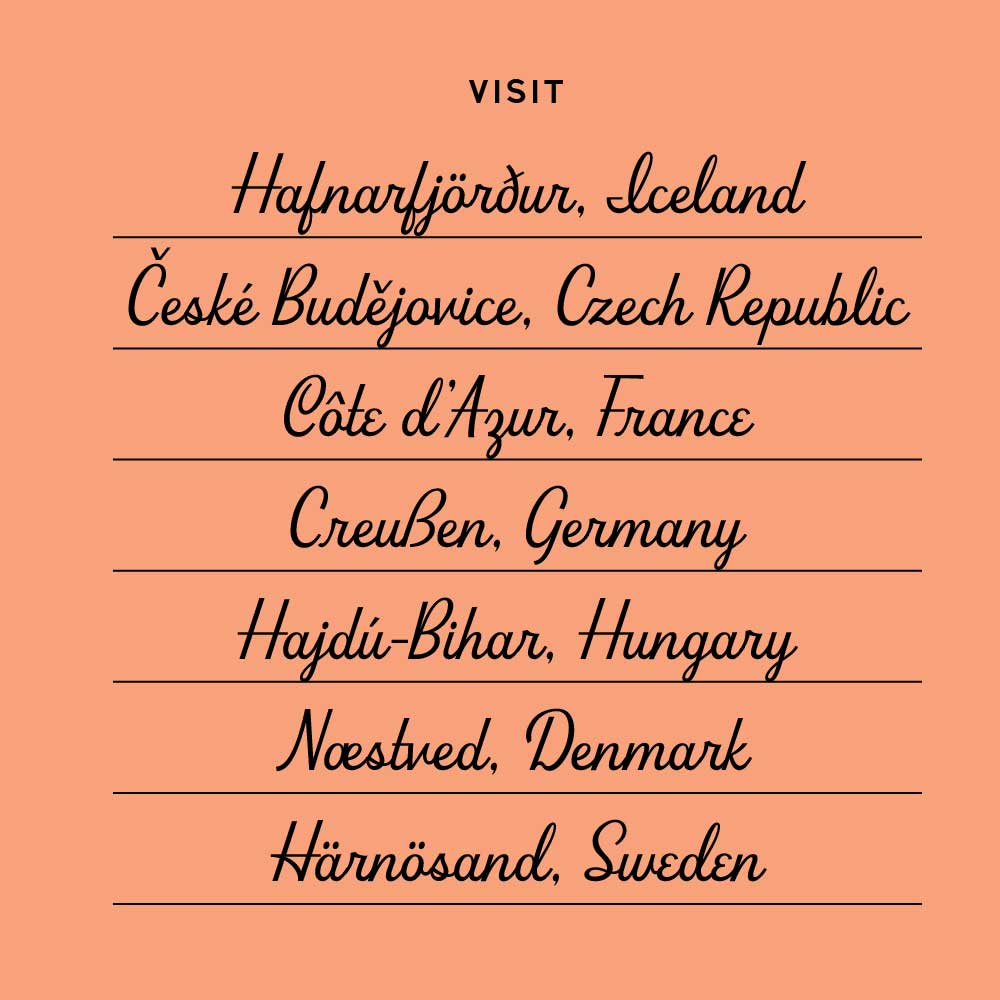
Beverly Drive Right language support
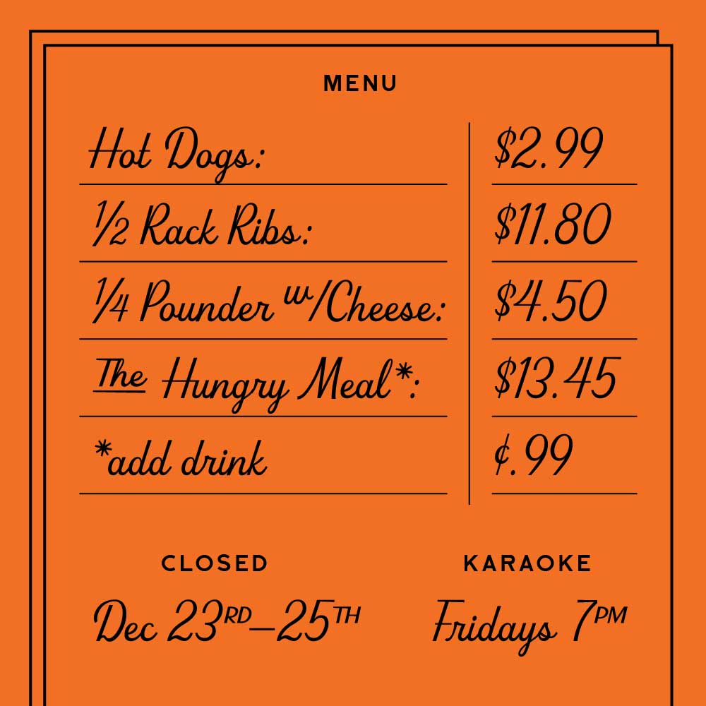
Beverly Drive right currency fractions

Languages Supported:

Afrikaans, Albanian, Basque, Bosnian, Catalan, Croatian, Czech, Danish, Dutch, English, Estonian, Faroese, Filipino, Finnish, French, Galician, German, Hungarian, Icelandic, Indonesian, Irish, Italian, Latvian, Lithuanian, Malay, Norwegian Bokmål, Polish, Portuguese, Romanian, Slovak, Slovenian, Spanish, Swahili, Swedish, Turkish, Welsh, Zulu

Beverly Drive Right script font 4 weights Cover
Beverly Drive Right 20220606 LA square 1000px

Test out Beverly Drive Right

Regular

Lakers and Dodgers for life.


Bold

Lakers and Dodgers for life.


ExtraBold

Lakers and Dodgers for life.


Black

Lakers and Dodgers for life.

About

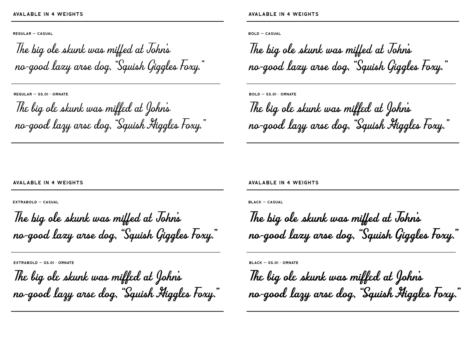
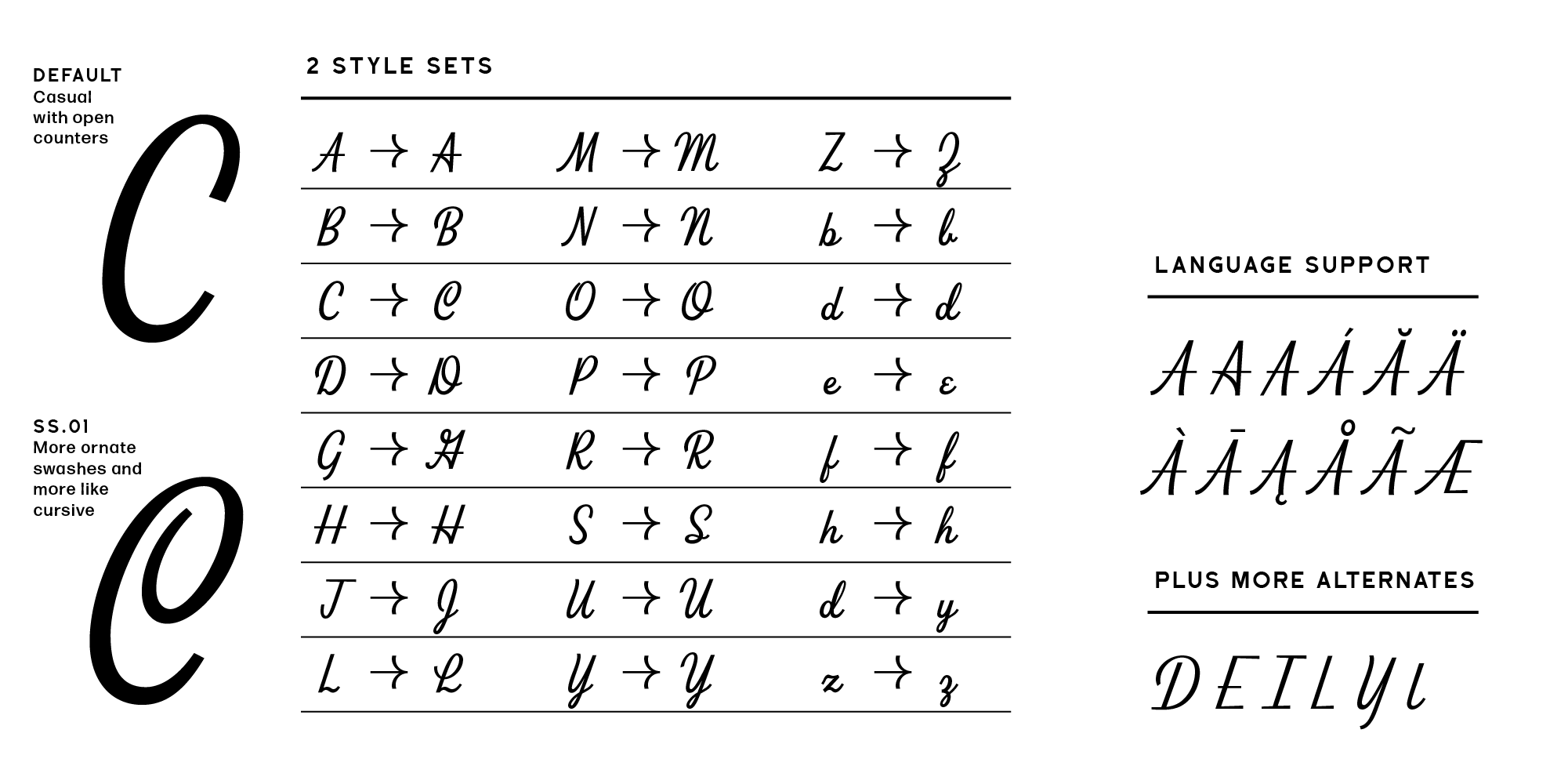
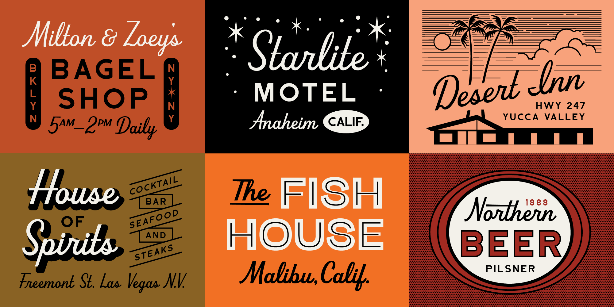
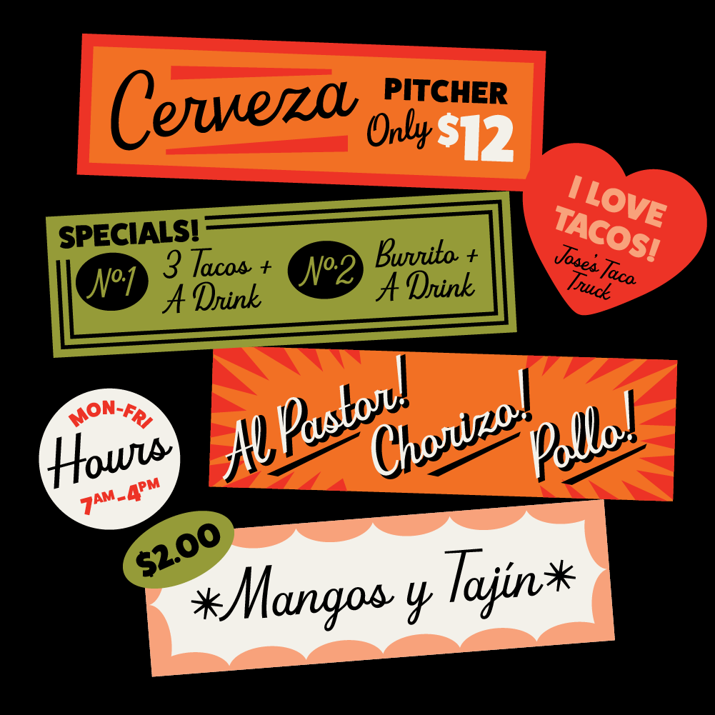
Beverly Drive is a retro script font with a low x height, slightly exaggerated cap height, and 2 unique style sets to suit any occasion. You can dress up (holiday cards or wedding invitations) or dress down (restaurant logo or beer labels). Click on the Licenses tab to see how you can use this font.

When you purchase the font, provide your email to be updated if/when we release updates on any glitches of the font weight/style you purchased.

Credits:

Typeface Design: Amy Hood, Hoodzphah, Inc.
Production: Hoodzpah, Inc.
© Hoodzpah, Inc. 2020

Fonts in use:

See how people are using our fonts: #hoodfonts

Features:

  • 531 glyphs.
  • Language Support: Western, Central, and South Eastern European characters.
  • Numericals, currency symbols, fractions, and punctuation.
  • Tons of fun extras like smiley faces, “rd” “th” “st” superscript contextual alternates, and extra ampersands.

Details:

  • 530 Glyphs
  • Open Type Format
  • Supports 37 Languages (scroll for more)

Trial Fonts

For commercial artists looking to try fonts before they buy.

For students working on class projects.

Get Trial Fonts ⟶ 

Licensing

What does the Desktop License Cover?

—Logos
—Stationery Collateral like Business Cards, Letterhead, Post Cards, Trifolds, Folders, etc.
— Personal Promotion Usage: Garage Sale Flyers, Local Theater, Band Posters
— Products: Tee Designs, Mug Designs, Stickers etc.*
— Marketing and Promotional Materials
— Packaging and Signage

* Exception: Use on product creation websites (ex: Zazzle), or apps that allow their end user to create a new design with the font (ex: Canva) is not allowed under these licenses. Contact Hoodzpah if you need a license for this. info@hoodzpahdesign.com

What doesn’t the Desktop License cover?

— Web Use (@font-face embedding). Purchase a web license for this.
— Ebook or Epub use. Purchase an Epub license for this.
— Apps. Purchase an app license for this.

How do I figure out how many users I should purchase for?

Think about how many people in your company will be accessing and using the font files. That’s how many users you need to license for. An exception to this is third party subcontractors like printers,  developers, animators, etc. (outside of your company) who may need access to the files for your projects temporarily. These are allowed temporary access under our license as long as they delete the files after the project is complete.

What if I’m purchasing for a client?

How many people on the company’s team will be accessing/using the font files? That’s how many users you need to purchase for. Write the client’s name in the notes section of your order if purchasing for them, or have them purchase directly.

I’m a creative—can I use this font license on more than one client project?

Each new client project requires a new license to be purchased for that client.

Where can I find your End User License Agreements?

Hoodzpah EULAs

Glyphs

Font Release: 3.0
Date: 06/07/2022
(If you purchased Beverly Drive, you should have gotten an email with a free download to the 3.0 upgrade. If you didn’t reach out to us at info@hoodzpahdesign.com. )

See All Glyphs

v3 Change Log

—————————————————————————
3.0 Log edits –
—————————————————————————
– Changed Y.ss0.001 to Y, and previous Y to Y.ss02
– Changed y.001 to y.ss02
– adjusted the @ sign counter space to be more open vertically. Adjusted placement on the baseline
– adjusted j, p, t width on all weights
– fixed r upstroke to connect seamlessly with w-r (on all weights)
– adjusted end stroke on p and b (bold) to be a little longer for more space between it and next letter
– updated e.ss01 to be wider on the finial for more kerning space
– updated finial end stroke of f.001 so that the kerning is wider on all weights
– fixed z.001 connection at baseline of 2 parts
– adjusted width on G on left side bowl on all weights
– adjusted upstroke cap angle on M to match N and A
– Changed all .002 to .ss02
– fixed A.ss01 apex connector
– fixed R.ss01 right leg to be higher
– updated spacing on umlaut
– adjusted Z.ss01 thicknesses on all weights
– adjusted J.ss01 thicknesses on all weights
– adjusted B thickness on regular weight
– adjusted guillemetes so that crotch is in exact middle now
– fixed two inconsistencies
– ampersand 2 adjusted (weights)
– minus weight adjusted to match consistency
– adjusted Registered and Copyright glyphs so circle is lower contrast
– adjusted angle on ring and degree glyphs
– moved degree symbol up
– ordfeminine and ordmasculine updated
– adjusted bottom loop of B
– other overall kerning adjsutments
– G.ss01 thickness adjusted on all weights

New Glyphs:
—————————————————————————
– Added casual capital D.ss02, E.ss02, I.ss02, L.ss02, l.ss02 with flat cross strokes at baseline.
– added one.numr, two.numr, three.numr, two.dno, three.dnom, four.dnom
– l_quotesingle_s.ss02, and l_quoteright_s.ss02

Kerning and Sidebearing Updates:
—————————————————————————
– Connected R left sidebearing to B
– Connected Q sidebearings to O
– Connected A.ss01 and A.002 right sidebearing to A
– Connected G.002 left sidebearing to G
– Connected B.ss01 right sidebearing to B
– Connected H.ss01 side bearings to H
– Connected M.ss01 left sidebearing to N.ss01
– Connected O.ss01 left sidebearing to O
– Connected D.002 left sidebearing to B.ss01
– Connected Y.ss01 left sidebearing to U.ss01
– connected quote glyphs to quote left and quote right sidebearings
– blackstar increased kerning
– at,
– product.002
– adjusted right and left arrows to not be slanted

Transfered to components:
—————————————————————————
– Q uses the O component
– g uses aloop component
– i.001, l.001, r.001, and s.001 uses the base letter component.
– added aloop component for easier updating (used in a, d, d.ss01, q)
– added upstroke componenet for .001 upstroke letters l.001, s.001, b.ss01.001
– added bloop
– ud.001 to use aloop + l
– the accent combs are connected to the original diacritics/accents
– Eth to use D component
– Hbar uses H component
– Oslash uses O component and Oslash.ss01 uses O.ss01
– Eth.ss01 uses D.ss01
– hbar uses h
– dcroat uses d
– ae uses e component
– j uses jdotless
– oslash uses o
– b, p, pthorn uses bloop
– quote single uses comma
– quote right uses comma
– added caroncomb.alt for a comma style caron on dcaron and lcaron.
– decomposed from base characters to get more space in final
– OE uses O
– Tbar uses T
– d_quoteright_s, d_quotesingle_s, f_quoteright_s, f_quotesingle_s, l_quoteright_s, l_quotesingle_s, n_quoteright_t, n_singlequote_t, t_quoteright_s, t_quotesingle_s, f_quoteright_s.ss01, f_quotesingle_s.ss01, f_f.ss01, f_f_l.ss01, f_l.ss01, all use components now
– n_d.ss01, r_d.ss01, s_t.ss01, etc. etc. use base components scaled 82% now
– tbar uses t
– exclam, question uses period
– semicolon and colon uses period and comma
– questiondown and exclamdown use base
– periodcentered uses period
– Numbersign.001 uses base N and period
– Numbersign.002 uses base
– all quote glyphs use comma
– guillemeteright uses guillemeteleft
– divide uses minus and period
– notequal uses equal
– less uses greater
— percent uses ring
– 1000percent uses percent and ring component
– micro uses u component
– product uses product.001
– all arrows connected to up arrow
– made fractions from base components

You might also like

Creepy gif from The Simpsons of homer patting couch, telling you to come and sit

Join Usssss

The newsletter no one asked for. Thoughts, latest work, and shop deals. Earnest and lightly seasoned with typos.

Enrollment now open for Hoodzpah’s Visual Identity Course! Get your seat

Enrollment now open for Hoodzpah’s Visual Identity Course! Get your seat