Looking for something?
Remind is a platform trusted by 80% of U.S. schools to connect educators, students and families. Since launching in 2011, Remind has grown from a simple messaging app into a company offering a broad range of education tools. While the growth has been beyond exciting, it’s also led to some growing pains:
— The company’s brand architecture had become unclear, and customers were confused about plan names.
— Their audience was often unaware of the new services beyond messaging.
— Remind’s brand identity needed to better reflect the aspirational vision the company has for education, and the inspiring people they serve.
Our team at Hoodzpah was brought on to breathe new life into the brand identity, while clarifying the product offering and broader company purpose. Our goal with the Remind rebrand: exude the ease of the app, and the positive connections it fosters, through updated naming, brand architecture, messaging, and visual identity.
— Discovery & Strategy
— Product Naming
— Logo, Typography & Color
— Messaging
— Website Design
— Illustration
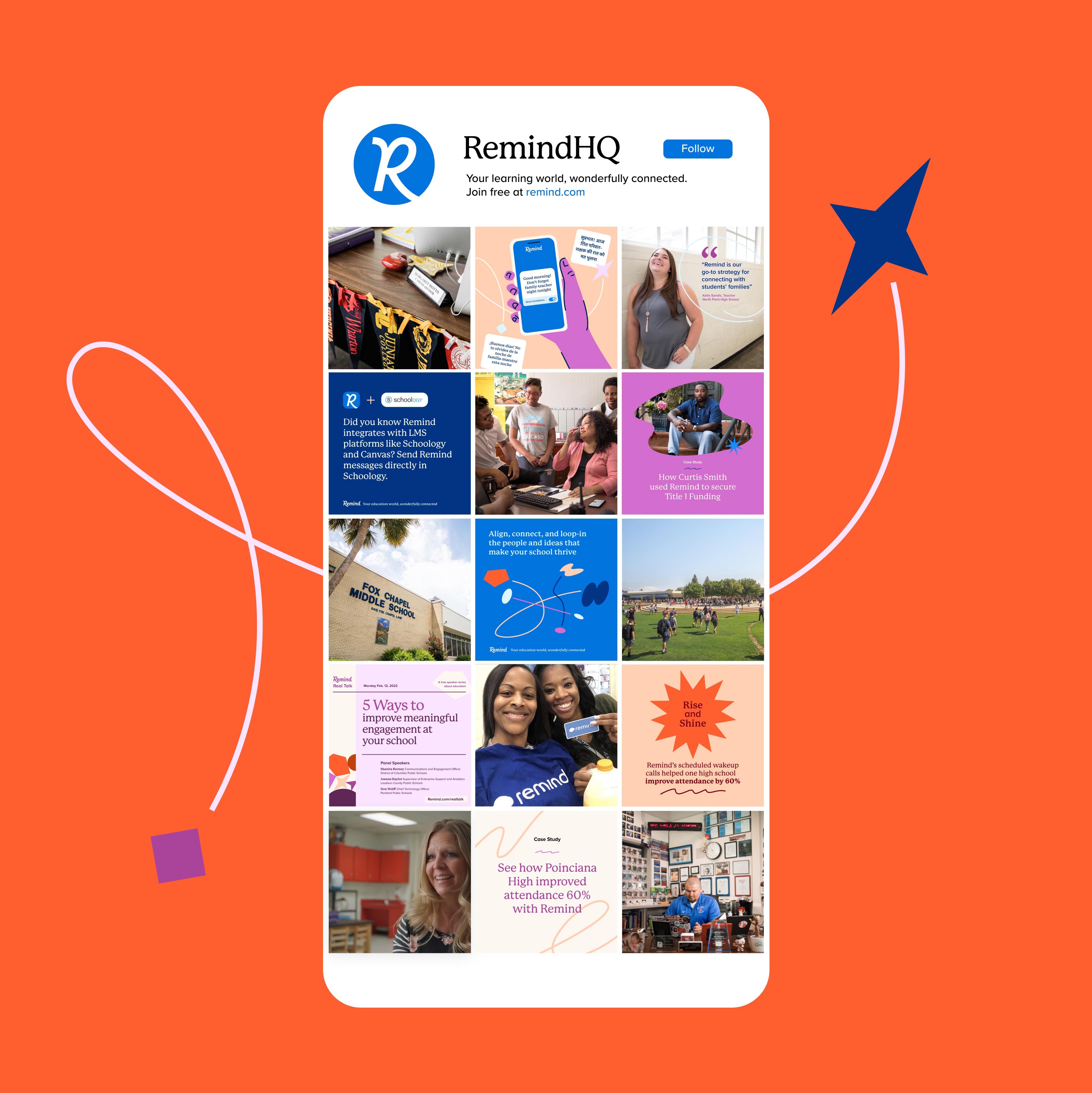
— Social Templates
— Brand Guidelines
— Website development and further web design based on our guidelines by Refokus
— Animations by Ethan Silva, Bad Lucky Studio
Huge thanks to the Remind team we worked with closely on this project: Quenton Cook (President and CEO), Courtney Drake (Director of Design), Tshaka Campbell (VP of Marketing), Jennifer Liu (Content Manager), Gulu Saiyed (Content Writer), and Remind photographers Taylor Chapman, and Patrick Michael Chin.

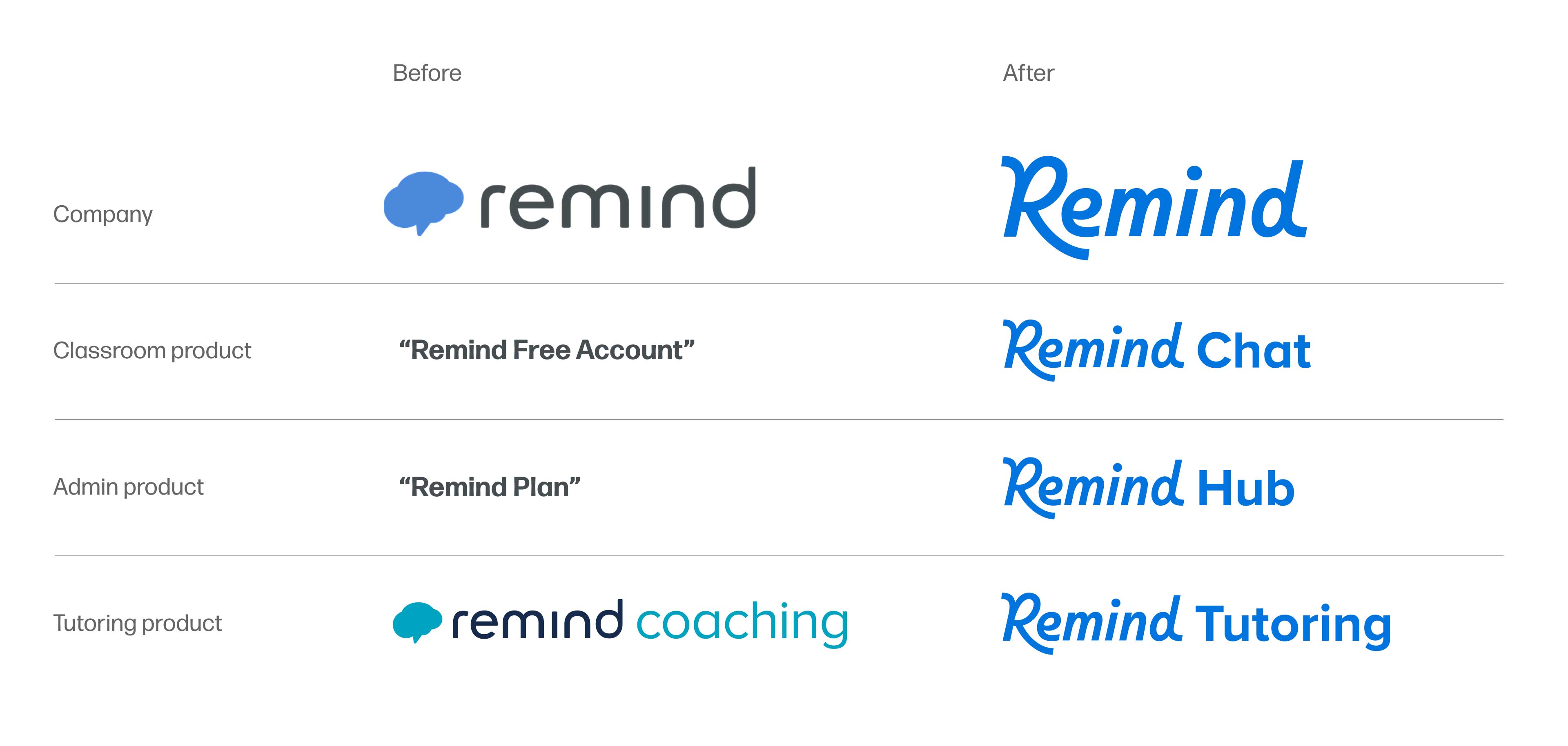
Remind’s new wordmark is a custom type solution that combines the simplicity of a sans serif with the playful movement of a script. The personality-rich wordmark presents a unique and ownable logo without the need of a logomark. Being as the company’s suite of products and offerings will continue to grow, dropping the logomark also consolidated the [Company]+[Product name] architecture, conserving space and simplifying the logo set.

Remind has grown from an app for texting between educators and classrooms, to an education company offering many solutions for learning communities. “Remind” as a company needed to be given distinction from the Remind products. The Remind products included:
1. “Remind free account”: A free product for teachers to message classes
2. “Remind Plan”: An admin product helping schools and districts consolidate communication and collaboration
3. “Remind Coaching”: A tutoring product for families and students which was causing confusion to users who assumed it was regarding school athletics.
We re-addressed the naming and architecture to create a more clearly defined family of products whose names simply represented their purpose.
This simple phrase encapsulated the company’s big purpose (learning and connection), and the method (wonderfully, because Remind’s platform makes connecting easy, meaningful, and safe). This informed our design language.

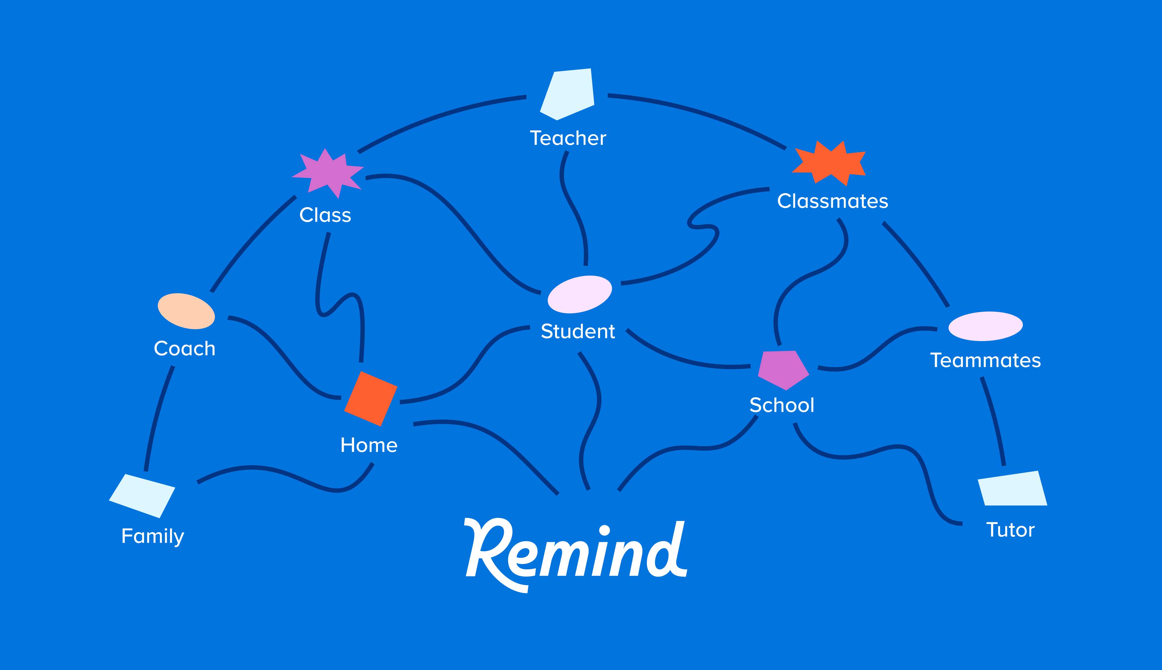

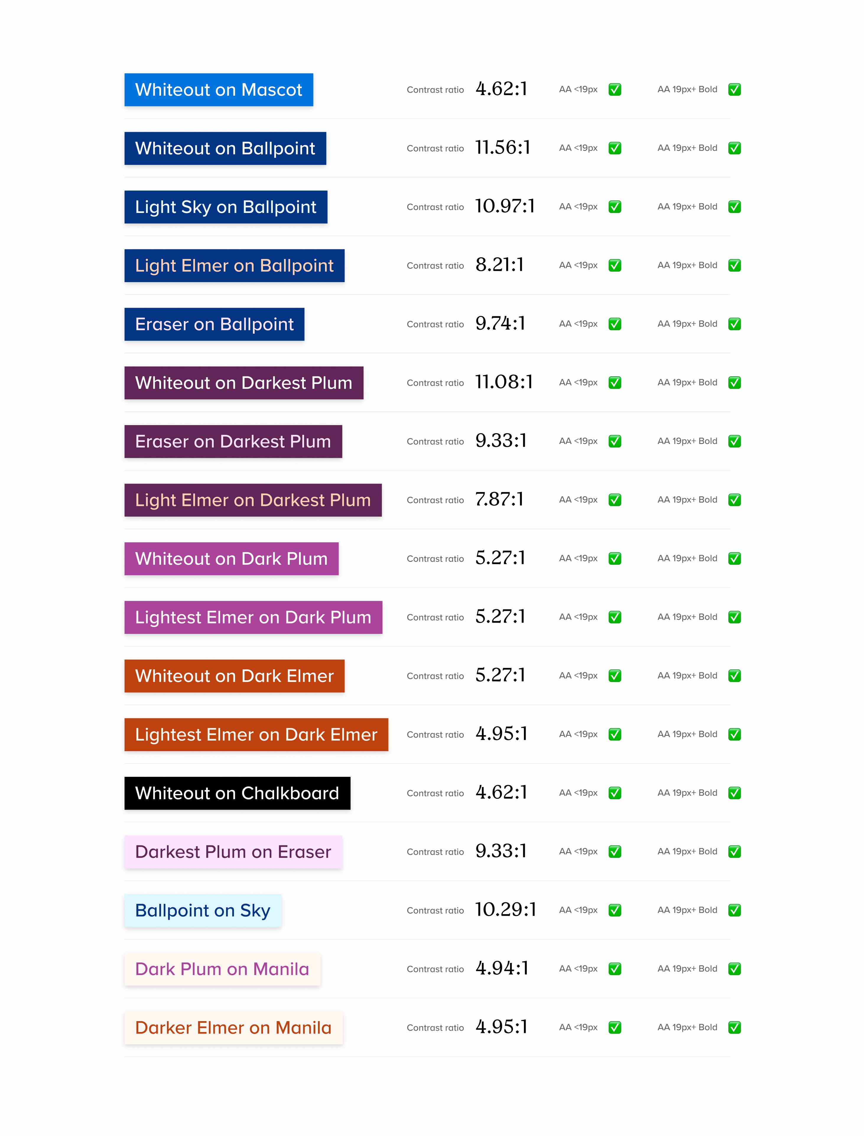
The updated brand color palette retains the primary “Mascot” blue used in the previous identity, as it was a fitting solution and would create a through-line of recognition for existing users. The new supporting palette is a vivid, cheerful array of oranges and plums.
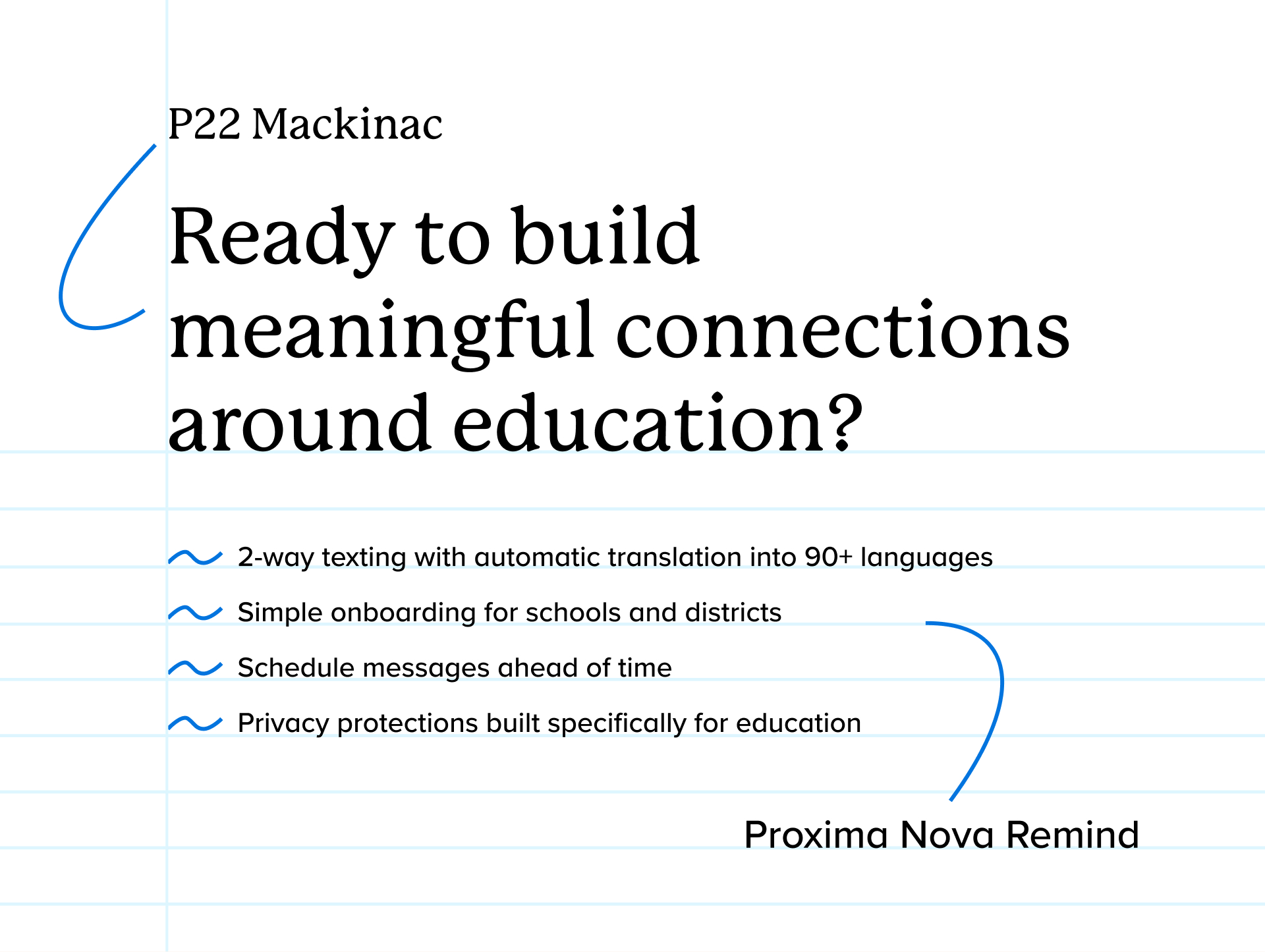
Headlines are lent an inviting, unassuming charm thanks to P22 Mackinac, a rounded-terminal serif designed by Mike Beens. Body copy and smaller subheadings remain in Proxima Nova Remind, a clean and versatile sans serif family by Mark Simonson, which Remind had customized for their unique in-app needs years ago.
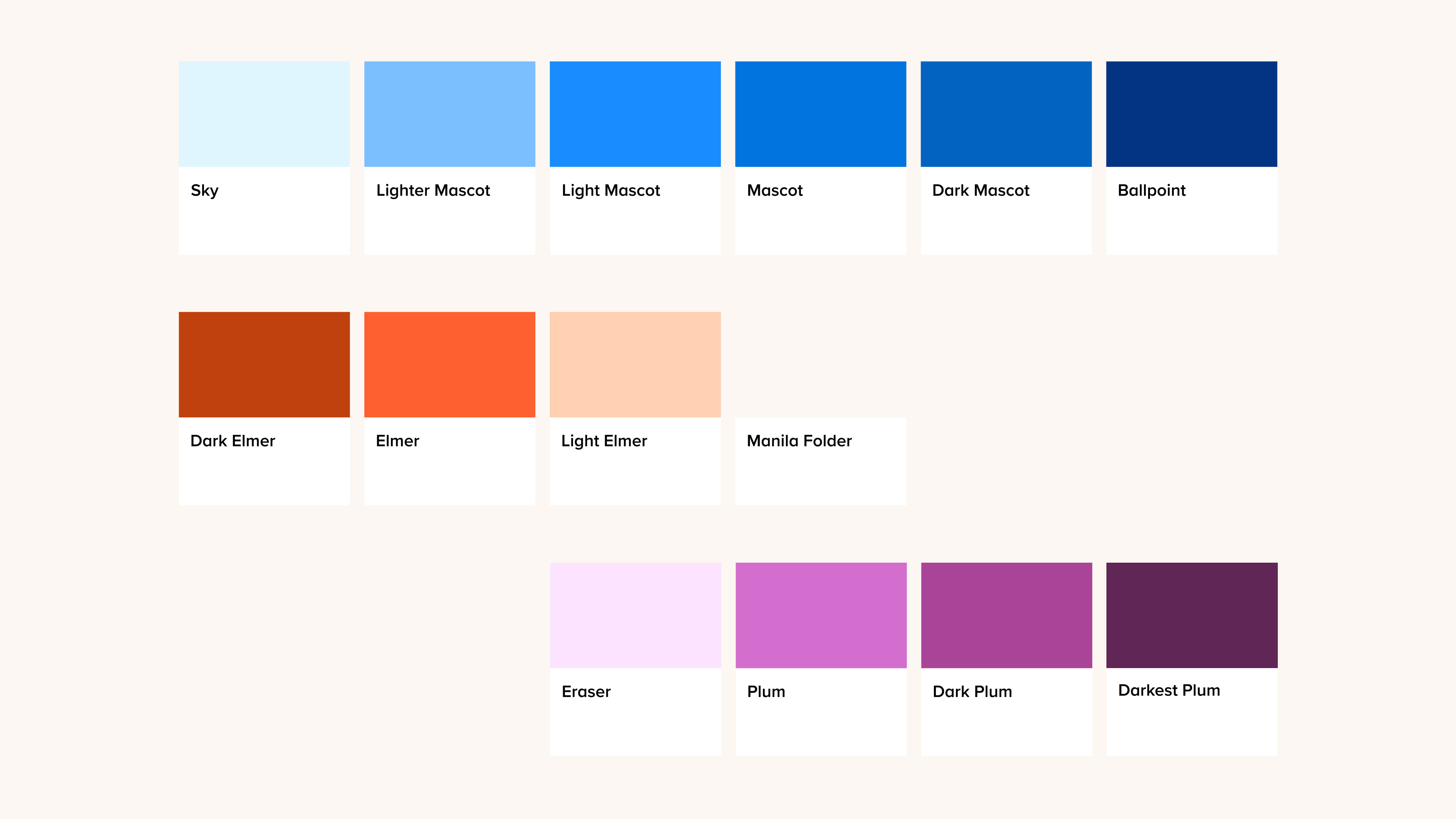
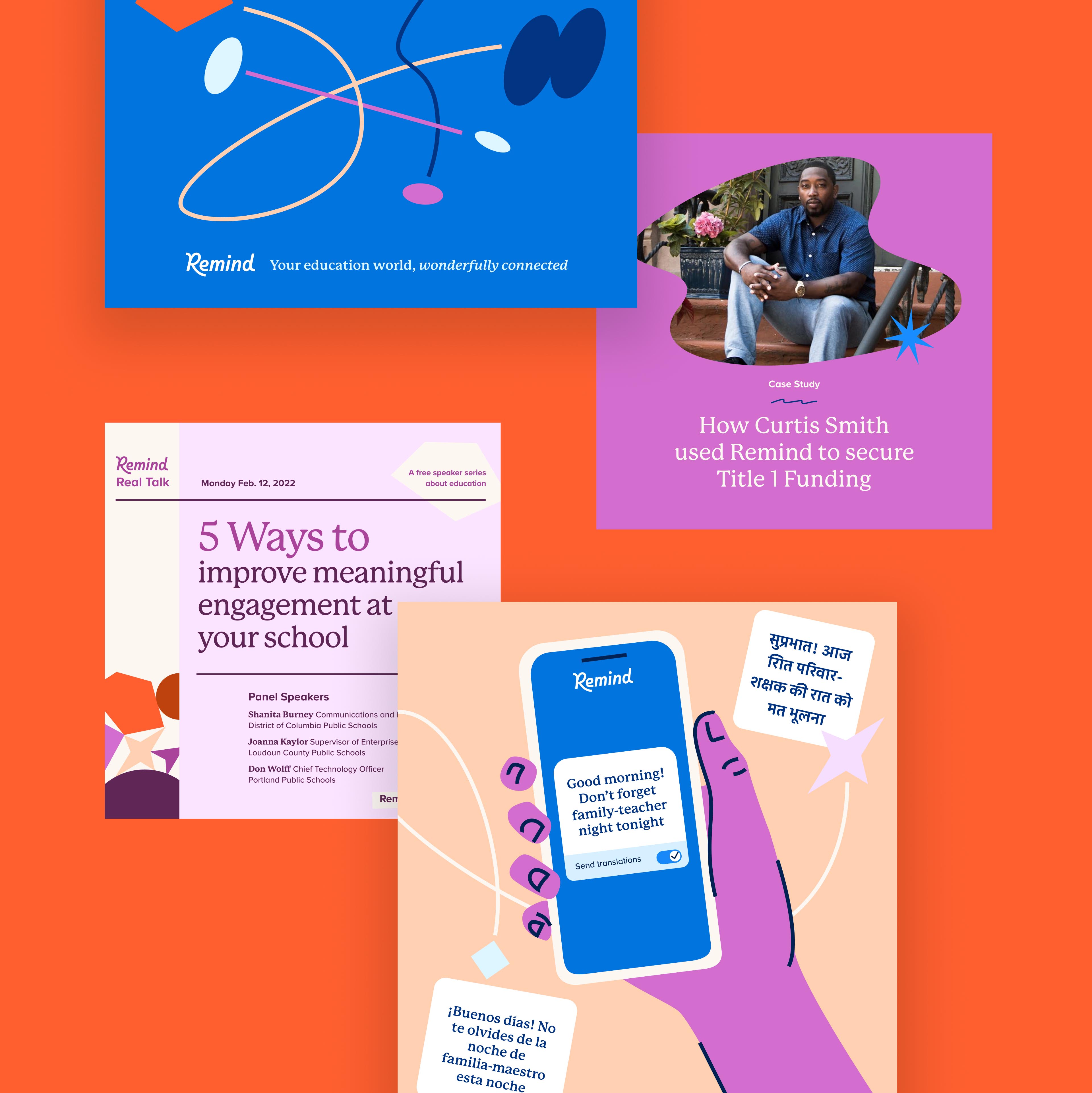
We extended the playful lines into the illustration library. Remind’s illustrations show everyday vignettes of education, with human, quirky twists (a hand waving from a computer, a cat distracting from homework). The illustrations feel warm and relatable.

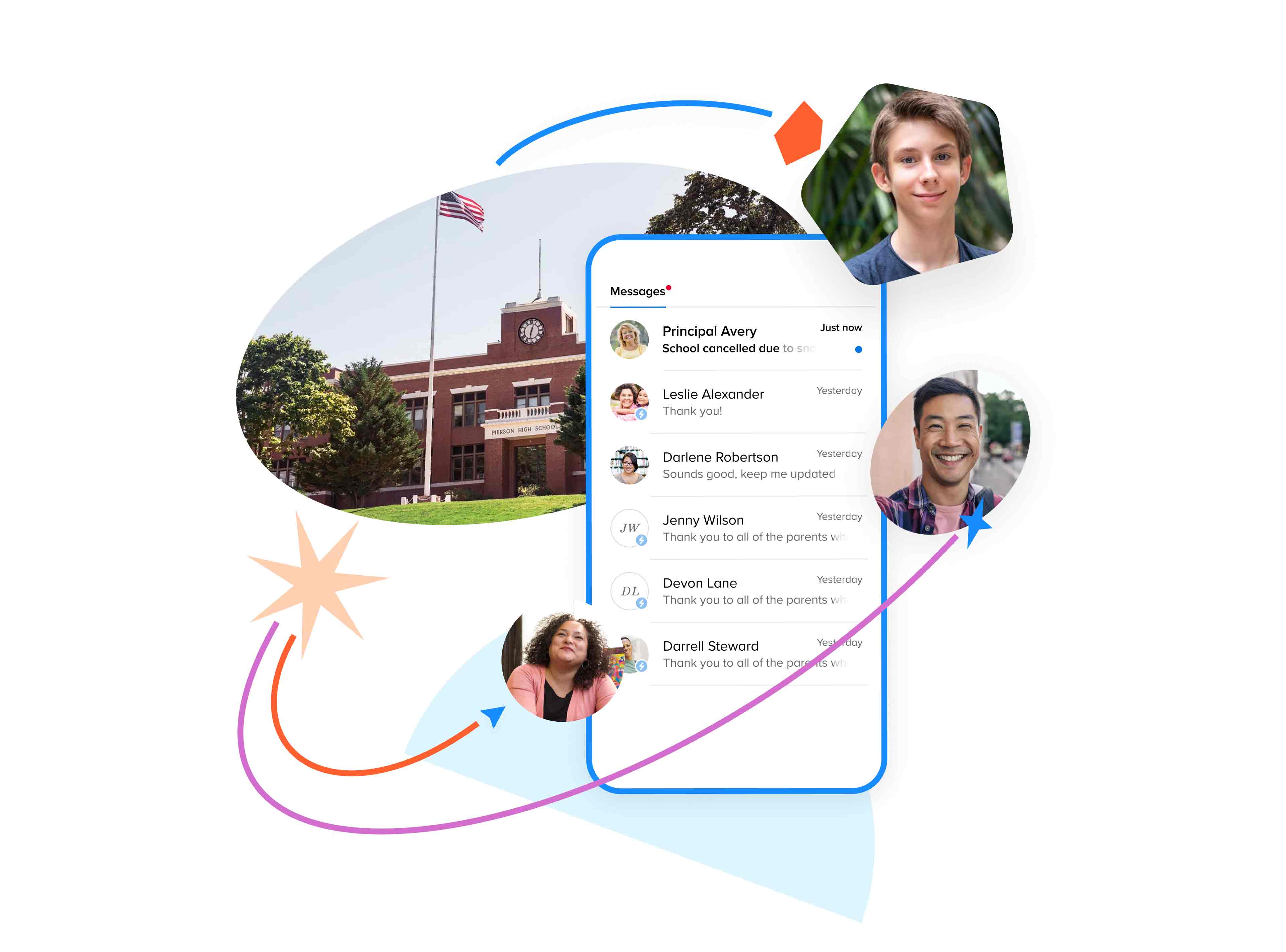
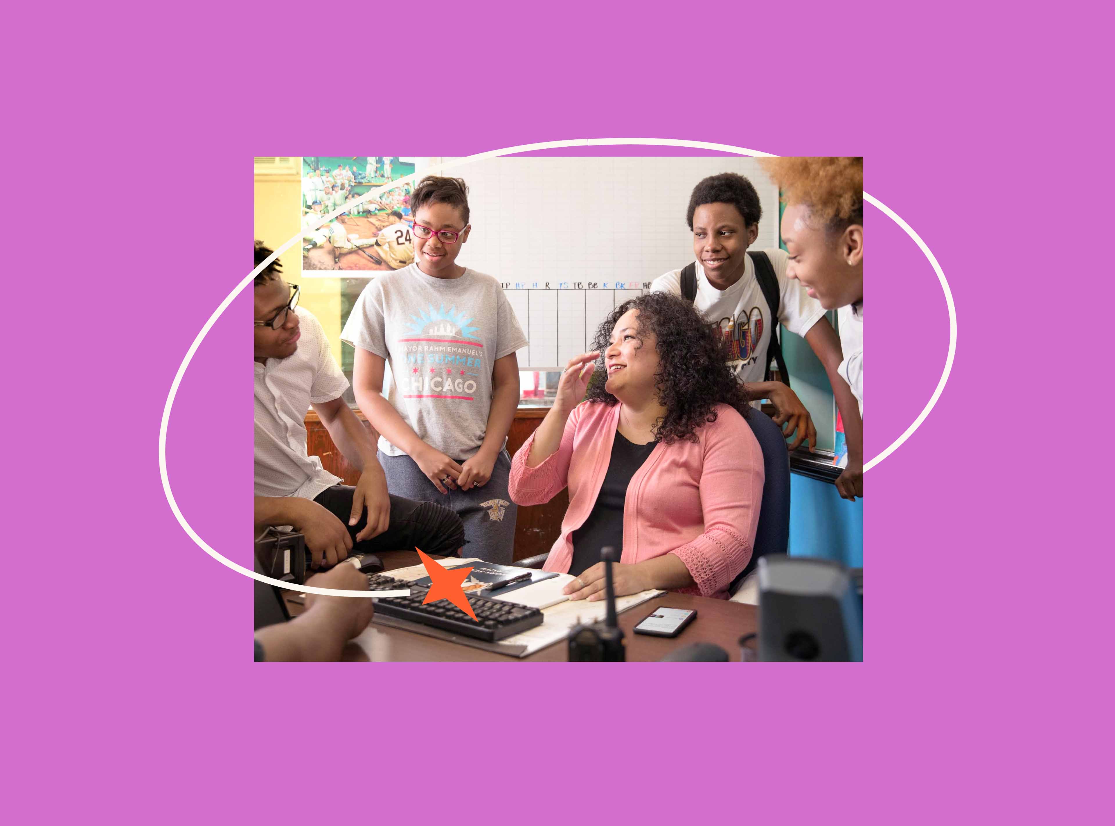
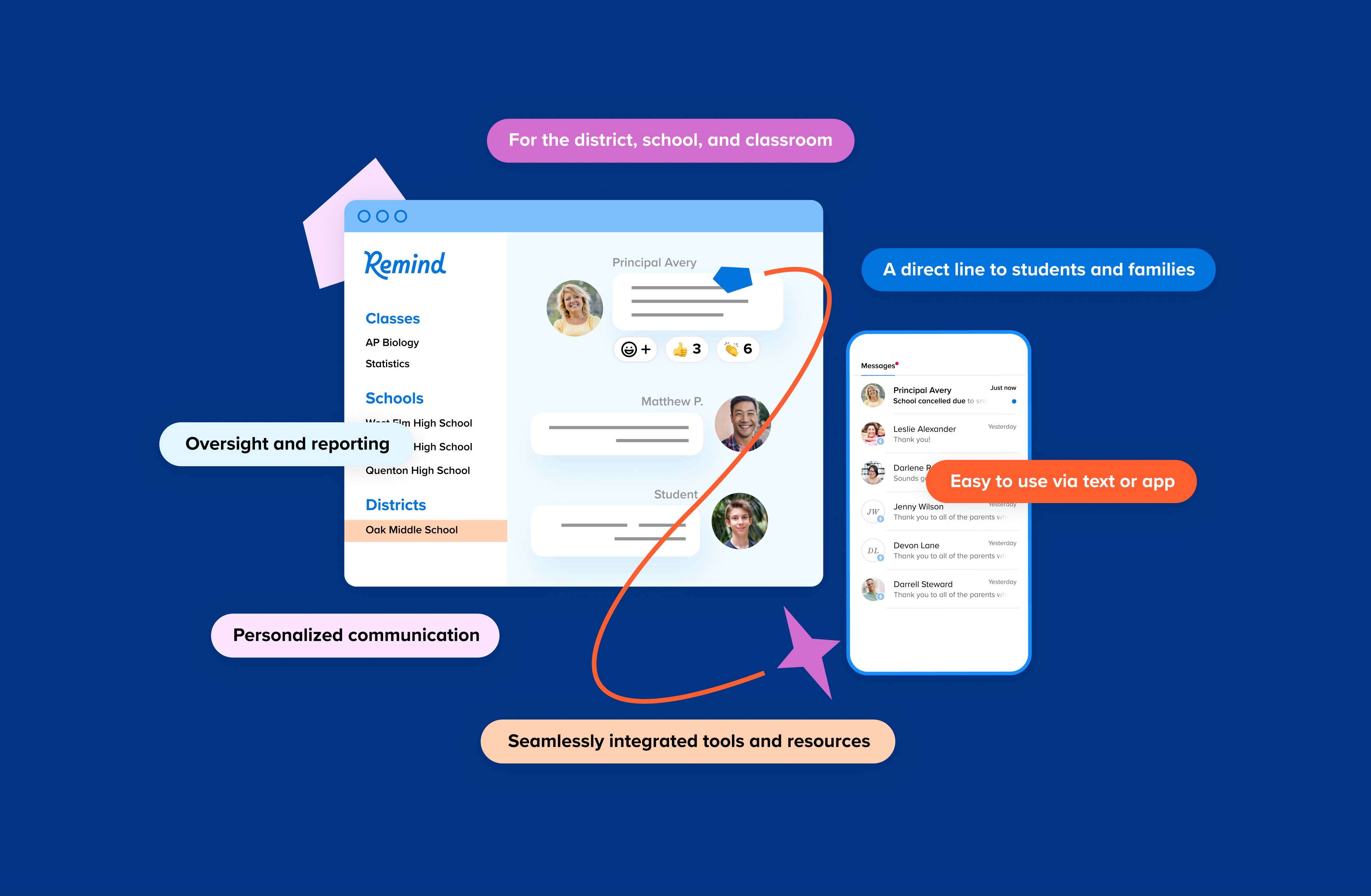
The connector lines and shapes integrate easily with brand photography, creating warm and lively collages. This simple but effective approach allows the Remind design team to output image assets easily at a large scale for use across the app, marketing touchpoints, print collateral, blogs and more.


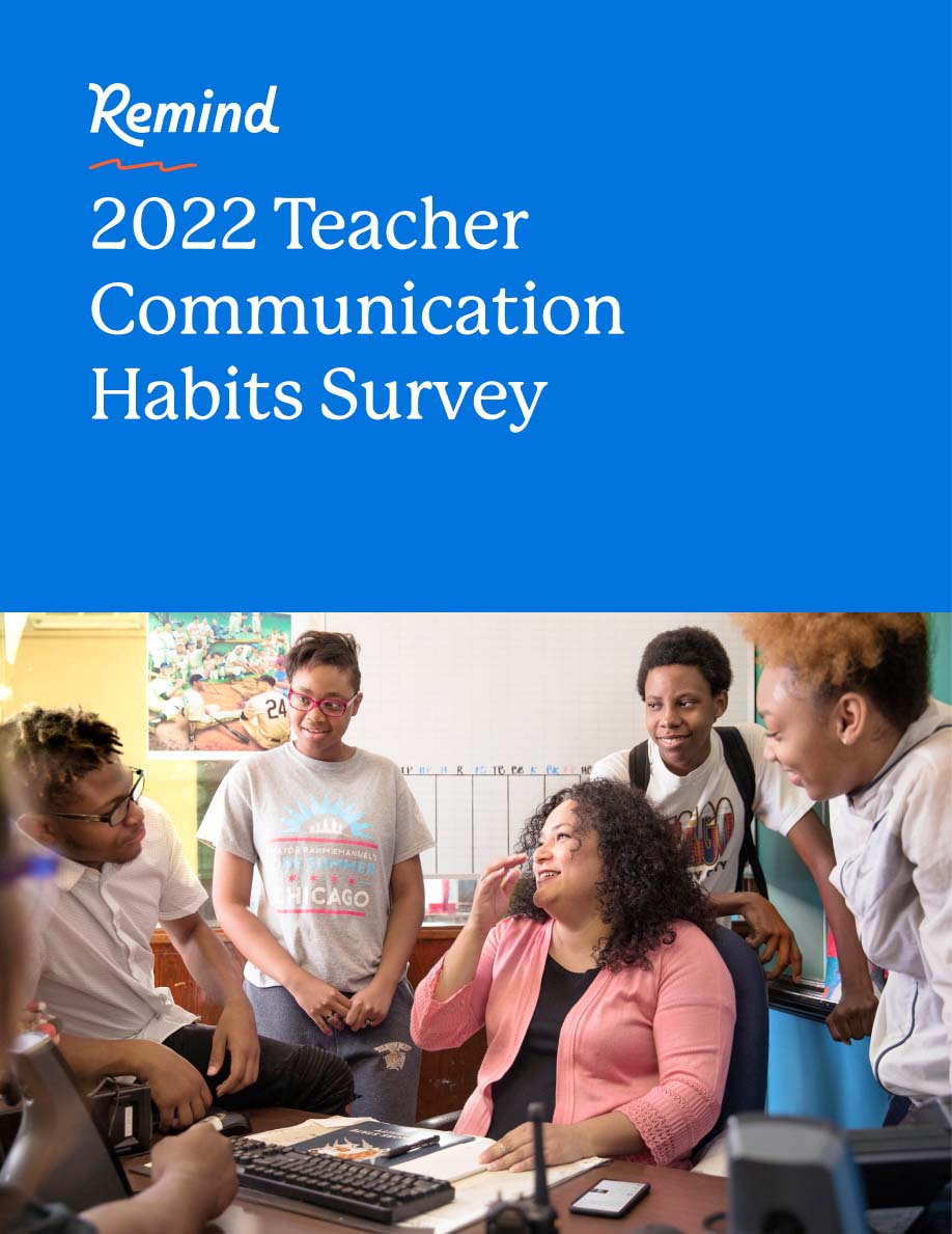
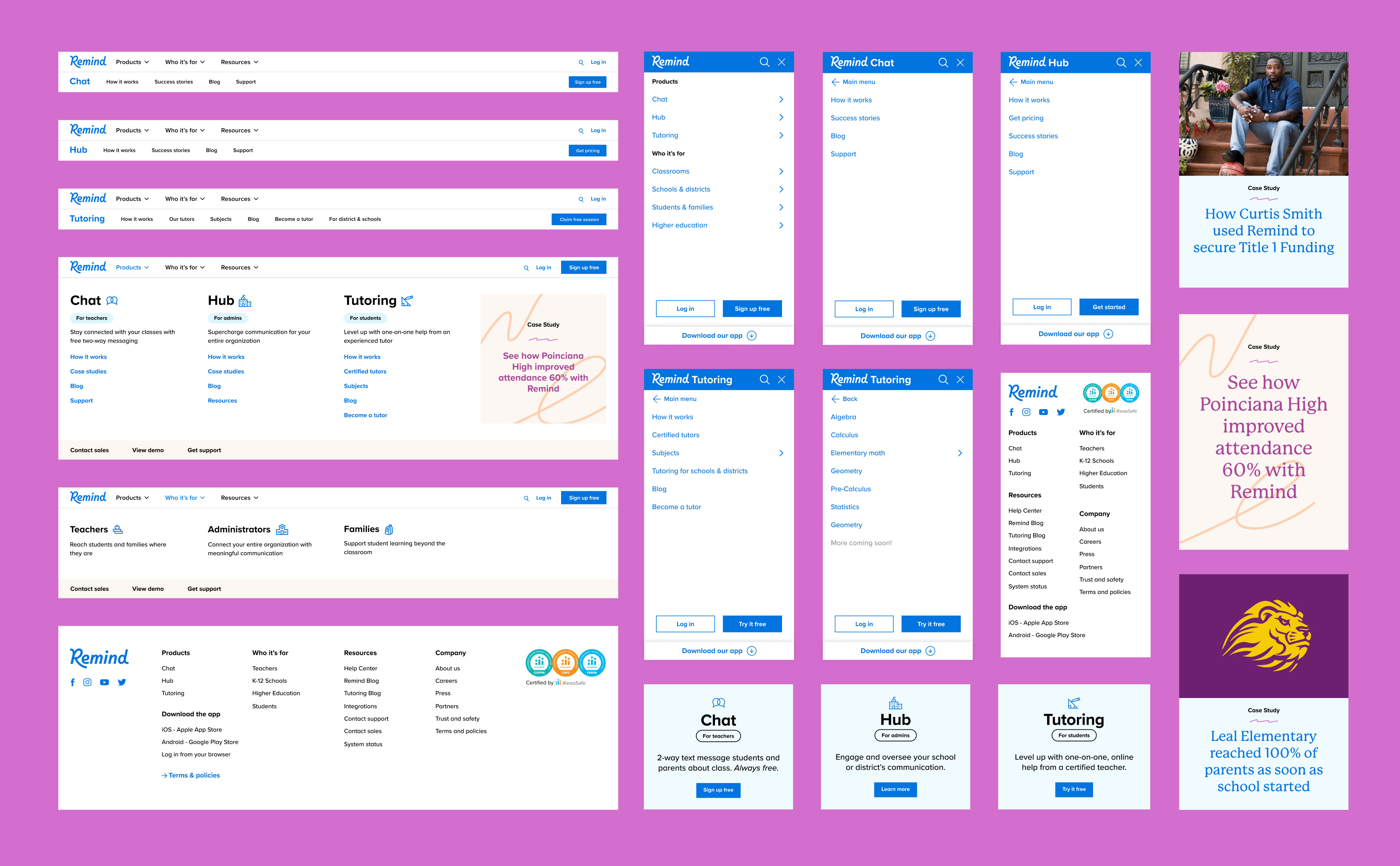
From refining the site structure, to updating the navigation, rewriting messaging, and redesigning core pages, we completely overhauled the marketing website. Refokus, an incredible design and development team, carried our foundational design work through to the remainder of the site pages and then brought it to life in Webflow. The work resulted in more quality click-throughs for Remind overall.


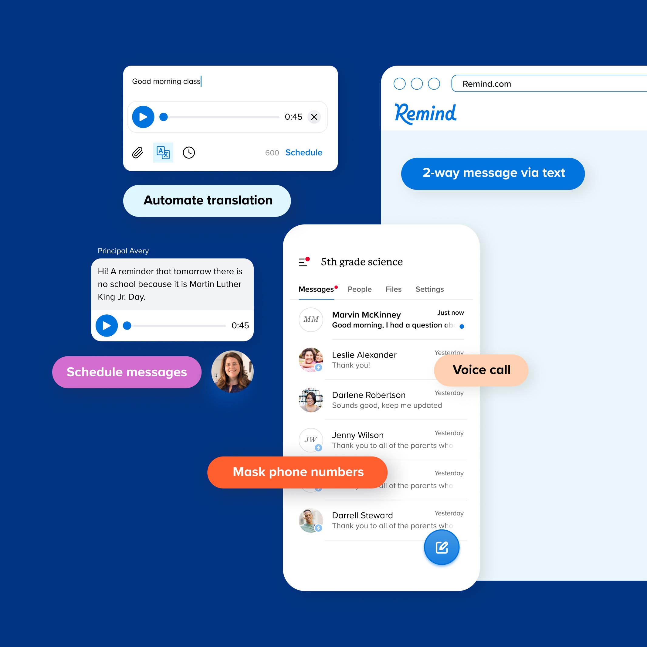
This gives users an evergreen idea of the platform without using exact UI screenshots (which would become outdated as updates were made).
Hoodzpah was a true partner, from setting strategy and creating a new brand architecture to defining our visual identity. They balanced offering their expertise with listening to our needs throughout the process.”
– Courtney Drake, Director of Design at Remind
Visit Remind.com to see more.