Looking for something?
Industrial Light & Magic’s work is interwoven into our collective cultural consciousness. Whether you were a child of the ’70s in awe of Han Solo the swashbuckling scoundrel in Star Wars; a child of the ’80s forever terrified of static on TV thanks to Poltergeist; a child of the ’90s who marveled at the T-Rex mauling the SUV in Jurassic Park; or a child of the ’00s during the pirate-fever caused by Davy Jones and his cursed crew in Pirates of the Caribbean — you have seen and experienced the wonder of ILM’s work. So when the legendary company reached out to us about rebranding, we were beyond excited. Since the company last updated its branding in 2005, it has grown from one studio in San Francisco to six studios globally. Our goal for ILM’s rebrand was clear: to respect their legacy while reminding the world that ILM is still the forerunner in entertainment innovation. We wanted to make the identity more bold and iconic in its own right, and unify the logos for ILM’s sub-brands.
— Logo and logo animations
— Typography and color
— Tagline
— Collateral (marketing, stationery, decks)
— Merch
— Web design
— Brand guidelines
— Rebrand launch video
— Ethan Silva of Bad Lucky Studio helped us bring the motion and logo animations to life
— Wordmark Mastering by Mattox Shuler and Brian Brubaker at Fort Foundry

In preparation for the rebrand, we did one-on-one and group interviews with more than 100 ILM team members, and gathered company-wide feedback from thousands more through surveys. We wanted to understand how people perceived the brand, how they worked together and with clients, what they stood for, what they hoped for the rebrand, and what their fears were. Simultaneous to our discovery process, Light & Magic premiered on Disney+, offering an in-depth look at the legacy of ILM from the likes of founder and filmmaker, George Lucas, director, Stephen Spielberg, and many of the employees that solidified ILM’s culture and ethos like Dennis Muren, John Dykstra, and Phil Tippett. From all this info there were 3 core traits that have remained true for ILM from 1975 through to today: Trust, magic, and innovation.

When we talked with ILM’s team it was clear, there was a lot of love for the original magician logo (originally illustrated by Michael Pangrazio and later finalized in a painting by Drew Struzan). There was also a lot of equity built into the bulb and cog, as those elements had survived many rebrands in various iterations to represent how ILM harnesses technical savvy and vivid imagination to make iconic moments. Over the years the logo itself had lost some of its “magic”. John Knoll, Executive Creative Director at ILM (and also a co-creator of Photoshop) said, “we need to bring back the magic.” The phrase became a north star for the project. The new glyph showcases a bulb silhouetted by a cog, with a spark of magic soaring around it. There’s an intrepid and dynamic feel to it which honors the legacy while looking towards the future.
Industrial Light & Magic’s beloved original logo featured “ILM” in a sturdy slab serif treatment. Being as our goal with the rebrand was to honor the legacy while ushering in a more bold and iconic presence, we created a new slab serif for the full wordmark that feels trusted, timeless, and bold. Subtle ligatures and a unique ampersand add a modern and unique touch. If the bulb glyph nods to ILM’s innovation, then the wordmark celebrates its legacy. Huge thanks to Mattox Shuler and Brian Brubaker at Fort Foundry for their final mastering consultation on the wordmark, to finesse it to perfection.

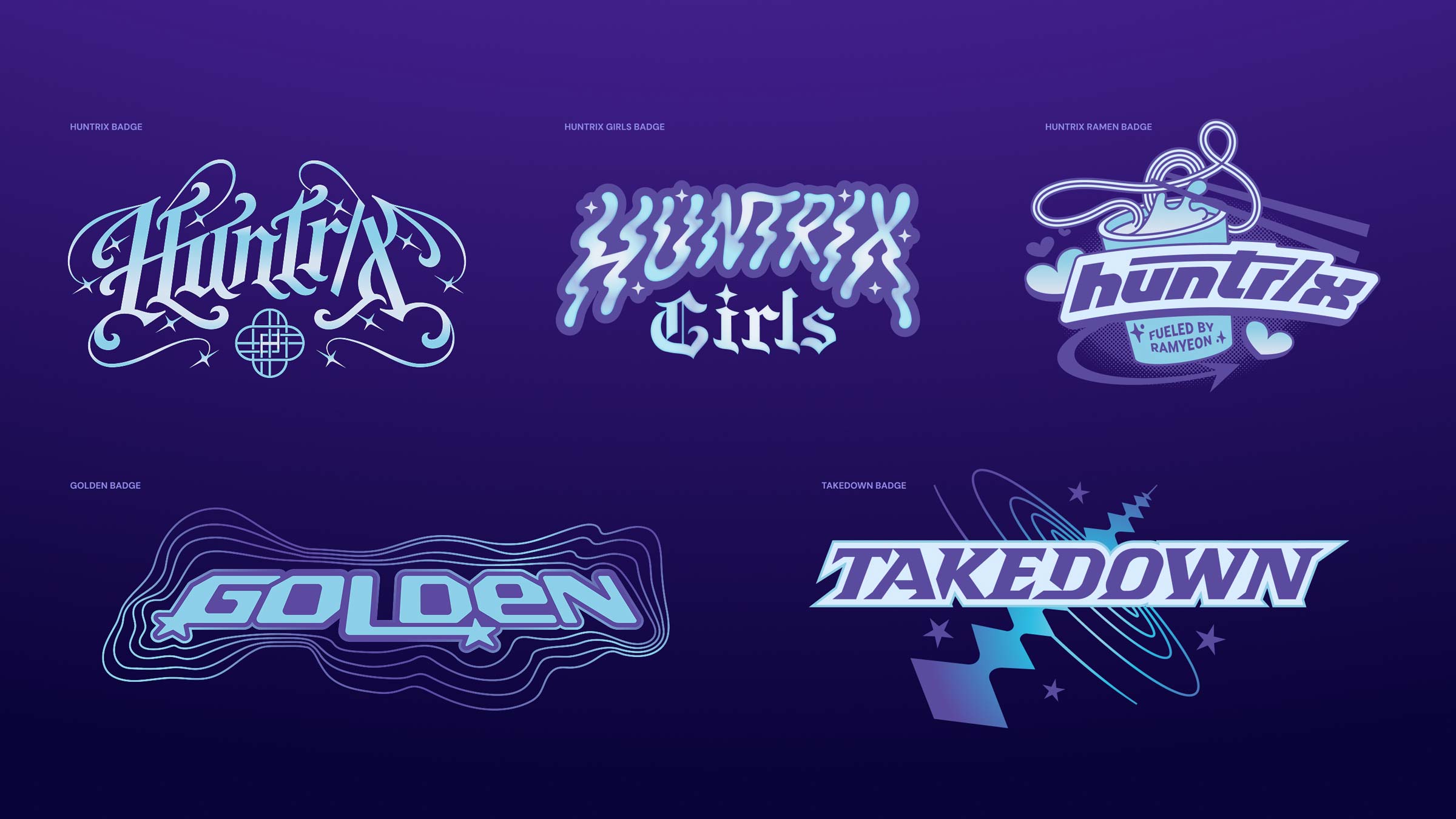
The new responsive logo system for Industrial Light & Magic strategically solves a problem that had evolved in the sub-brands: we needed one consistent way to tie the sub-brands to the parent company. That’s why we made an “ILM” wordmark in addition to the full name, so we could reference the parent company succinctly. All sub-brand logos share the ILM monogram to reinforce the parent brand and to borrow the inherent legacy and trust that ILM’s name carries. The glyphs for each sub-brand were also updated to match the execution of the parent glyph in weight and negative space. Most of the sub-brands and department glyphs are close to their original because of existing equity. Technoprops didn’t have a strong tie to their old glyph, which was overly complex, so we completely redesigned theirs to feel more in keeping with the family of logos. ILM Art shares the parent glyph because it’s a department of ILM, rather than a sub-brand.

The logo animations, like the rest of the branding, celebrate legacy and innovation. There’s a tinge of retro quality, with light and color focusing into the final logo state. Logo animations were created for the ILM parent company as well as its two most public facing sub-brands: ILM Immersive (their consumer-facing Immersive entertainment arm), and ILM StageCraft (their lauded virtual production platform, including LED stages). Huge thanks to Ethan Silva, the talented motion designer behind Bad Lucky studio who helped us bring these to life.

ILM’s brand typefaces are inspired by fonts seen on the storyboards and scripts they work from everyday. Headings are set in Owners by Mckl, and body copy is set in Owners Text by the same type foundry. For captions and labels, ILM uses a monospace typeface called Code Saver by Ryoichi Tsunekawa of Dharma Type.


Whether their work is featured on the silver screen, on a TV, or through a VR headset, ILM projects are always cinematic. The ILM rebrand relies on a rich, cinematic color palette that celebrates the incredible stories ILM helps their clients tell.


The modular look of old storyboard templates from ILM’s archive served as inspiration for layouts. We used divider lines throughout deck covers, social templates and more. This simple yet effective treatment adds interest to any layout, making it an easy system for the ILM team to carry on.
Getting ILM’s “look” comes down to 5 principles:
1. The ILM monogram serving as a framing device (inspired by its film-like form)
2. Rounded corners on images
3. Divider lines
4. Roger Rabbit (the tan/cream color) instead of white
5. Simple layouts using bold type and colors

As part of our branding scope, we created hundreds of pages of templates, from everyday decks in Google Slides, to social media posts. The designs rely on a simple but powerful recipe of bold colors, beautiful type, and the stunning imagery ILM has become synonymous with.

We designed the new Home, Projects and About pages for their redesigned website. These plus a new styleguide were foundational elements that the ILM internal team then ran with, applying the new design themes to the rest of the website.

A new “studio thread” illustration featured at the bottom of the website celebrates ILM’s global team.

After such an all encompassing rebrand, it’s important to summarize everything in one document that the whole team can collectively refer to.

Turn your sound on for the full goosebumps…