Looking for something?

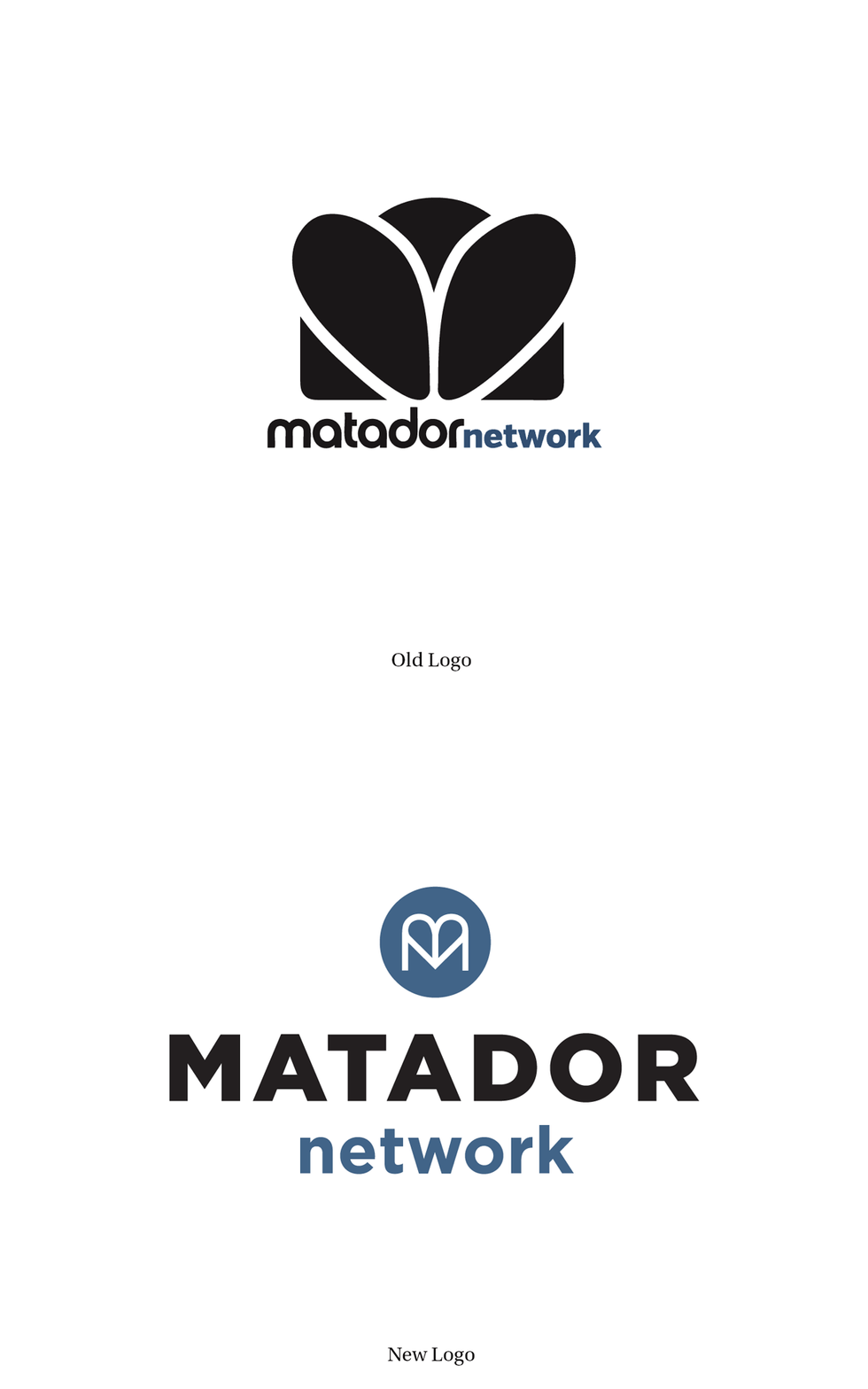
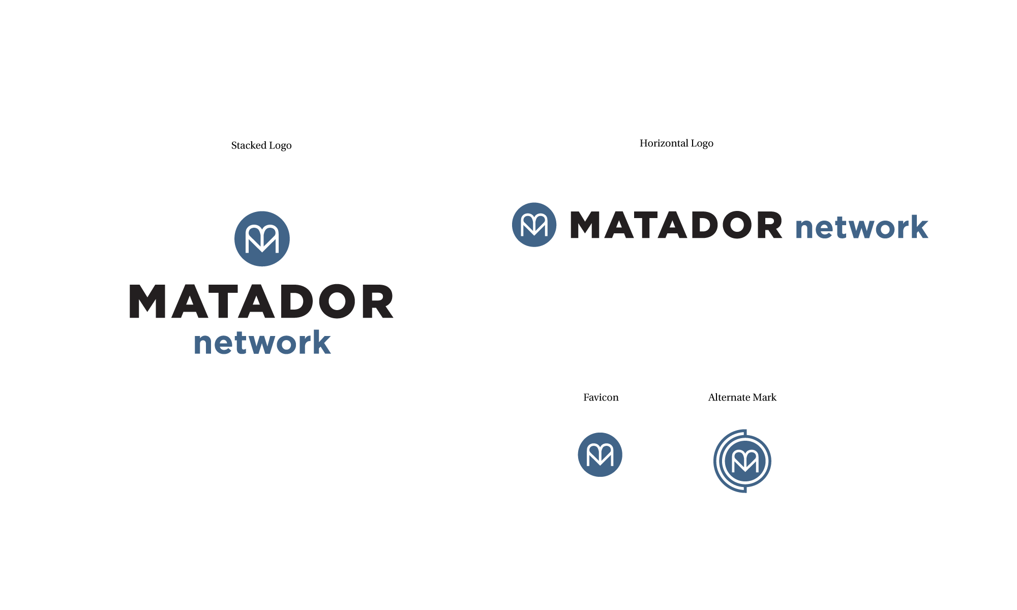
The team at Matador brought Hoodzpah on to help them update their Matador Network logo and corresponding marks. The leading online travel magazine felt their old logo looked a little web 2.0 and wanted to explore new iterations. In the end we finalized a system that is an ode to the original logo that started it all, but is cleaner, sleeker and more timeless. Scroll down to see the old and new logo comparison.
Huge thanks to Scott Sporleder for bringing us onto this project!
— Discovery Session
— Identity System
— Collateral & Web Audit


If you haven’t checked out Matador Network it is an amazing site with contributors from all over the world. They create tons of custom content in house and via collaborations with some epic travel brands. www.matadornetwork.com