Looking for something?
$25.00
In stock
— Screenprinted by the gems at Native Screen Print Co. in FL
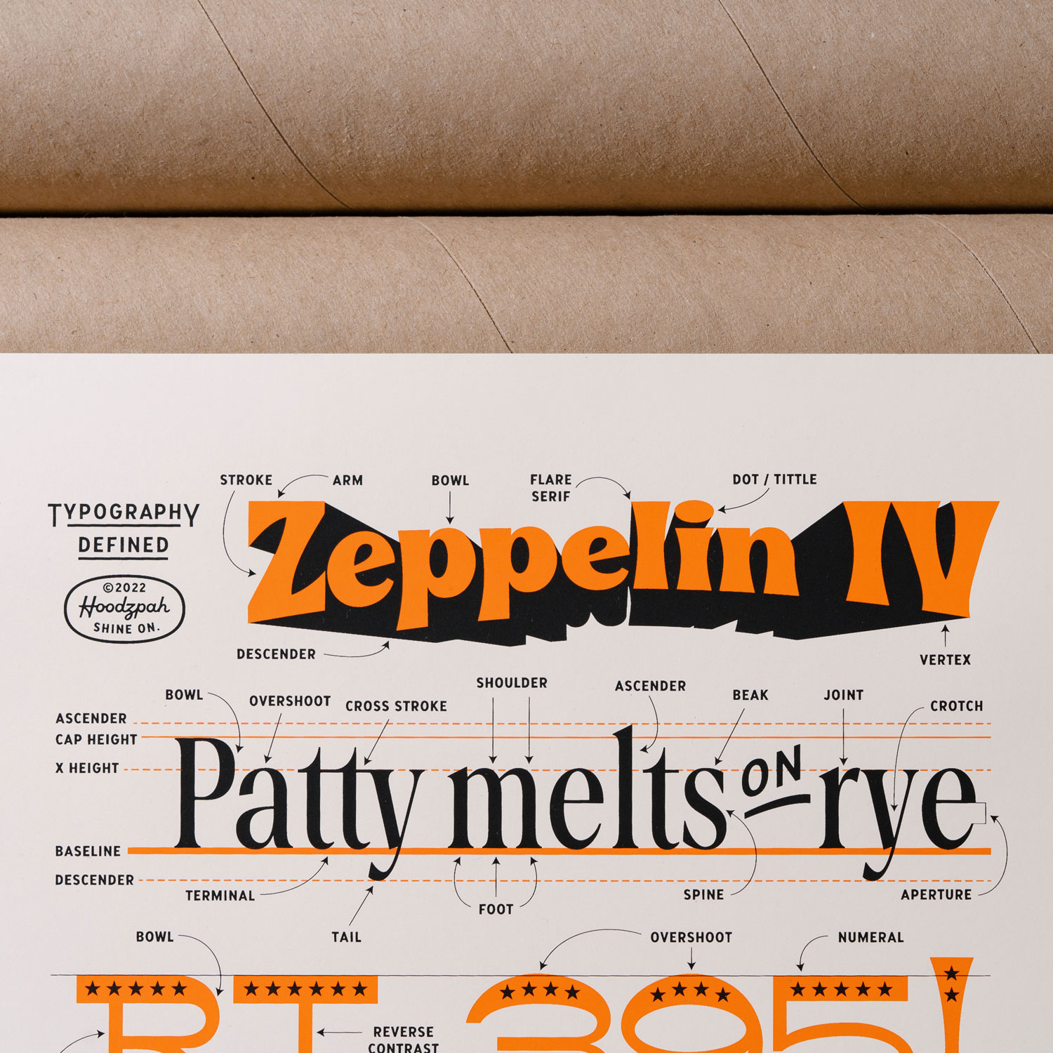
— Orange and Black ink on off white paper
— Sized 11×17 (aka easy to frame)
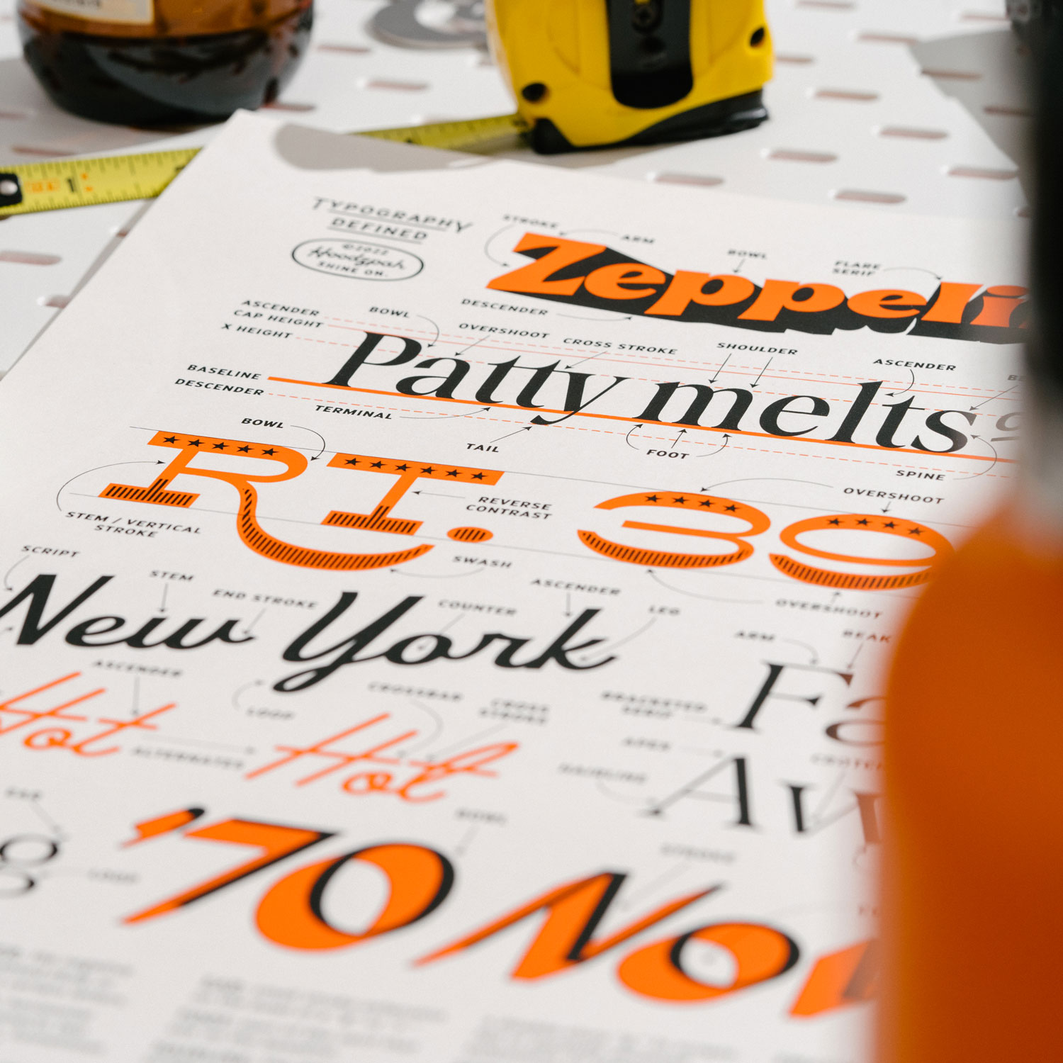
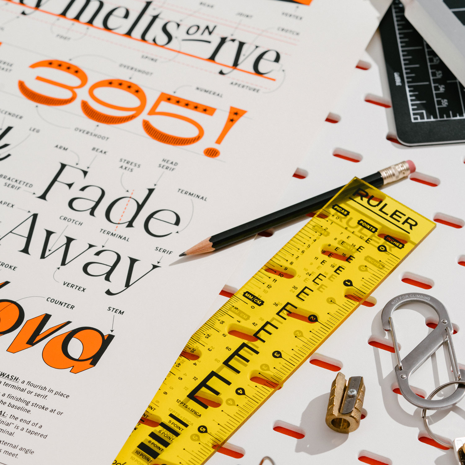
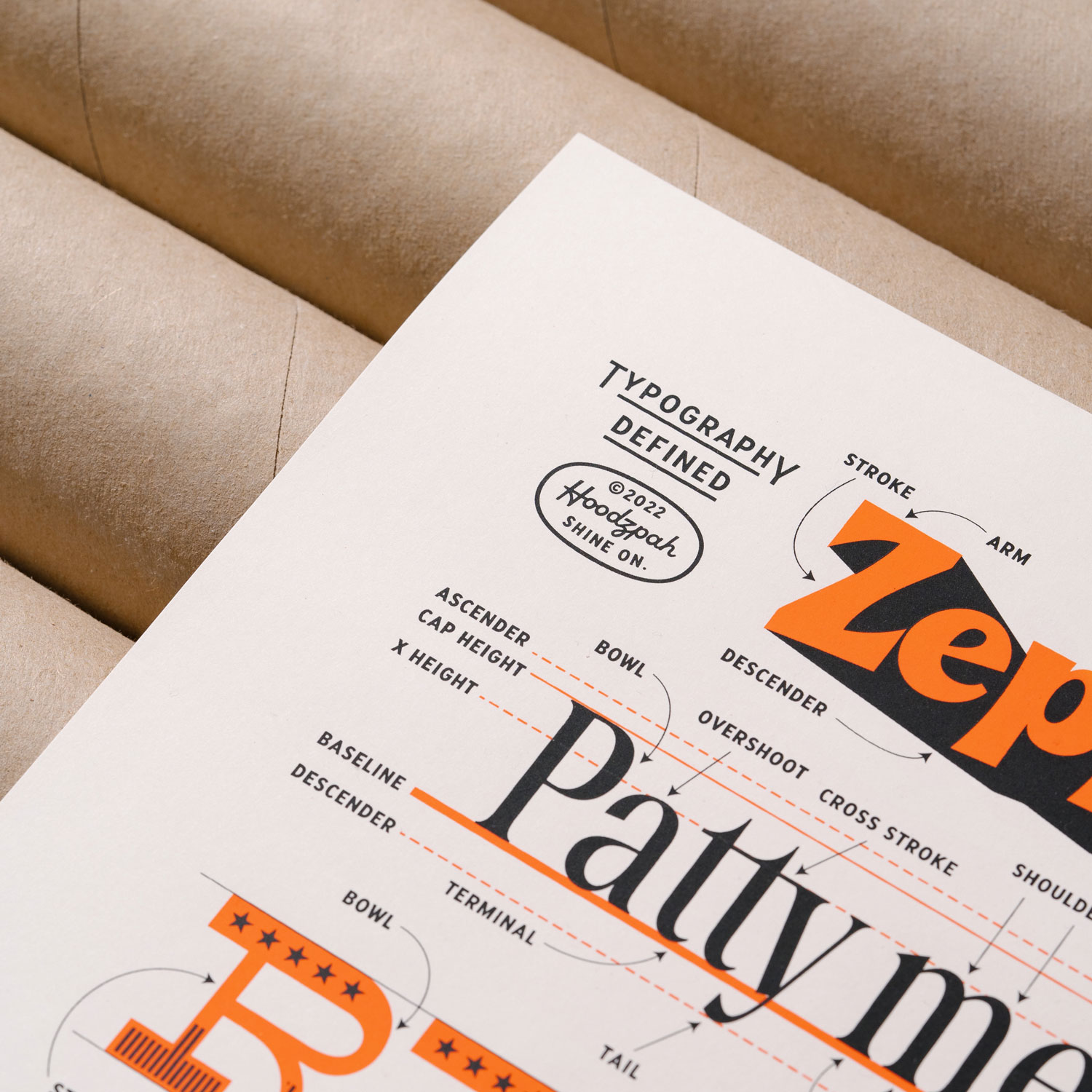
— Core typography terms itemized and defined
— Designed by Amy Hood
— Hand Numbered

We make lettering and typefaces and have been for around 10 years, and yet we still get hung up on the terminology. We’d be in the Hoodzpah office trying to review a piece of lettering for a logo or a new typeface in the works and we’d be pulling our hair out trying to communicate our edits
“This end bit needs to be thinner.”
“No, not that one, this one.”
So I set about to make a cheat sheet for us of universal (or as close as) typography definitions so we could all get on the same page. This poster was born. I hope it helps you as much as it’s helped us.
Printed by the pros at Native Screen Print. I’ve never seen such precise alignment!
There is some variation in typographic terms so I tried to stick with just the basics that were most used from my research. There are a lot of very specific terms that apply to only one feature on one character. For those most part we kept those out and stuck to the simple basics.
For our research we looked to the Typographic greats. We referenced:


