Looking for something?
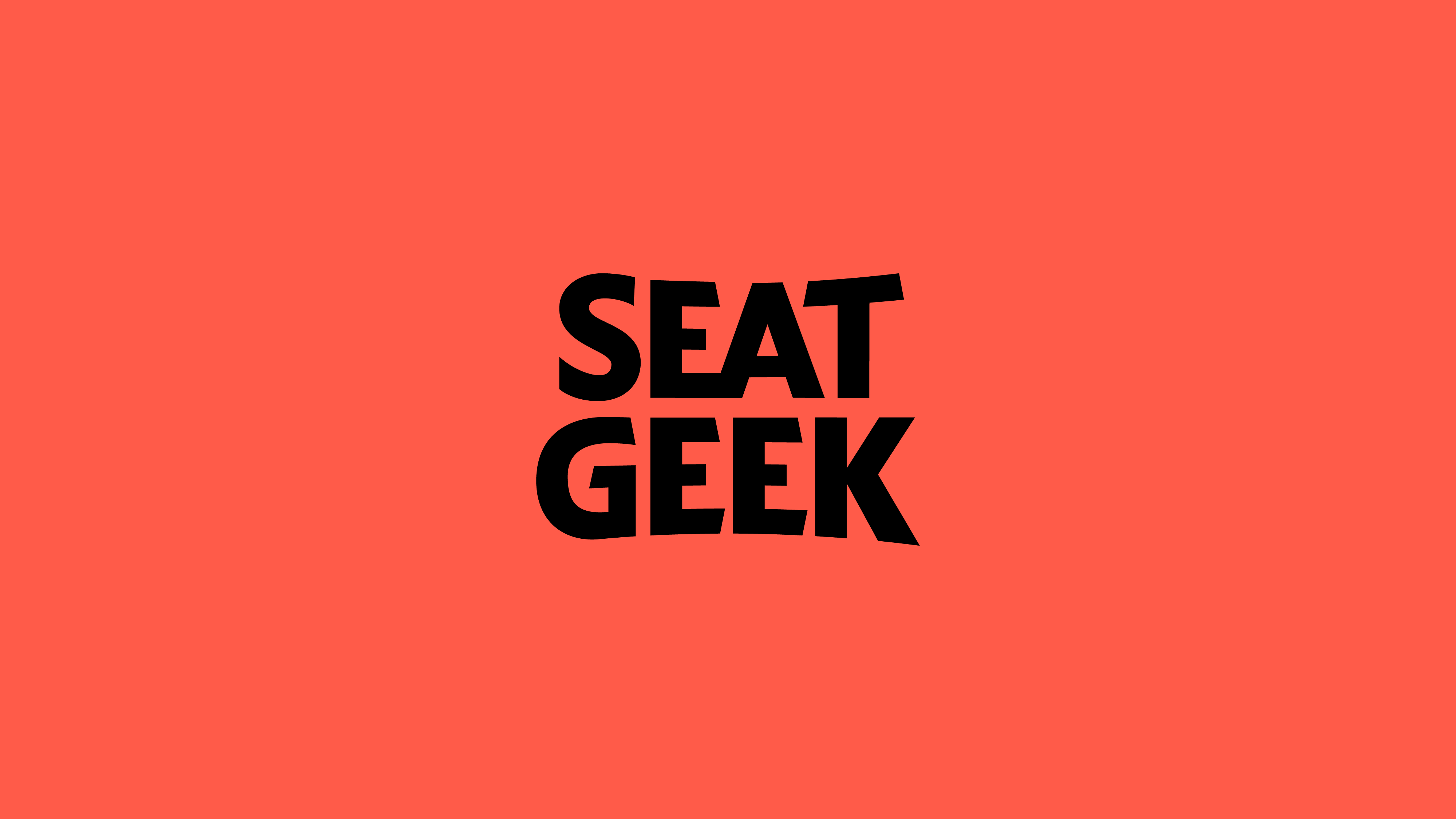
SeatGeek approached Hoodzpah to create the new logo and custom brand typeface for their 2021 rebrand. SeatGeek is the leading mobile-first ticketing platform where fans can buy and sell tickets. With a search engine that inventories all the largest ticketing sites so you get the best price, there’s no reason not to love this outfit. The goal of the rebrand? To breathe the life of live events back into the brand, differentiating from tech-sleek competitors.
— Wordmark
— Brand Typeface
Mother Design, Design Strategy & Foundation
Hoodzpah Design, Wordmark and Custom Brand Typeface
Mickey Duzyj, Illustration
SeatGeek In-House Team, Managing and Steering Shared Vision and Execution
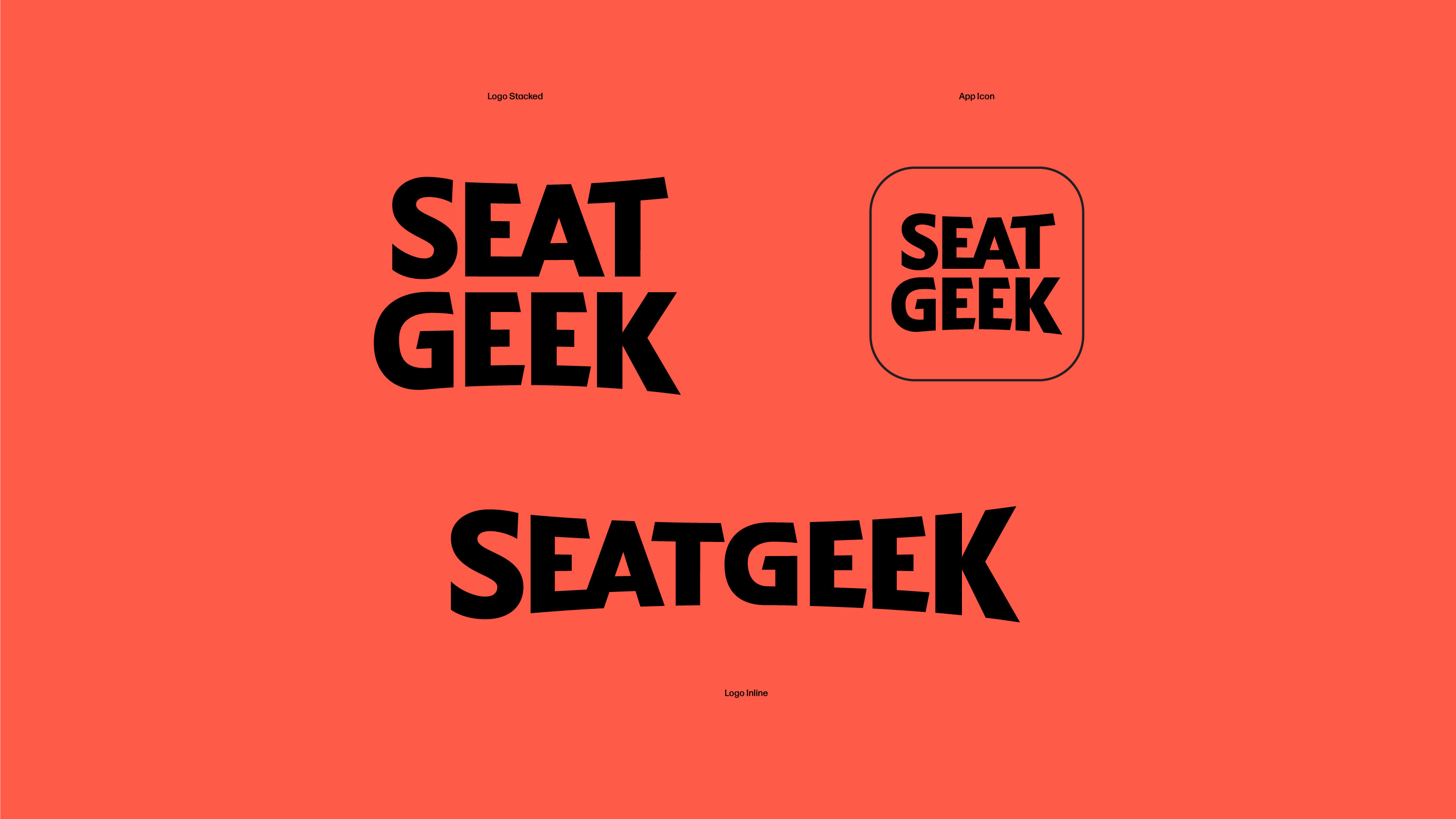
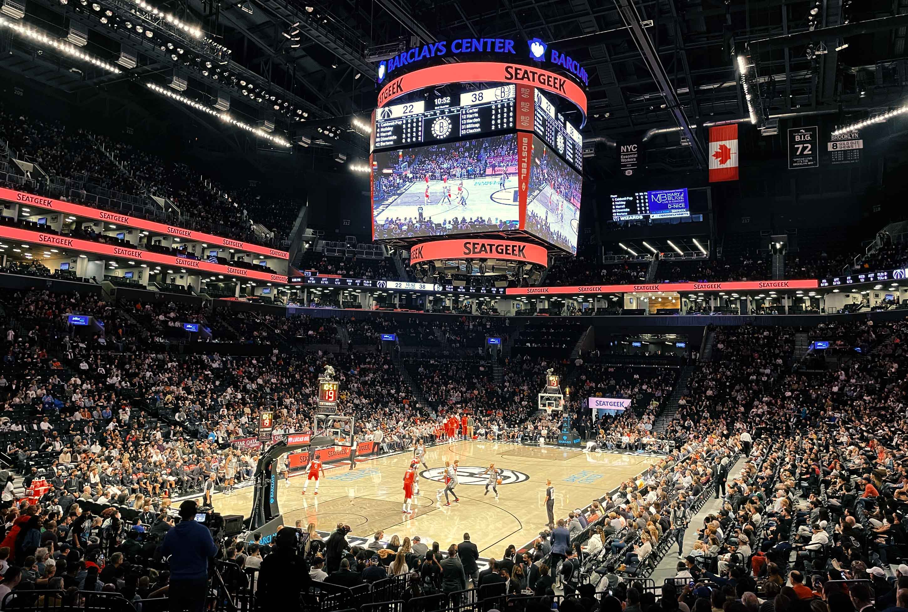
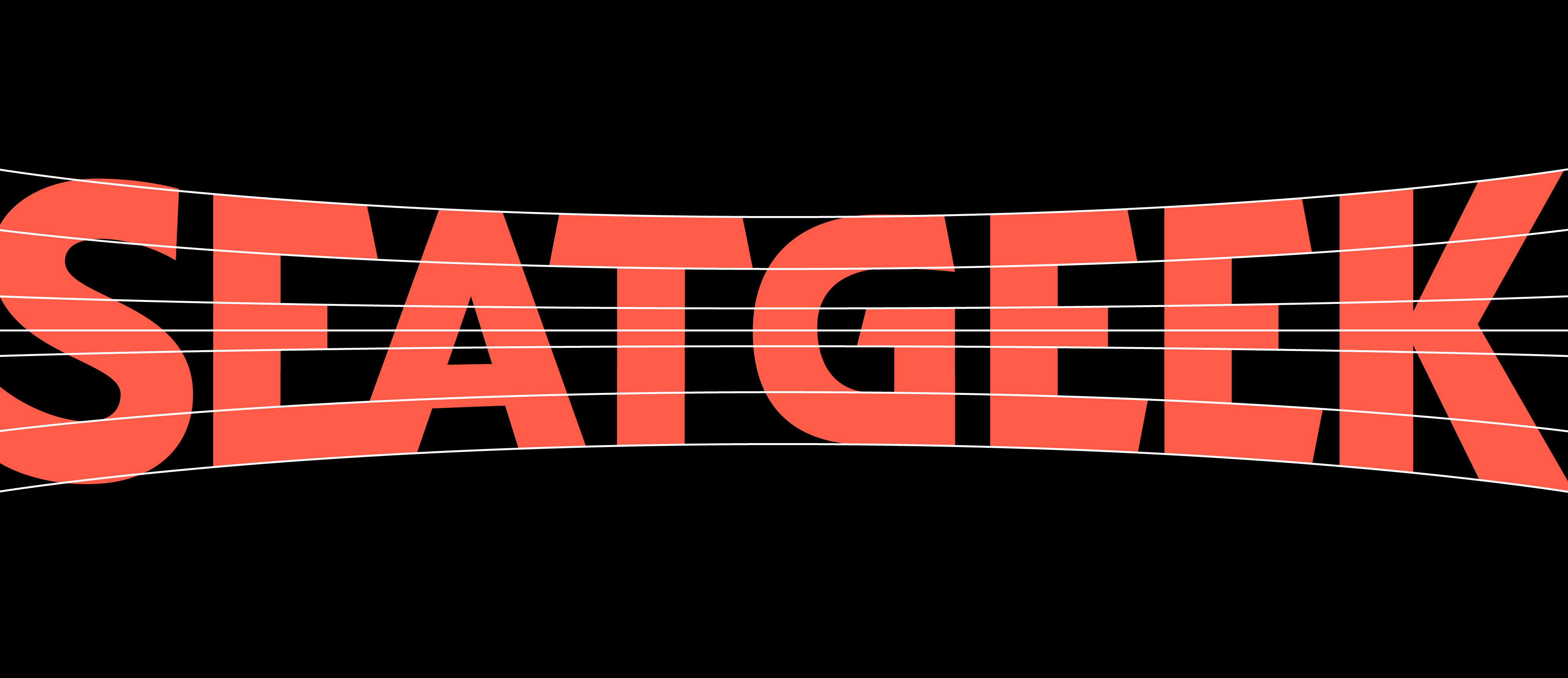
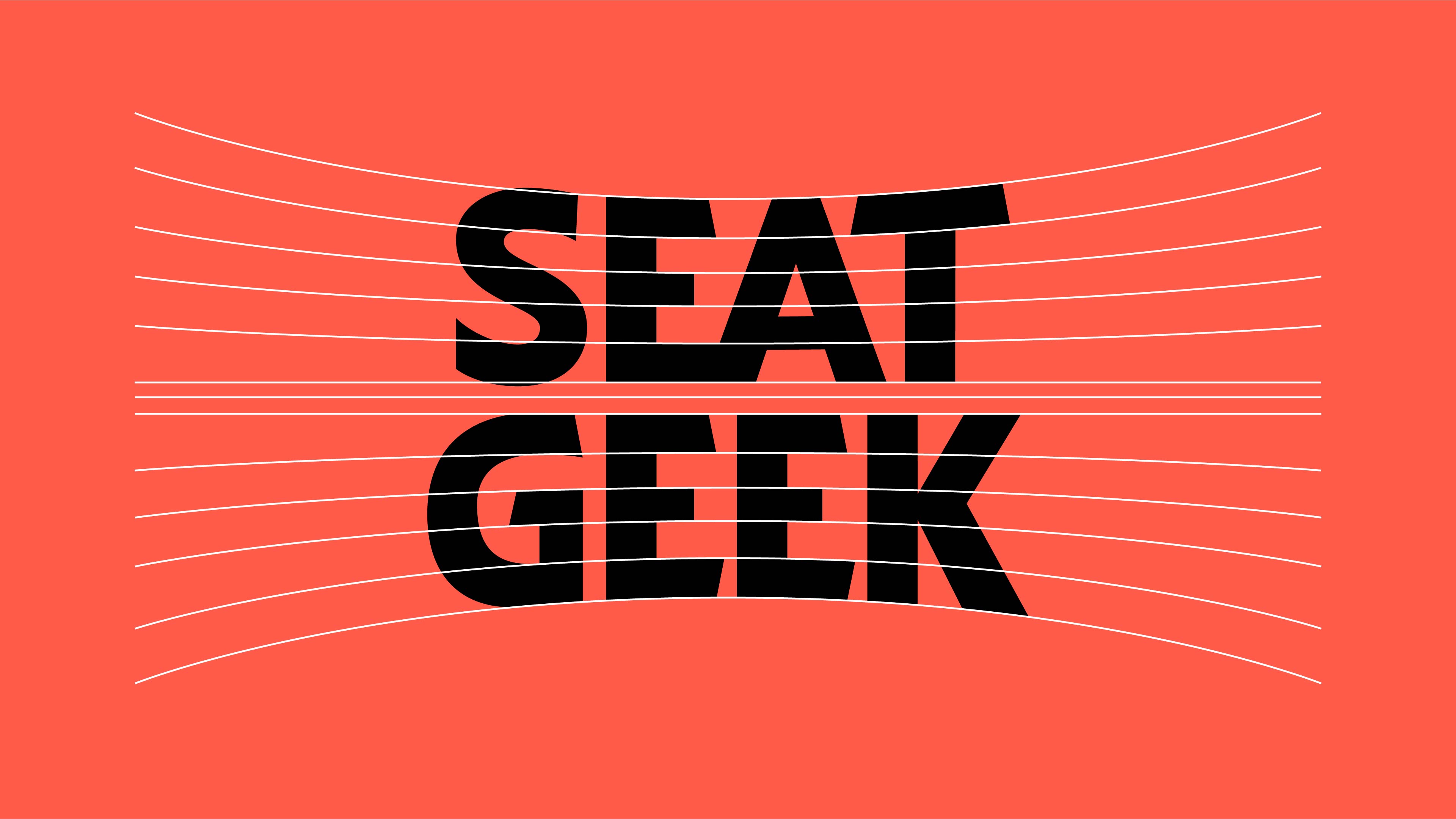
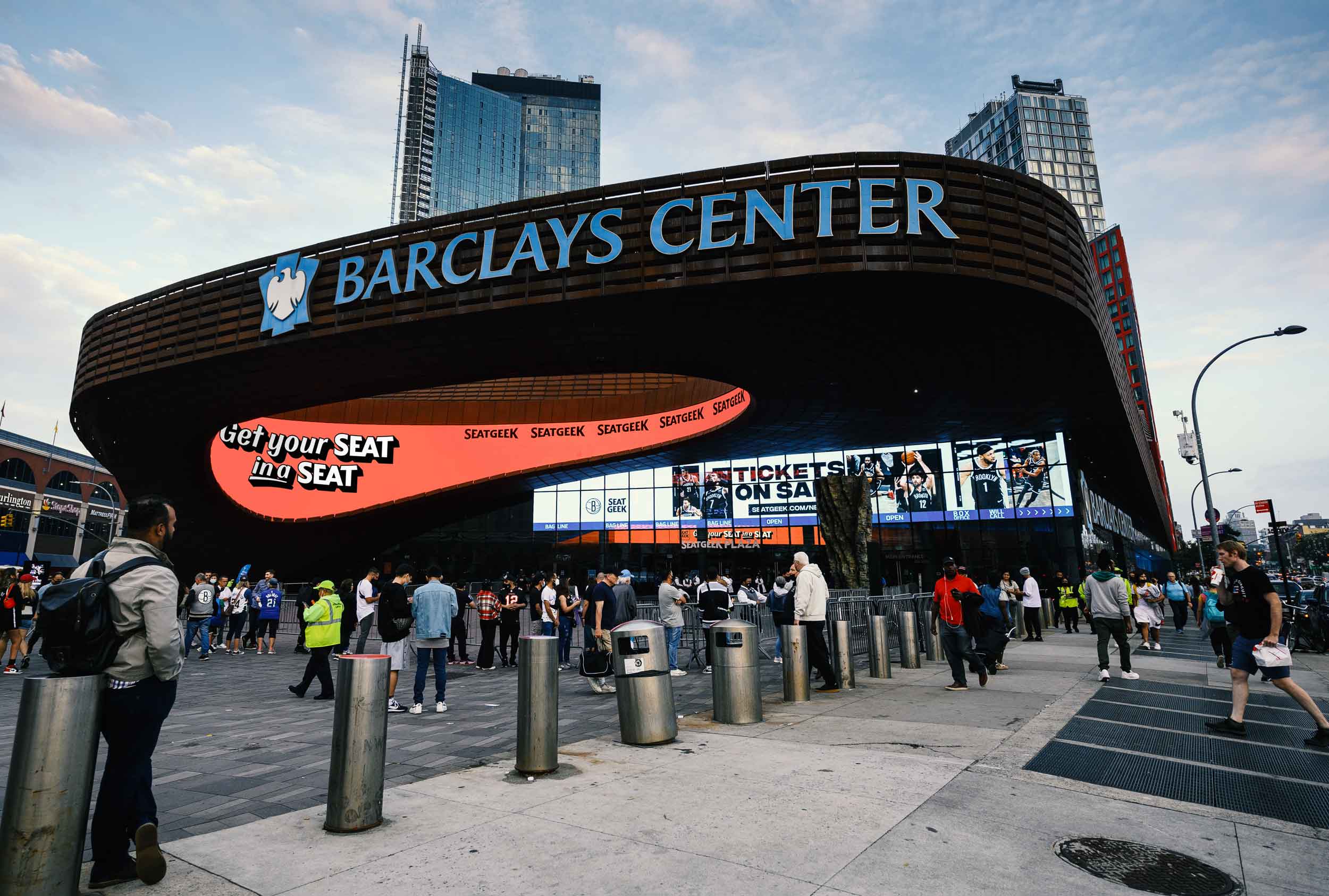
Working with SeatGeek’s in-house design team (led by Creative Director Tim McCarthy), Mother expertly set the tone for the project. Their strategy and design drew from the dynamic event ephemera of yesteryear. When passed the torch, we executed a new vision for the SeatGeek logo. The custom type is inspired by the lively typography that used to dominate show-posters, and still lives on in venue marquees, and even on Jumbotrons. The curved wordmark also alludes to the horizon lines of stadiums, stages, and theater terraces that are the backbone of live events. But it still maintains a modern execution necessary for the online and mobile product.
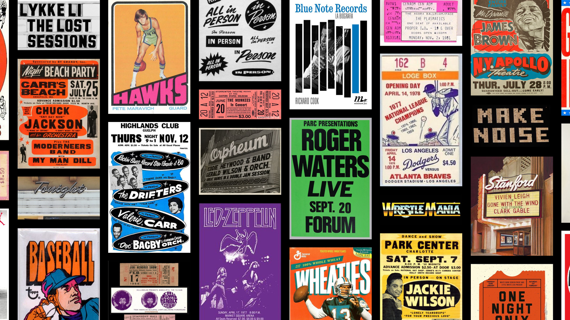
– Quote from the SeatGeek blog announcing rebrand
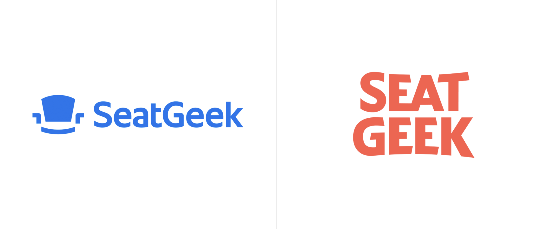
Creative Director Tim McCarthy and Copy Lead Scott Barrows of SeatGeek helped us understand the dream for the new logo easily. Create something:
— Bold like the events we ticket
— Human like the emotions they evoke
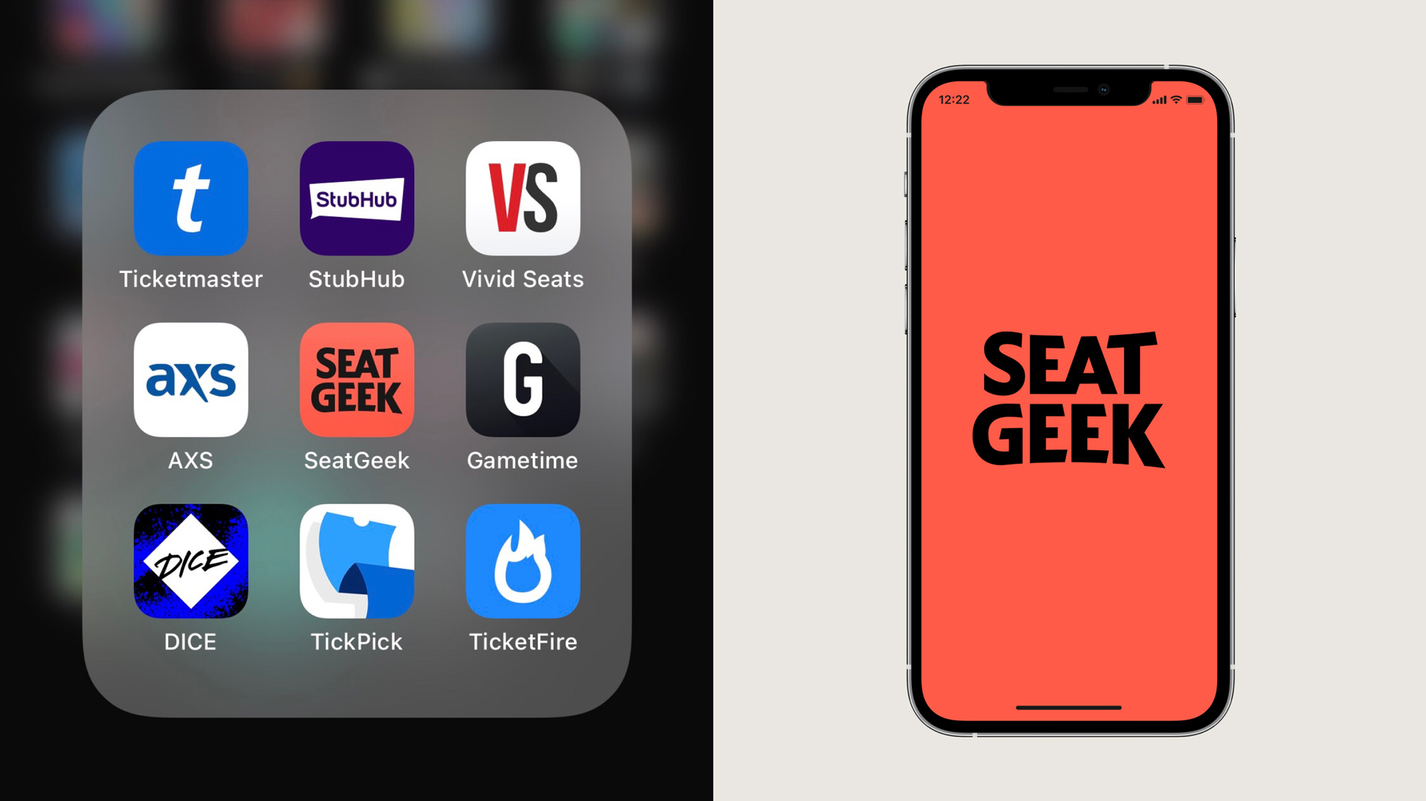
— Distinct from our competitive set
— Confident in our expertise
Also, the SeatGeek logo redesign needed to work in-line, stacked, and in an app icon.
We went to the drawing boards. Our initial custom type solutions ranged from extremely lively, to more restrained. From script to sans and somewhere in between. Whatever the solution, an “EA” ligature became a must for kerning. We narrowed in on the final concept with the SeatGeek team. Finally, we had two steps to finish:
— First, make it actually perfect. We made a consistent execution according to the numbers.
— Then, make it look perfect. We made optical adjustments to balance the wordmark. Mainly, the S and K were adjusted on the in-line wordmark, and the S, T, G and K were finessed on the stacked to make them feel like they extended to the same height and baseline in the corners of the wordmark.

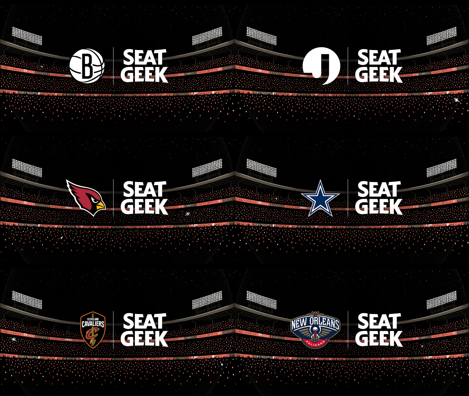
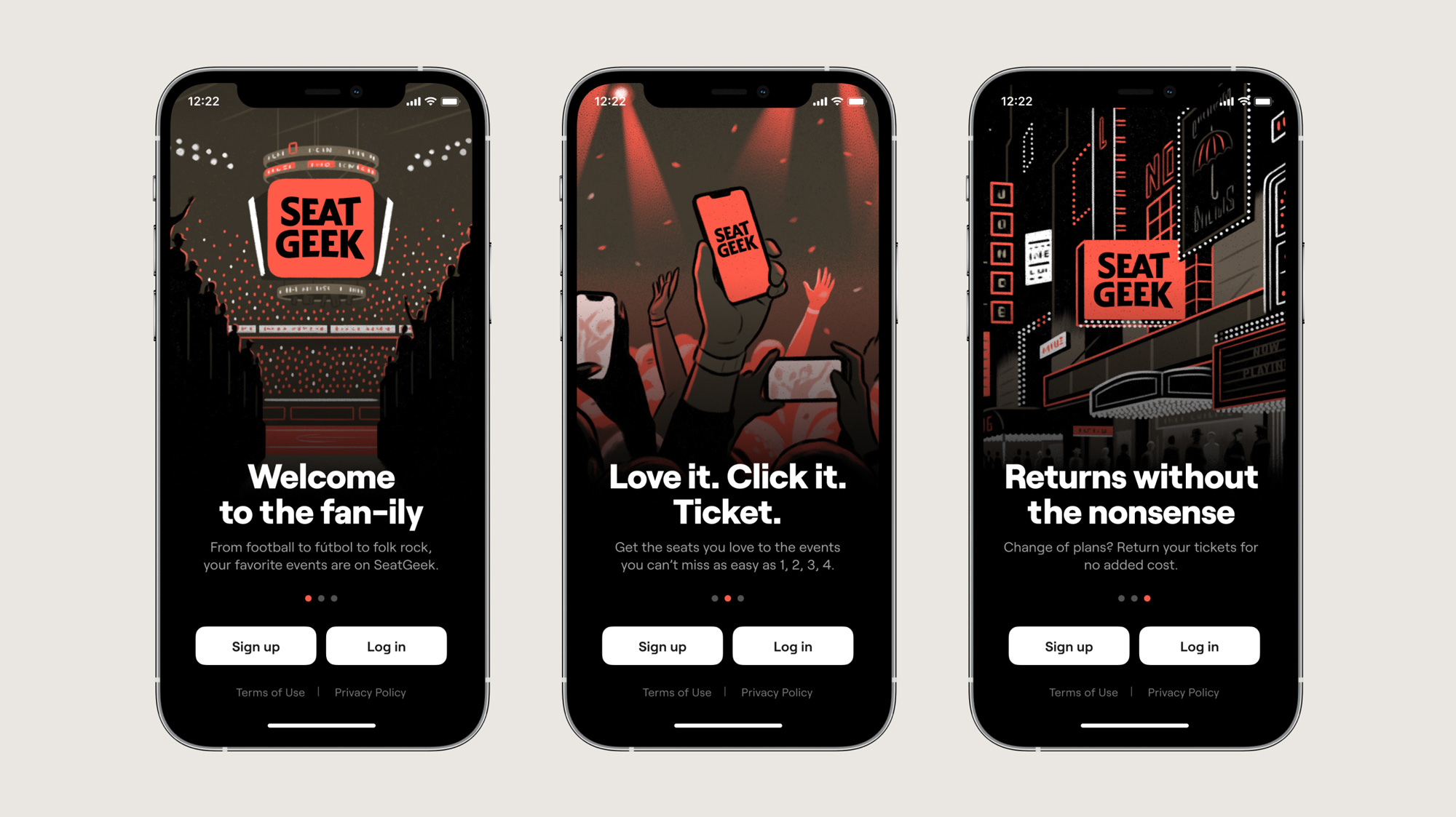
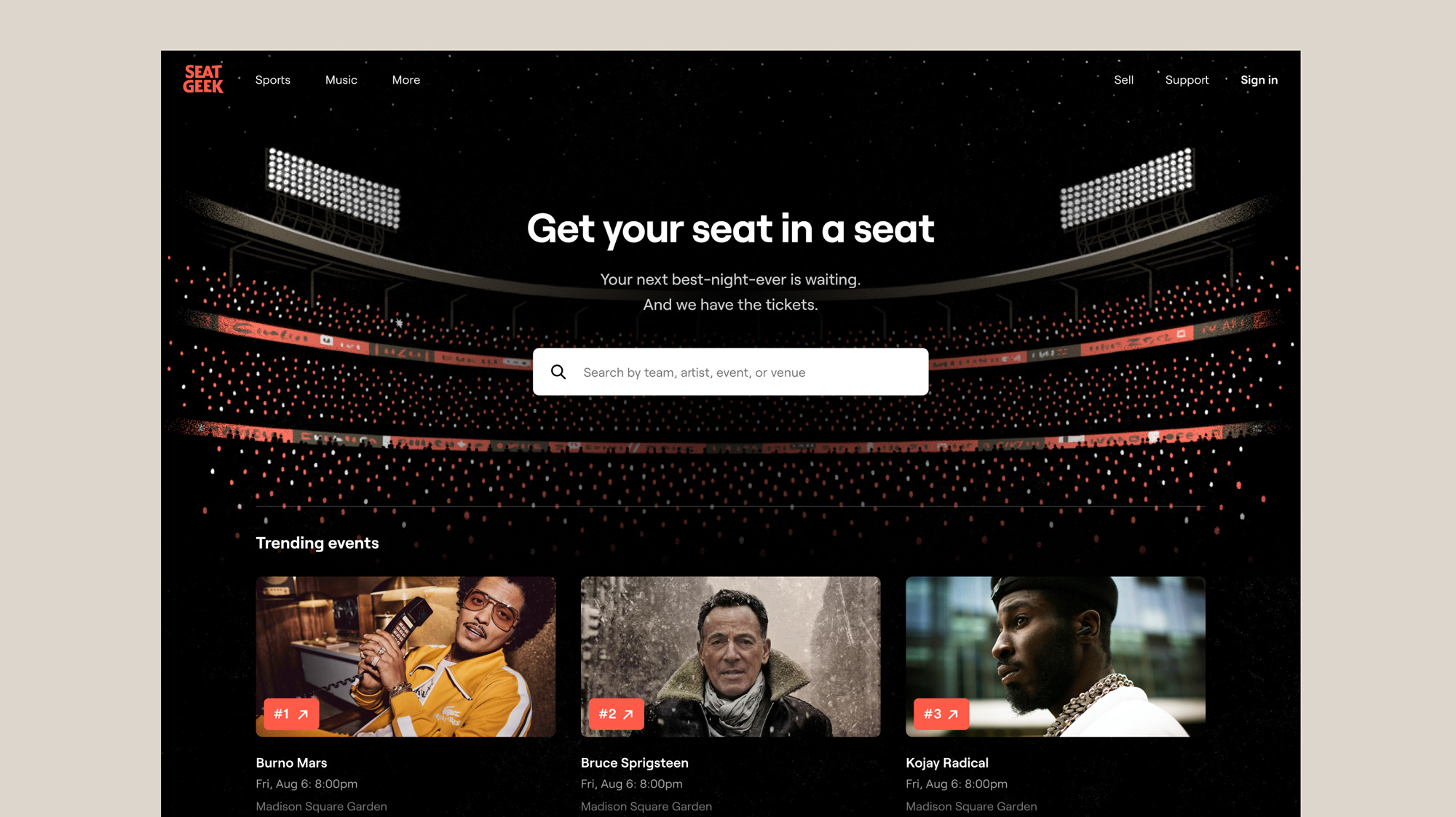
Illustrator Mickey Duzyi added his golden touch with textured illustrations that feel warm and timeless throughout applications. The scenes blend seamlessly into the UI, adding interest without making overlaid content illegible. The in-house Seat Geek team rolled out the new direction across brand touchpoints and launched the new design Wednesday, July 21, 2021.
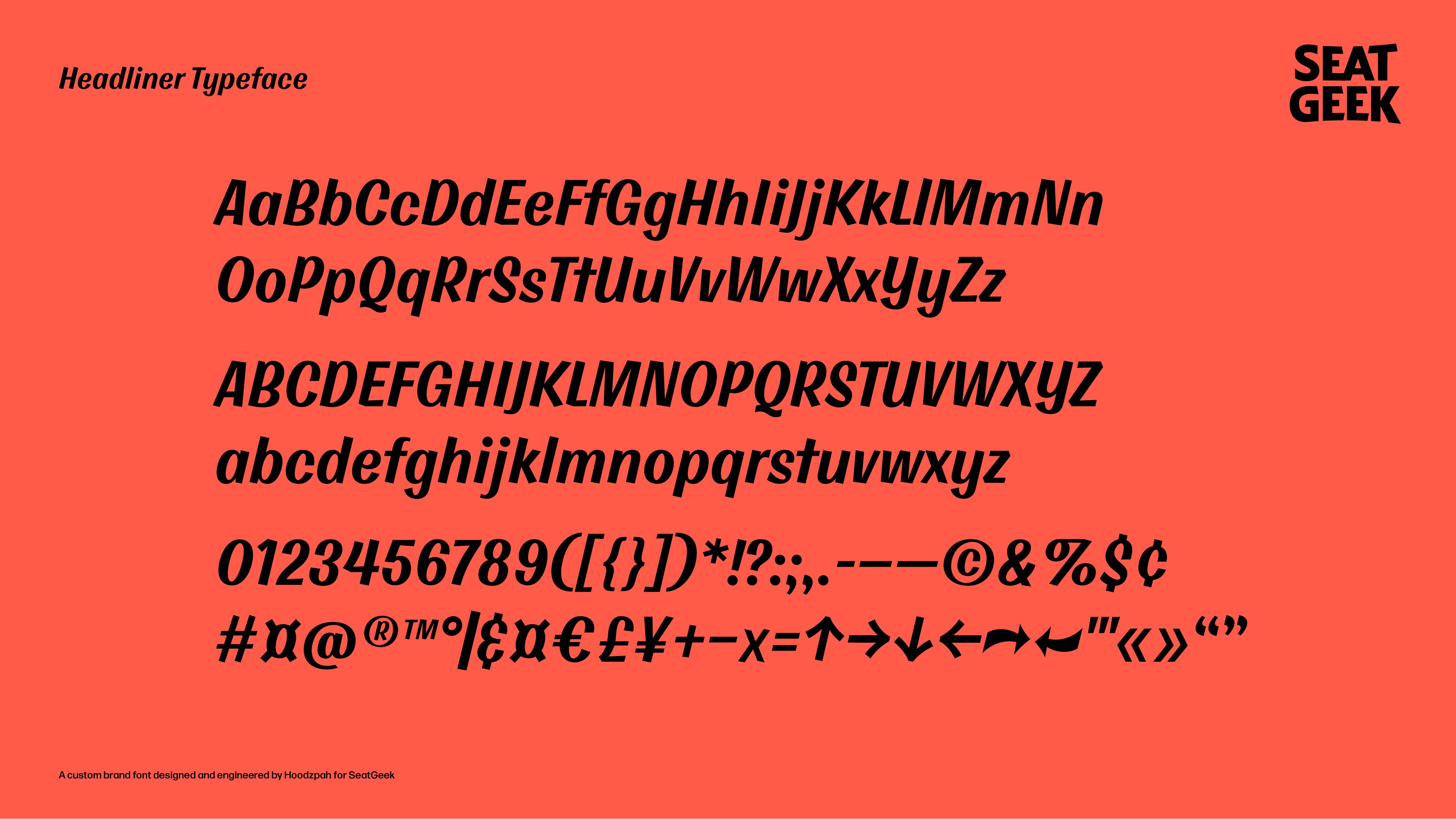
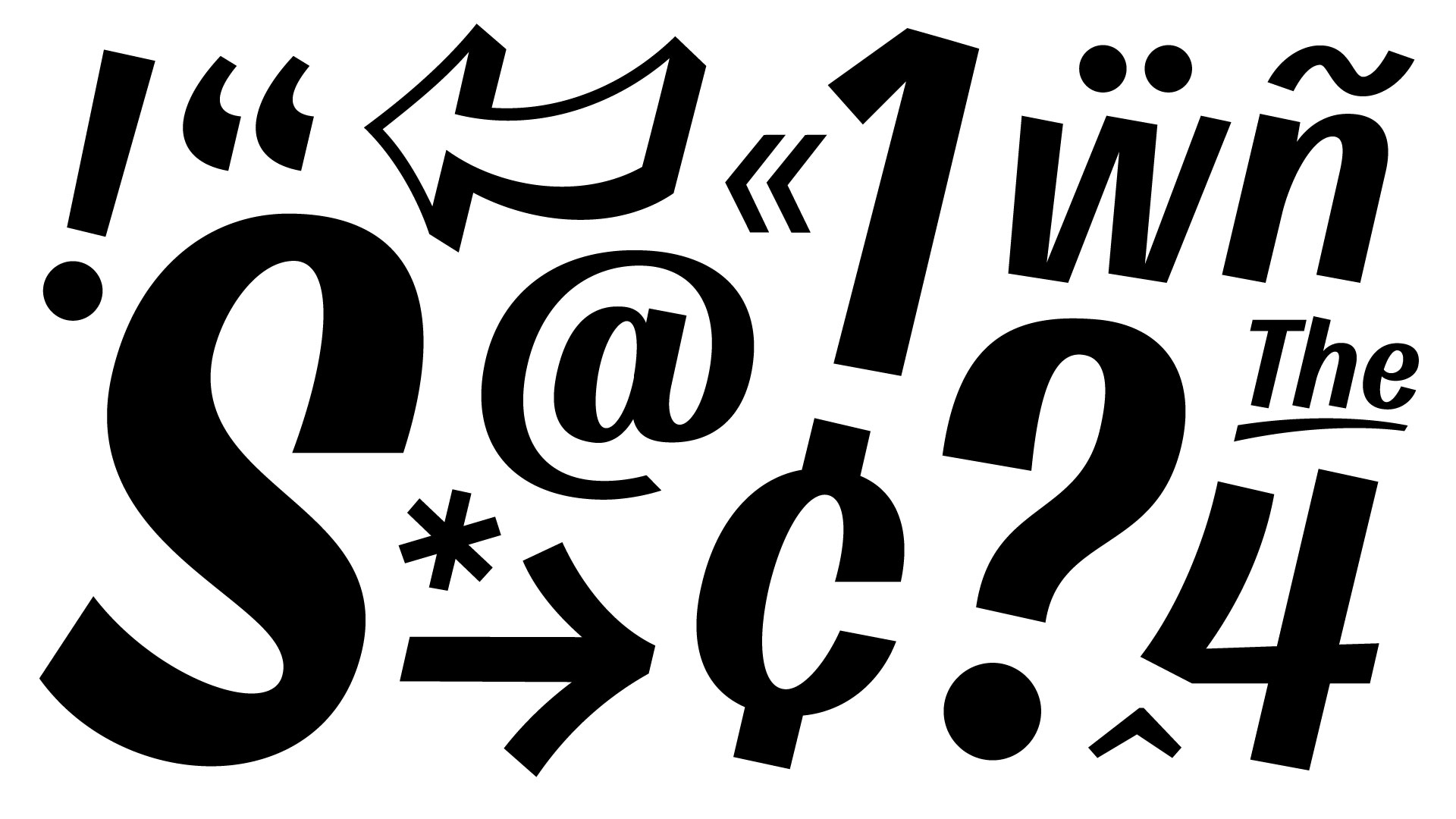
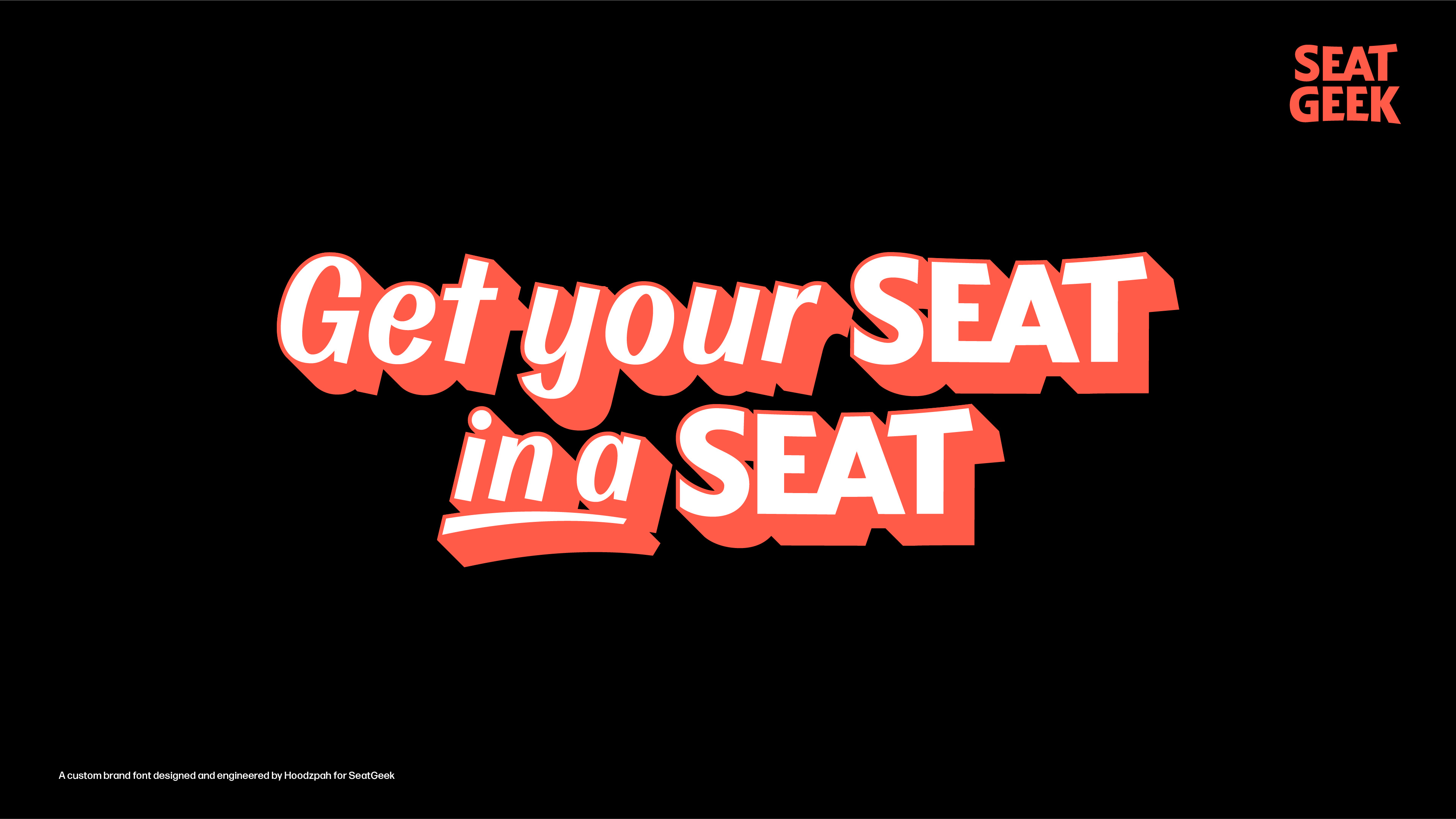
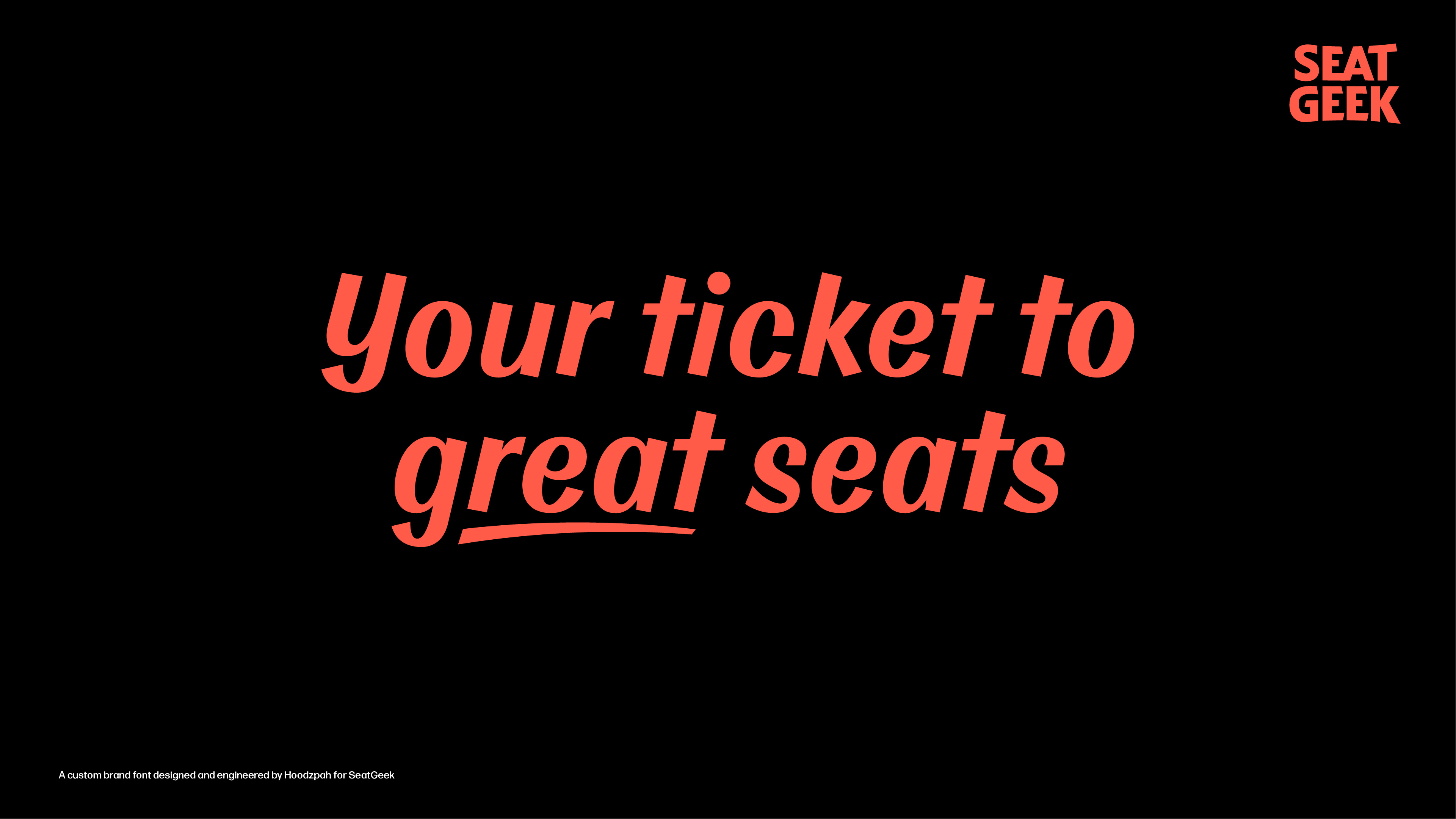
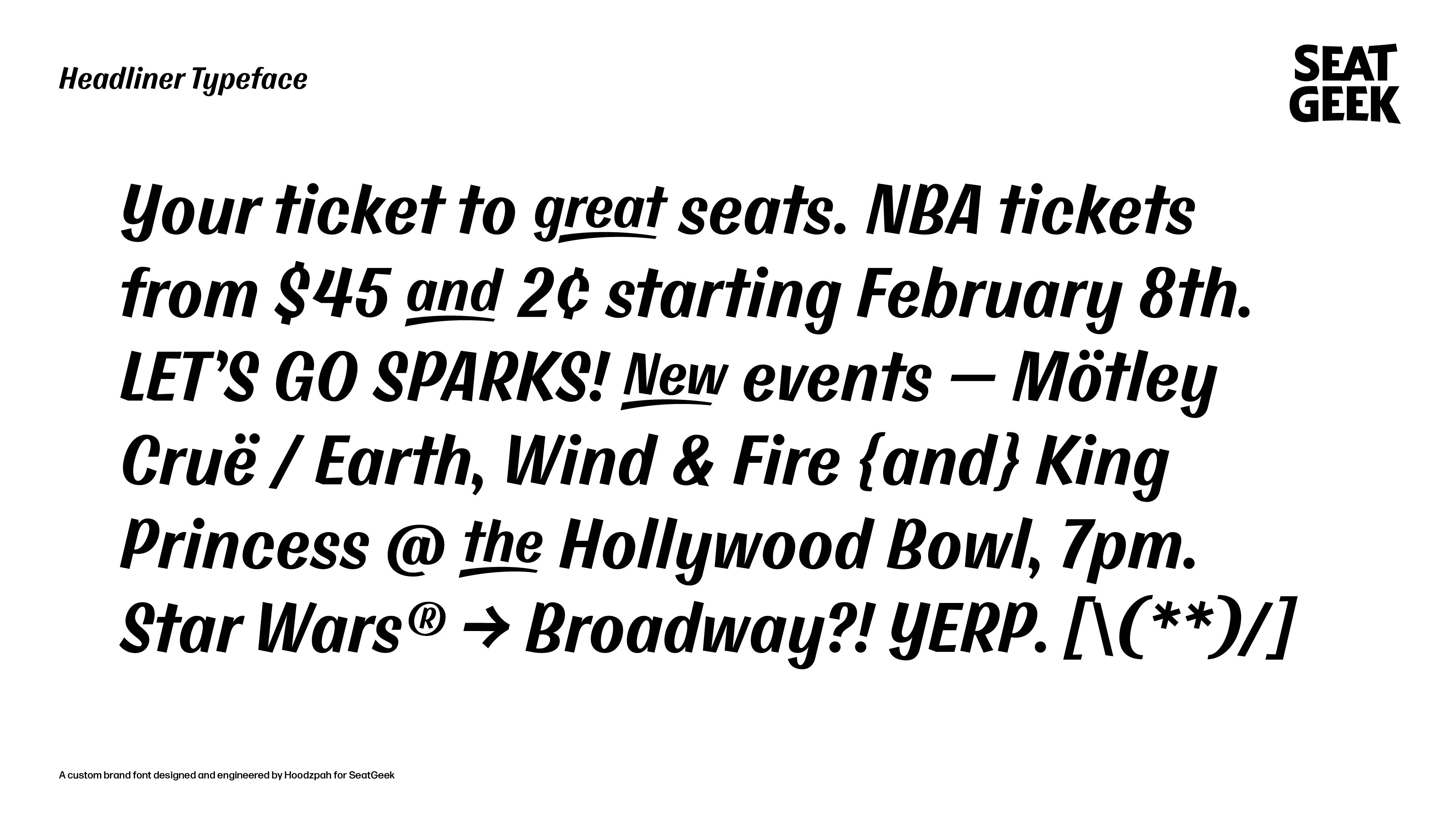
SeatGeek asked us to design and engineer a custom display typeface they could use across their new brand initiative. Brush lettering is iconic to event handbills across the ages. So it was the perfect avenue to explore for the typeface. The lively movement of the slanted letterforms reflect the energy and excitement of live events. There’s a feeling of nostalgia, which perfectly mimics how great events become great memories for so many people.
Working with the SeatGeek team was incredible. Their collaborative process, careful consideration, and genuine positivity created a pillow fort of creativity to thrive within. See the whole design system in action over at SeatGeek.
– Tim McCarthy, Creative Director at SeatGeek on his experience with Hoodzpah