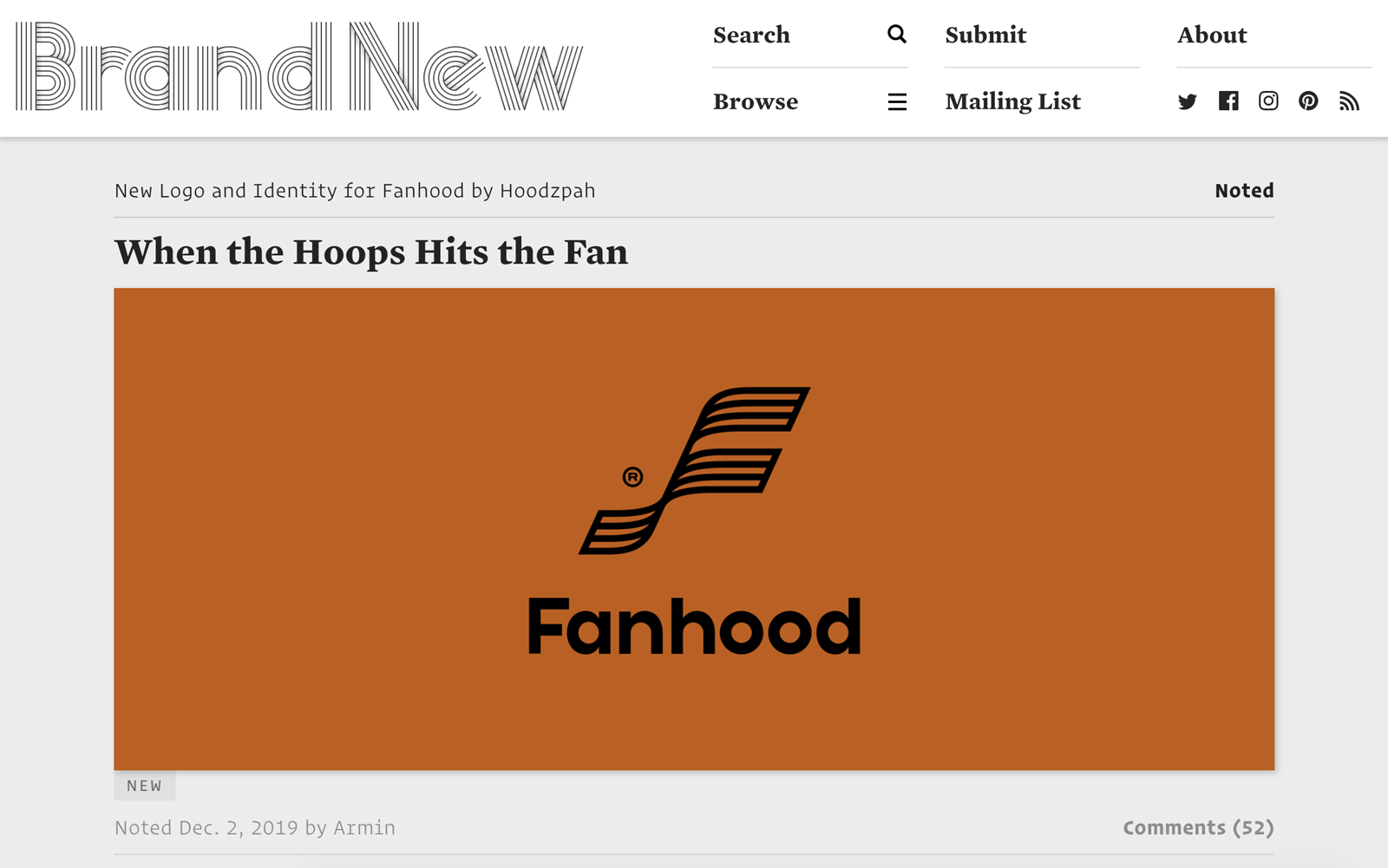
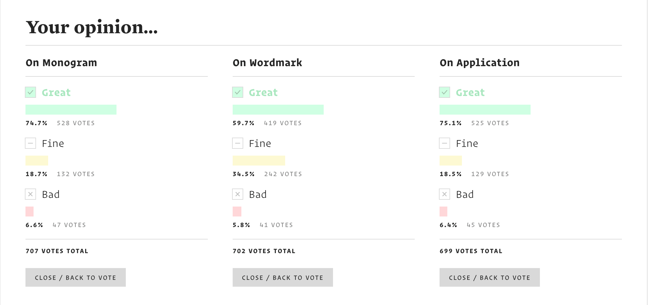
Head over to Brand New today to see Hoodzpah’s work for Fanhood reviewed by Armin Vit, one half of the dynamic duo behind Under Consideration’s Brand New. We have seen moments of unfettered glory and moments of abject failure on Brand New. So we were stoked to read Armin’s comments, and see the voting reactions.
“Visually, I really like the monogram and the texture it generates as all the thick lines come together. The wordmark is nice too, with the short ascenders, tall x-height, and very round-y structure. The color palette is quite nice too, stepping away from the vibrant color trend and going with a more vintage aesthetic that is well complemented by the typography’s similar vibe. The bonus script font is a nice touch that plays out really well in application as a kind of archival accent.” – Armin Vit. (Read Armin’s full review and vote your opinion here!)
“Overall, as a basketball fan and a design fan, this is an instant sign-up, so mission accomplished.”
– Armin Vit
If you’re a basketball fan looking for great inside-reporting and news in your inbox, go signup at Fanhood.co. For our case study on the brand identity work we did for them, see here.


