
Looking for something?

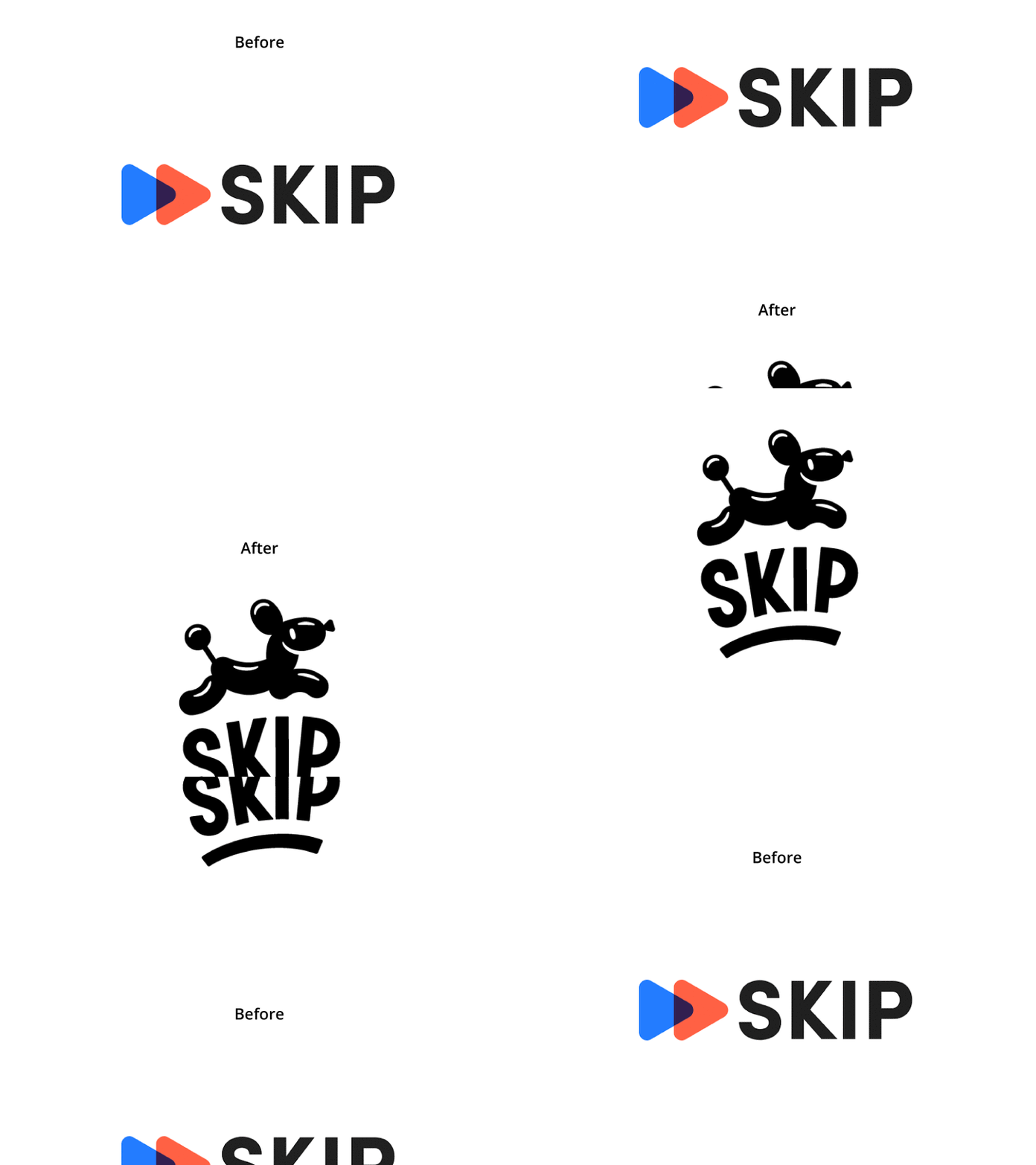
Skip is simple and awesome: an app that lets you self-checkout on your phone so you can skip the line at grocery stores, gas stations, and other retail locations. When the Skip team approached us, they were about to launch their technology across hundreds of new stores. The problem was, the old brand identity wasn’t capturing the easy, magical, and clever personality of the app. The original icon, two overlapping triangles, alluded more to the fast forward button on an audio app. Colors and typography were expected and sterile. It was vital to get the identity and environmental graphics fixed before the launch. So we put our heads together with the Skip team.
Jennifer Hood
— Logo system
— Typography & Color
— Illustration
— In-store Signage
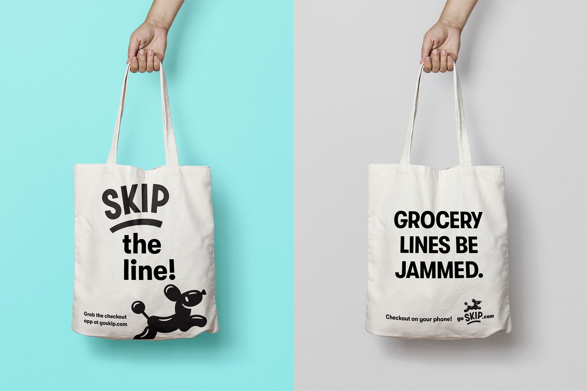
— Posters and Swag

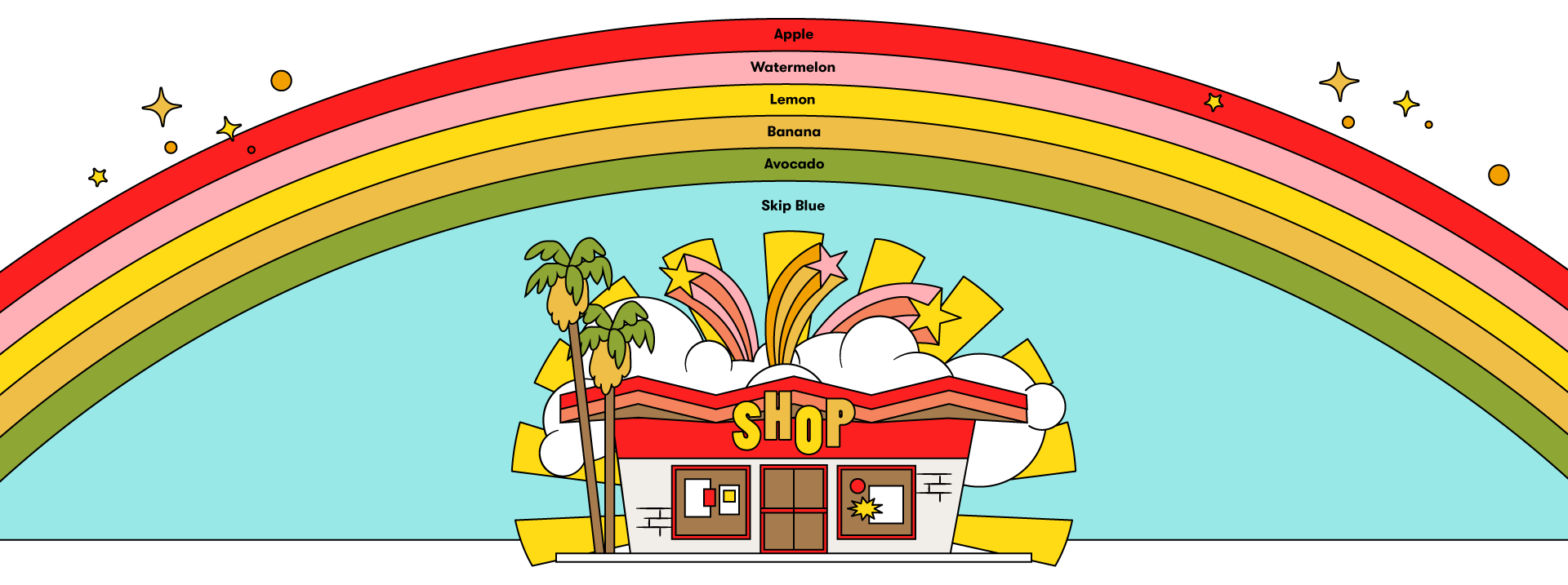
The new identity exudes the feelings of simplicity, ease, and a hint of mischief (I mean, you are walking out of the store without going through the checkout line — it’s the non-heist of the century). No longer sterile, the new mark has a unique personality in the balloon dog mascot and the custom word mark lettering inspired by old hand lettered grocery signage.
![]()

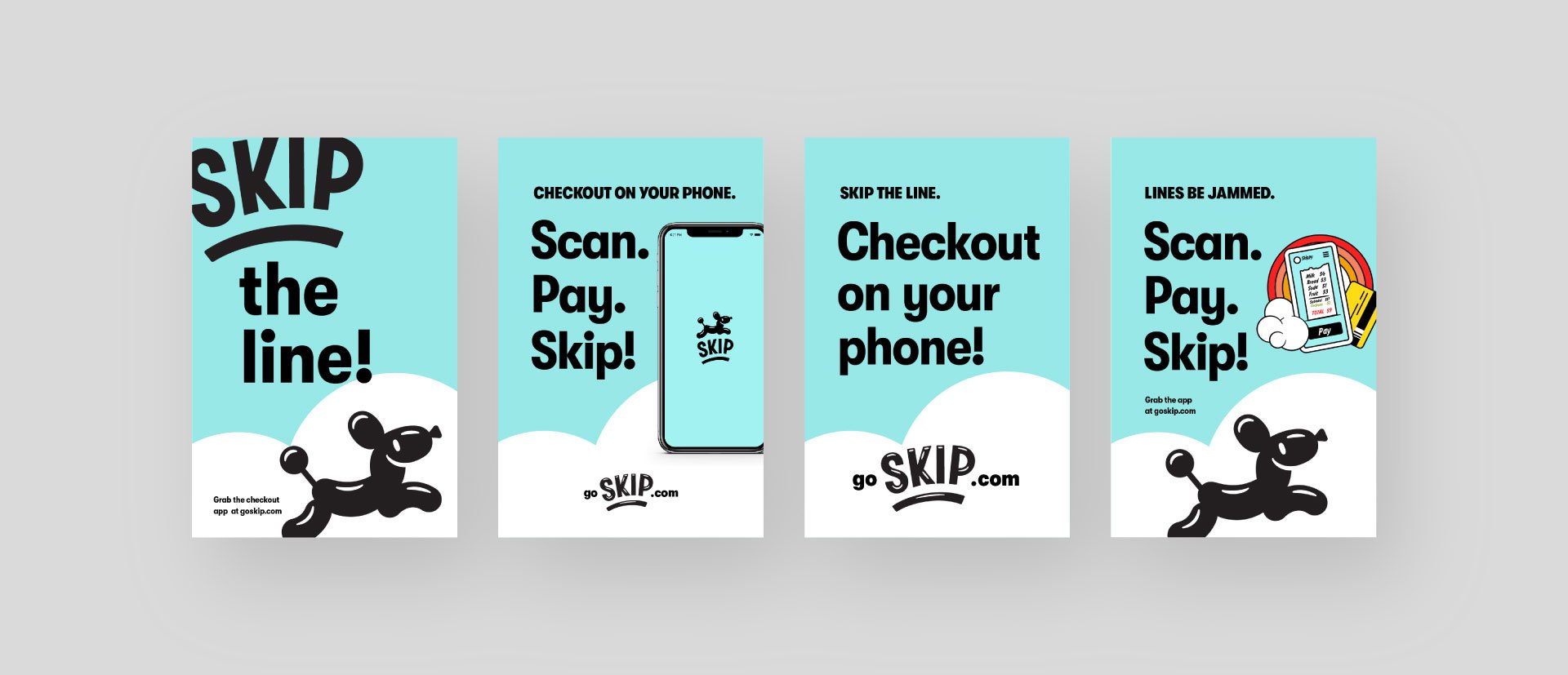
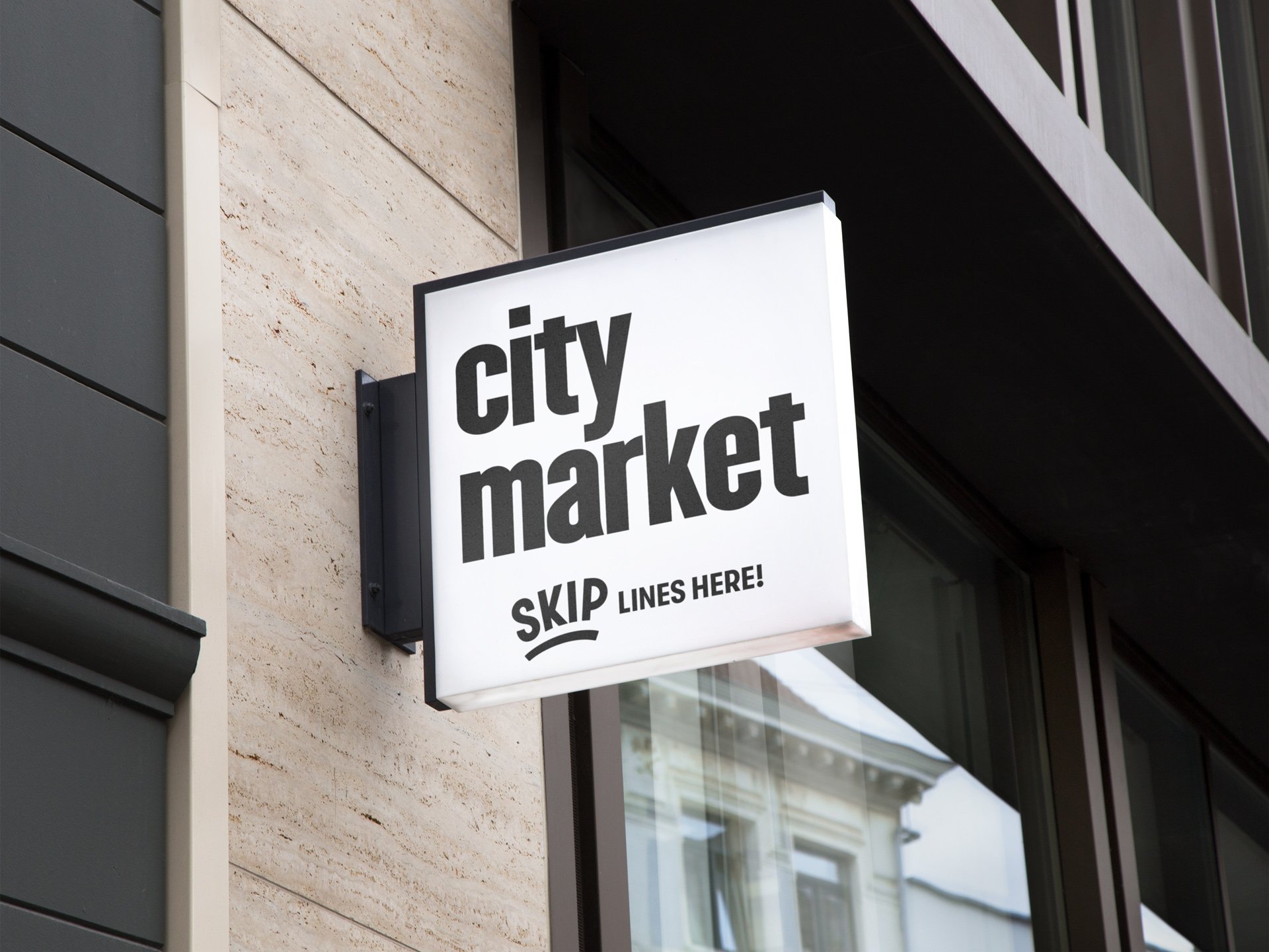
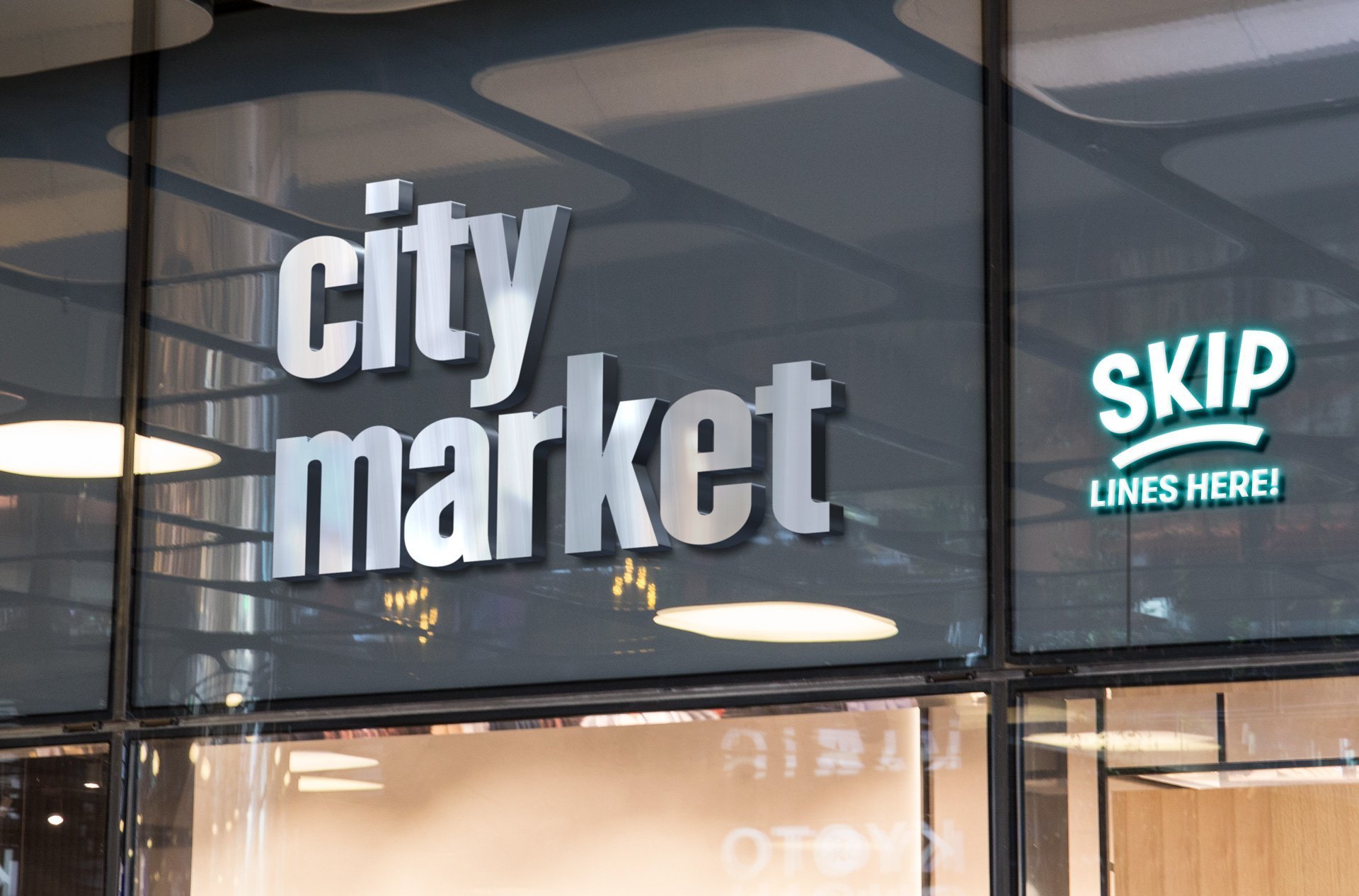
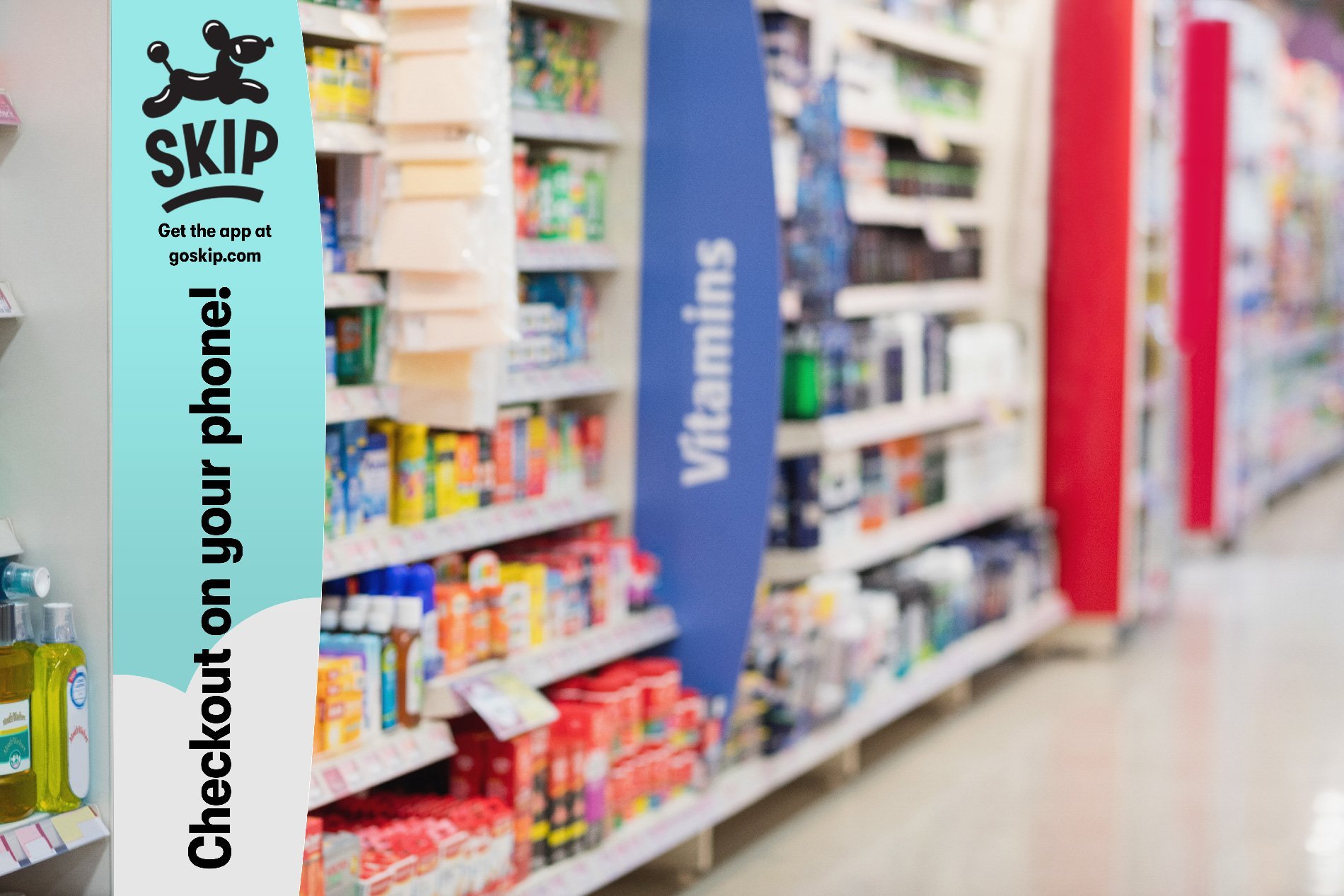
Skip’s style has not sacrificed utility. As the technology is still fairly new, signage within busy stores will be key in communicating what the Skip checkout app is, how to get it, and how to leave once you’ve finished checking yourself out. The mark is very legible and stands out in a store where everything is vying for attention.
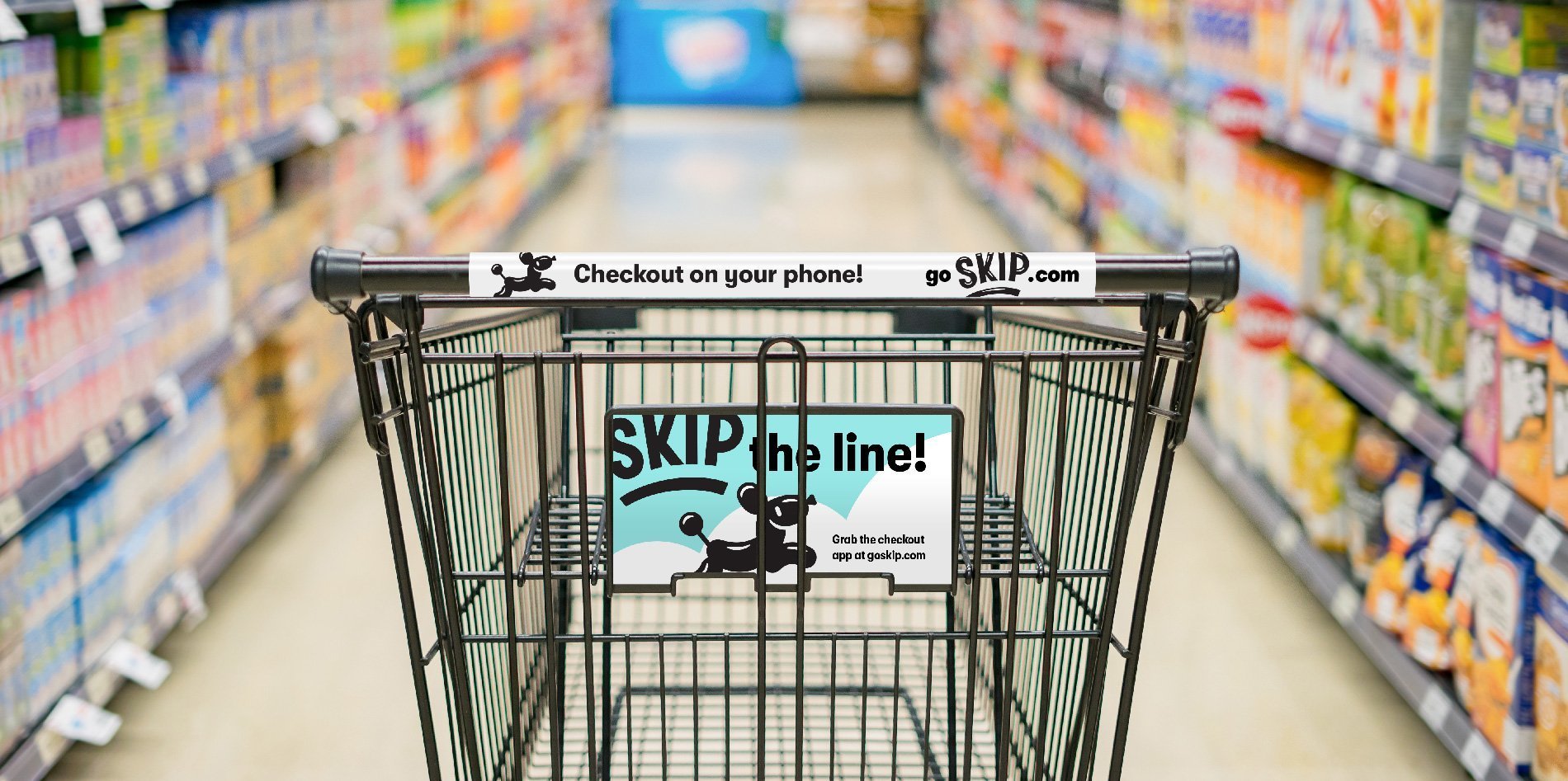
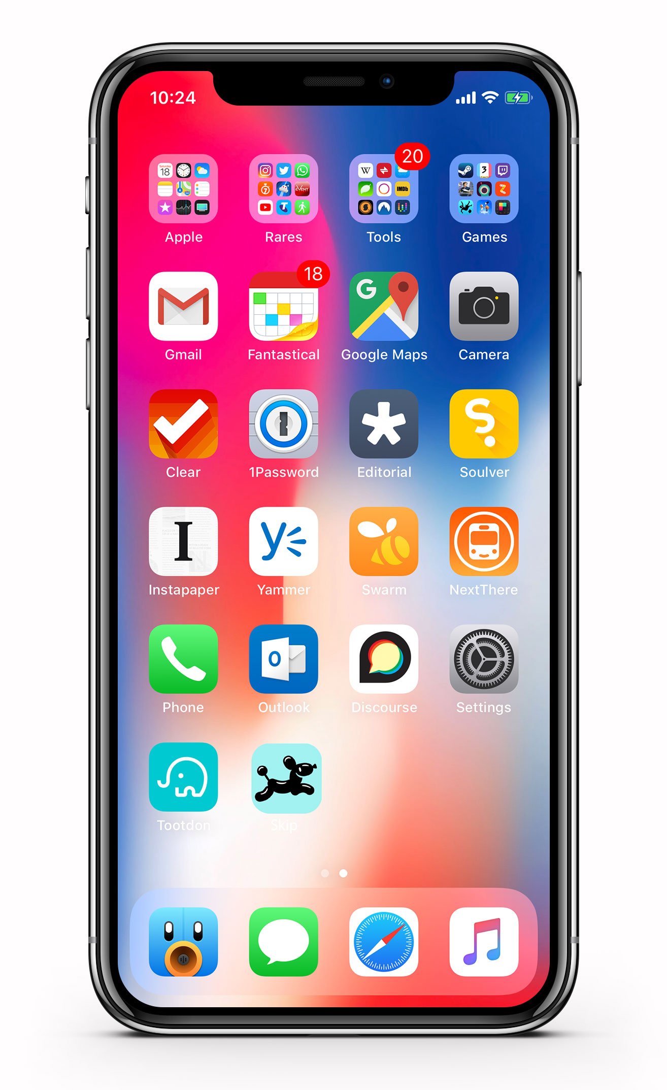
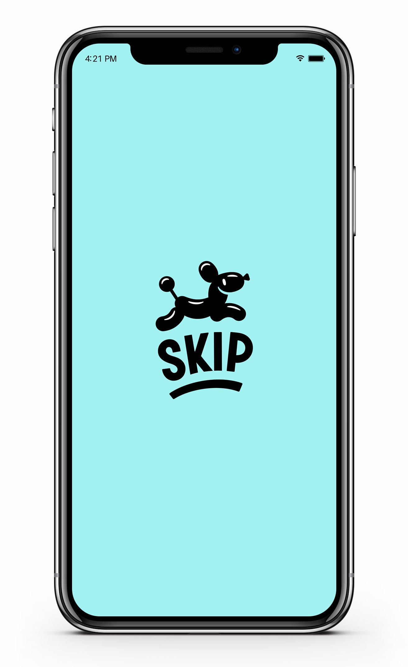
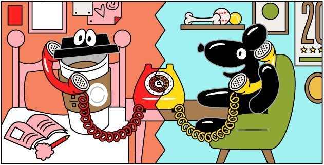
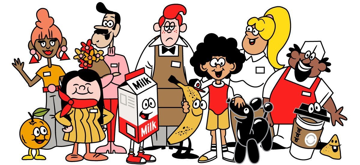
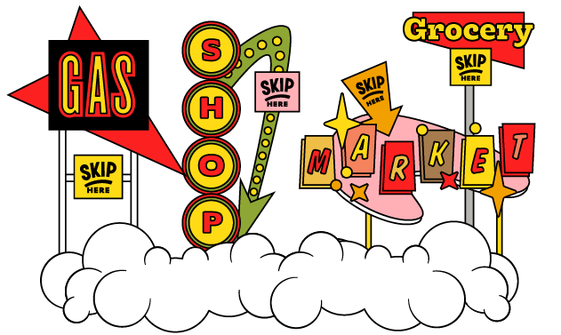
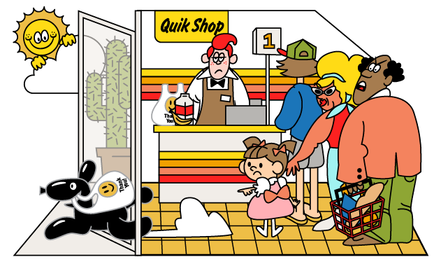
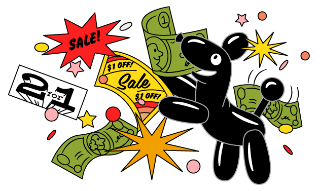
Below, the illustrations and new brand identity are applied to the Skip app website homepage. The website design was done by Skip’s in-house design team, helmed by the talented Dustin Locke.
Learn more about Skip and download the app at www.GoSkip.com
