Looking for something?
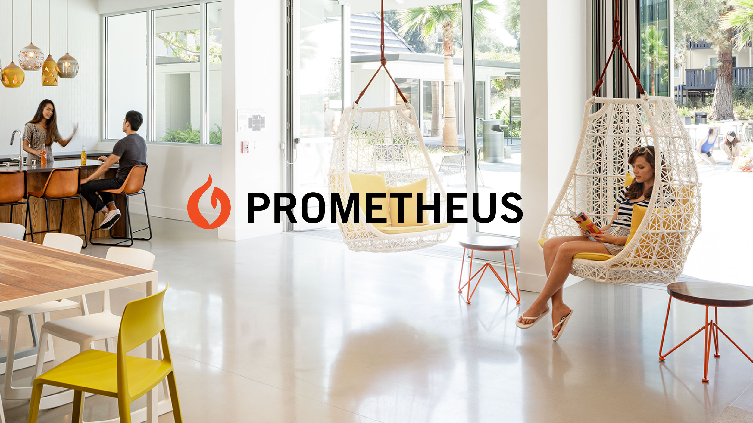
Prometheus Real Estate Group is the largest private owner of multifamily properties in the San Francisco Bay Area. Founded in 1965 by Sanford Diller, Prometheus has an incredible legacy and presence in the real estate world, with design-focused and innovative properties and incredible give-back program that earned them B Corp status. But the company’s brand identity had become dated and unfocused. Hoodzpah was selected as the brand agency to update Prometheus’s brand identity for future generations, highlighting Prometheus’s commitment to building forerunning residences and building even better community.
— Logo refinement
— Typography, Color
— Print and Web Collateral
— Illustration
— Environmental Graphics
— Messaging
— Brand Guidelines
We came on board to redefine the visual and vocal tone of Prometheus. Our goal: to reflect Prometheus’s fore-running focus on design, technology and amenities, while also highlighting their purpose for good as community builders in their neighborhoods. This meant creating a warm yet modern aesthetic and pairing it with welcoming, trustworthy messaging.


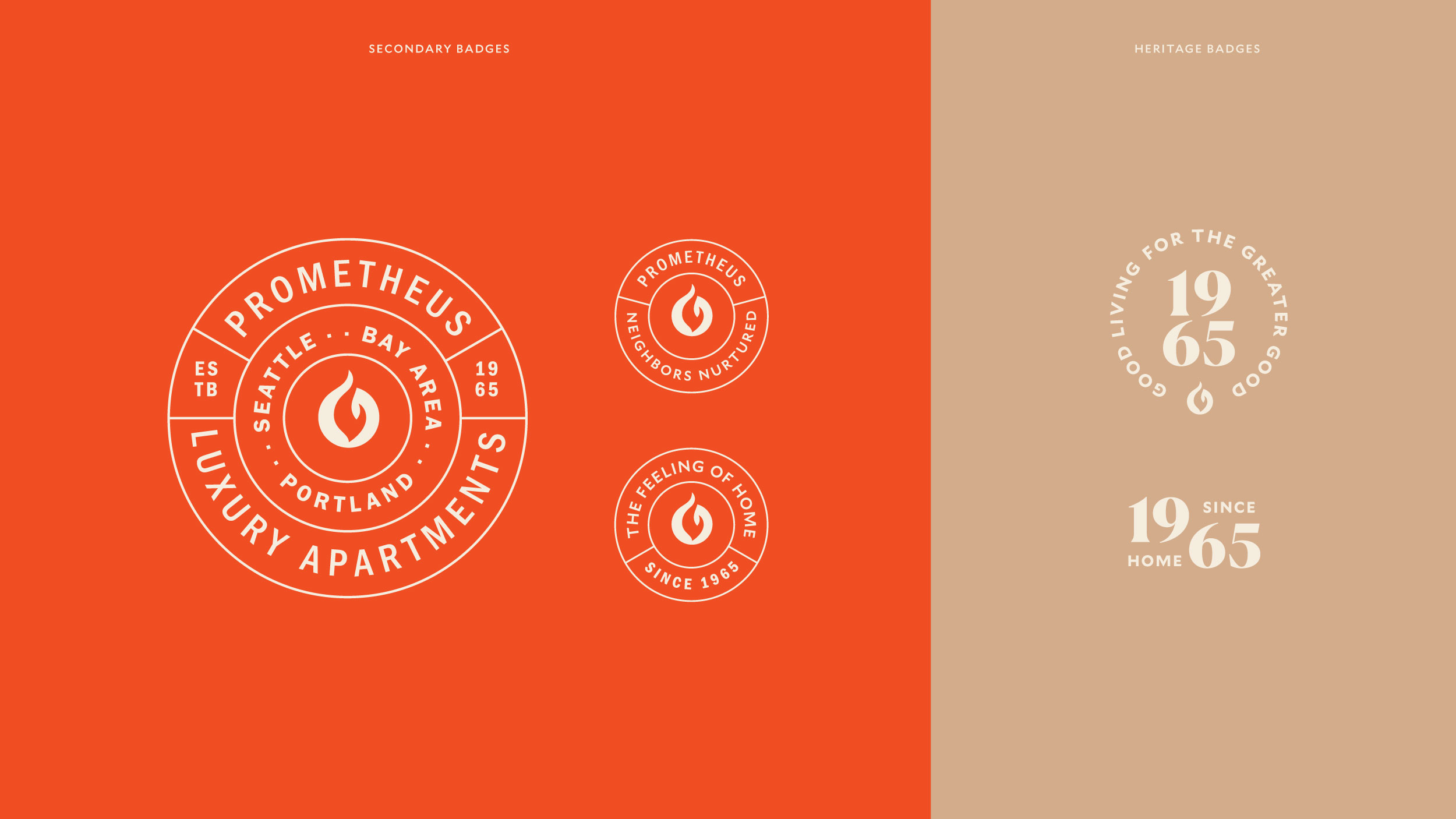
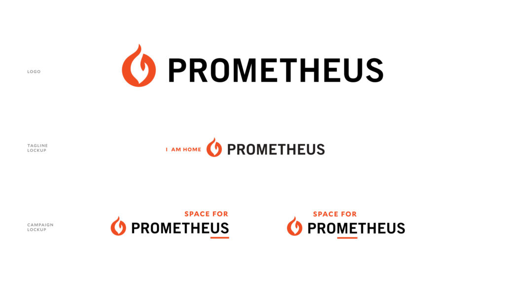
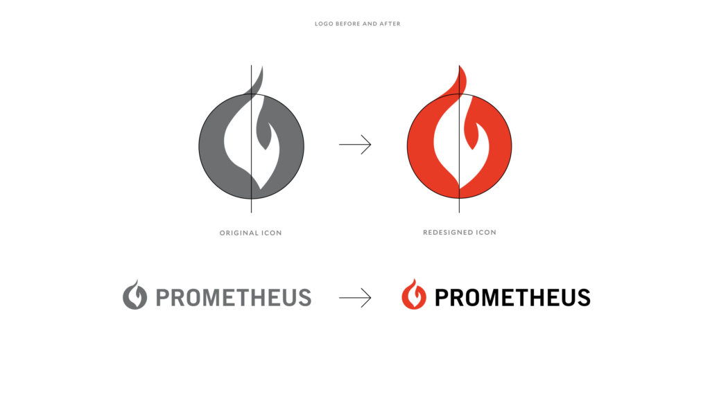
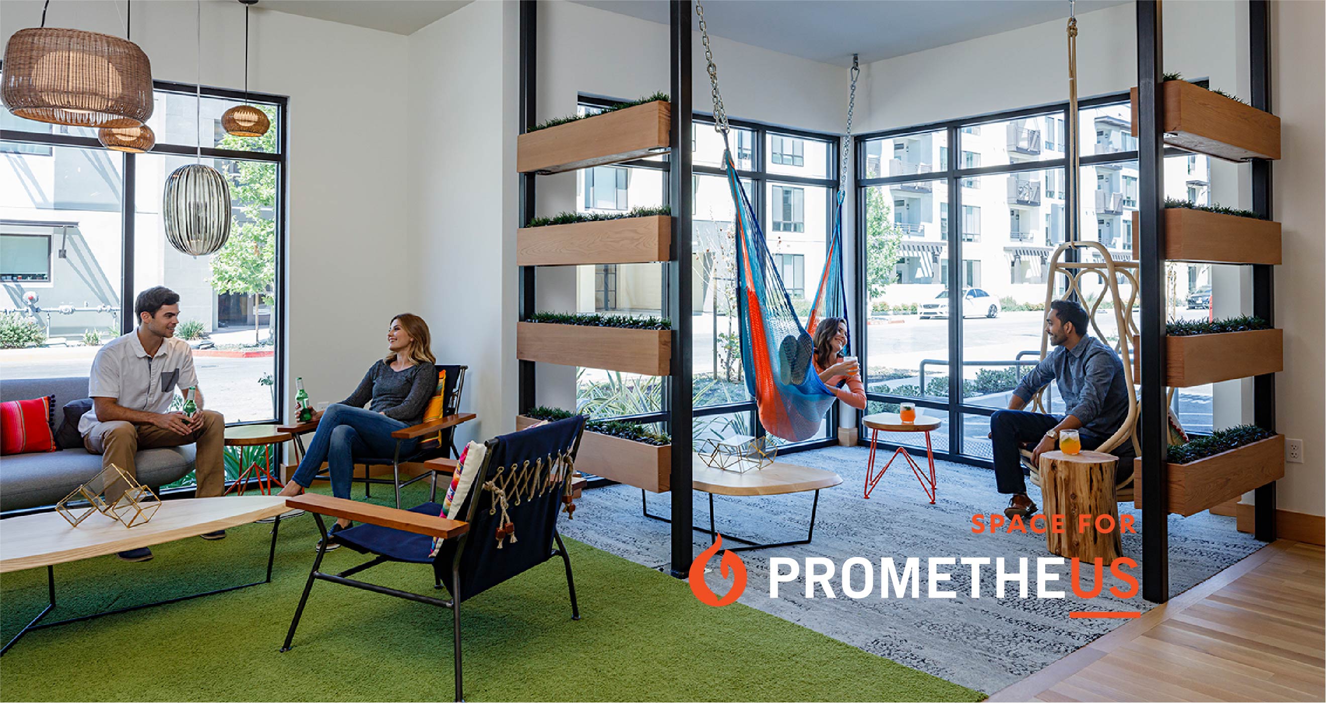
Prometheus has been building communities since 1965. The logo has an incredible amount of brand equity built into it. So our plan was to retain that equity by only refining their icon to be a more evenly balanced mark. Next, we created secondary marks that highlight the company’s legacy and mission. These assets become tools to use in layouts that add both meaning and visual interest. Typography and color were updated. The flared serifs of Canela presented a welcoming and engaging personality font, while Mallory provided an open, legible, and modern sans serif for support. We reworked taglines, messaging and core values. “Space for” was the new campaign developed during this process, where “us” or “me” is highlighted in the Prometheus logo to reflect the company’s purpose as a home and a community.
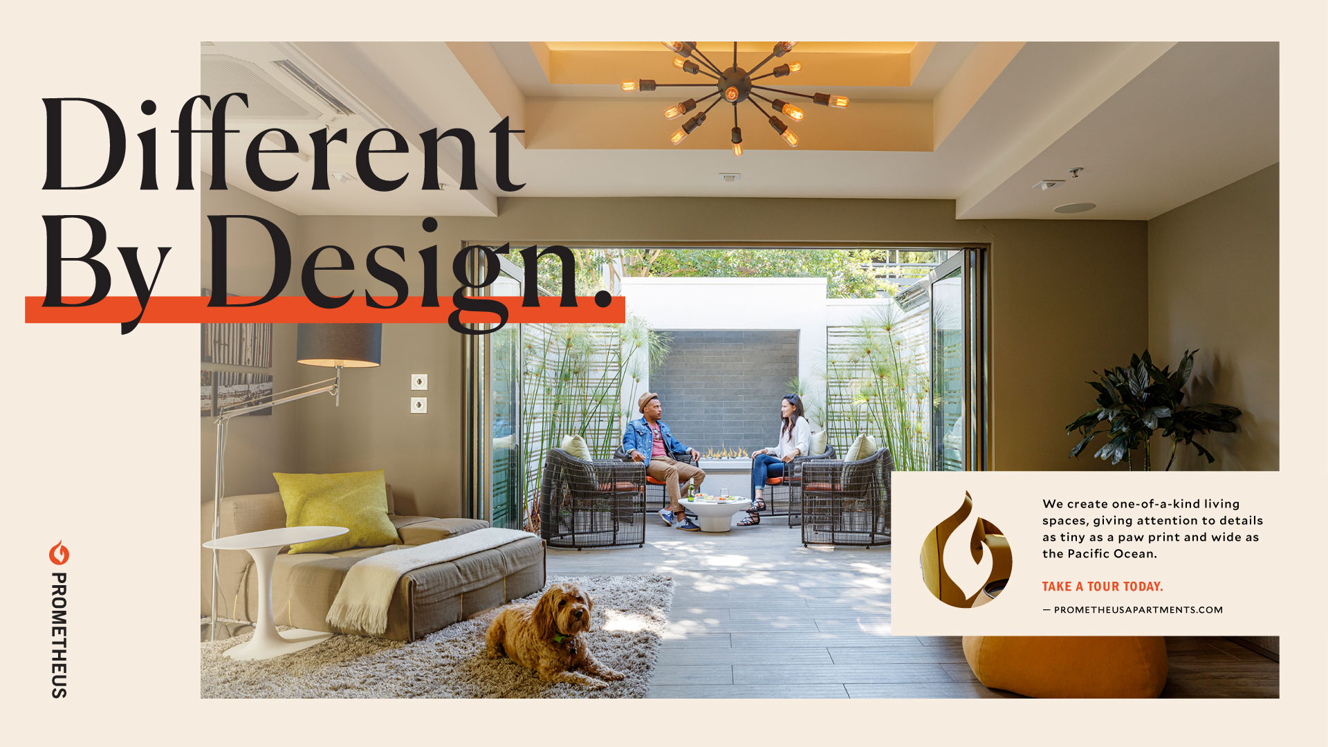
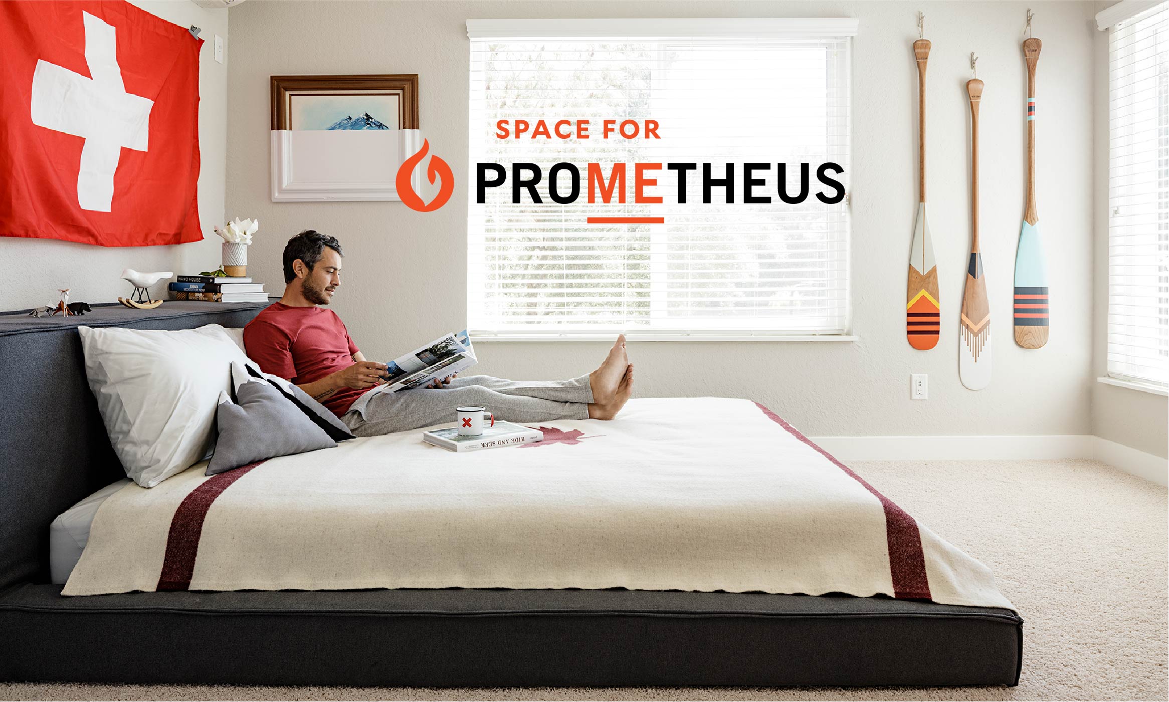
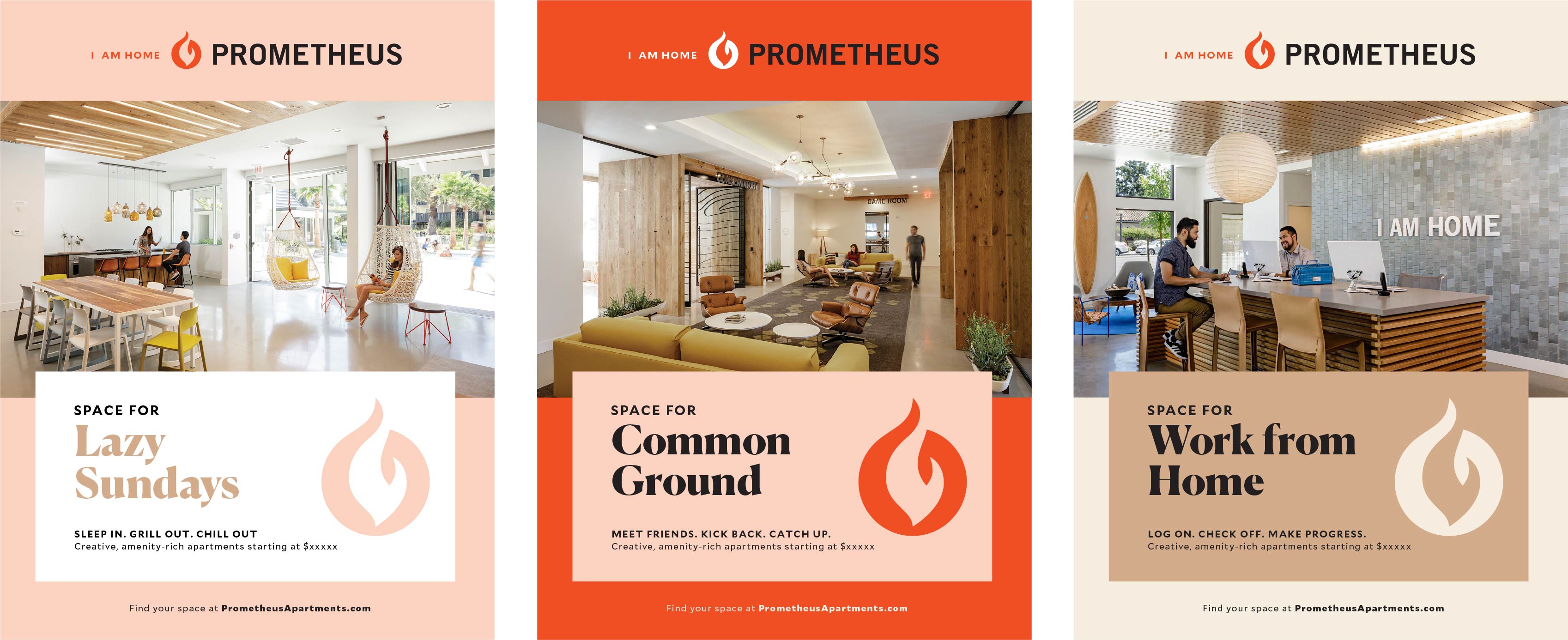
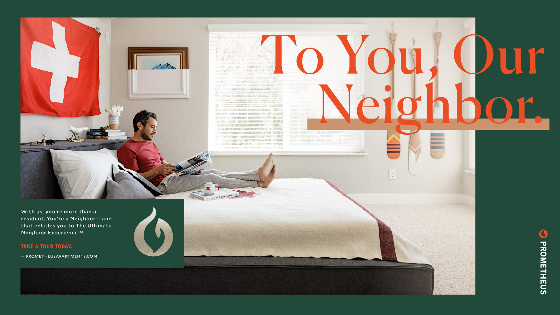
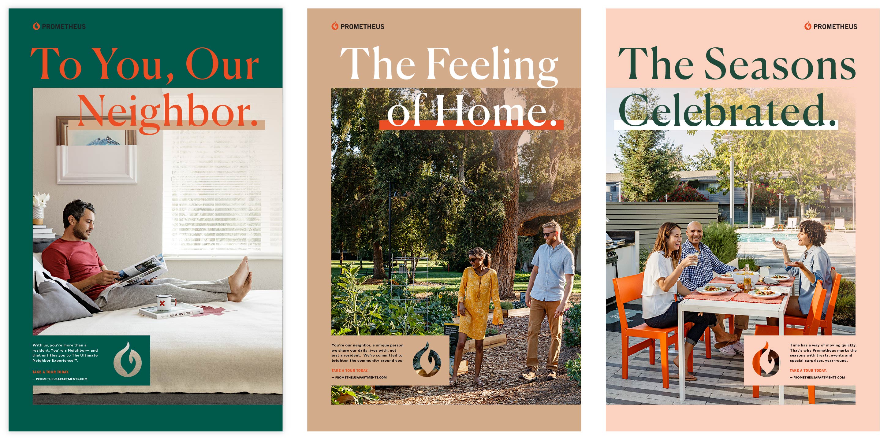
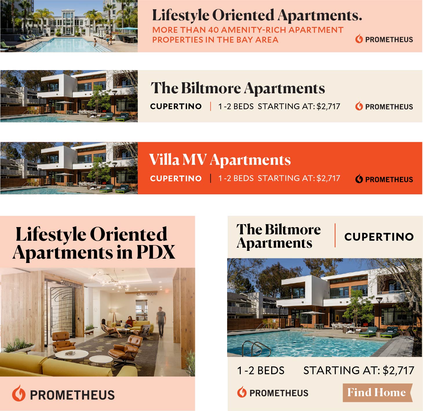
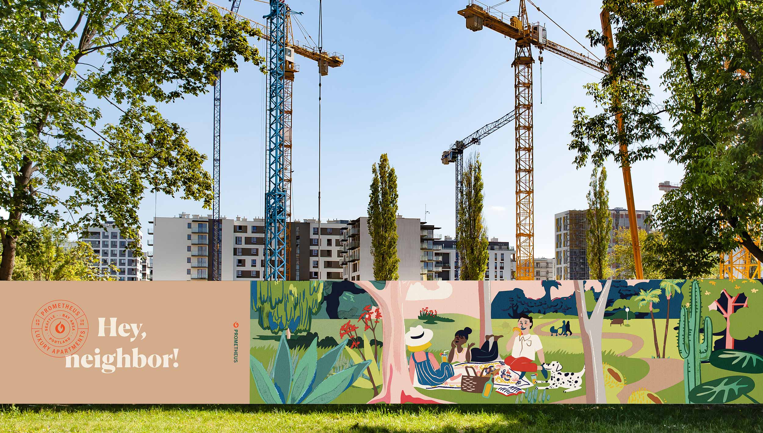
A library of design templates was developed for Prometheus’s in-house design team to use ongoing across their many properties. We reskinned the company’s website to reflect the updated type, color and visual feel. Next up, we created a new system of construction fence designs to help make in-progress job sites more visually appealing to surrounding residents while telling the Prometheus story.

Select pages from the Prometheus Brand Guidelines
