Looking for something?
PJC is an experienced, early-stage venture capital firm out of Boston. When they started their student-run venture fund, they approached us to help them put form and function to their idea. The new fund would serve ambitious first-time founders at college campuses across America. So the brand identity needed to speak to that unique student.
— Naming
— Logo System
— Typography, Color
— Messaging
— Collateral and Social Media
— Website

― Captures Odds On VC’s spirit: we are experimental, brave,
optimistic, unexpected.
― Appeals to young, ambitious, world-wise founders without pandering. They are young, but capable.
― Differentiates us from traditional institutional VCs and
existing college funds.
― 18-35 years old (generally). Gen Z / Millennial. Diverse in gender and ethnicity.
― Ambitious and motivated. Most will be first-time founders.
― Scrappy, industrious, thrifty, inclusive, optimistic, ambitious, and socially conscious.
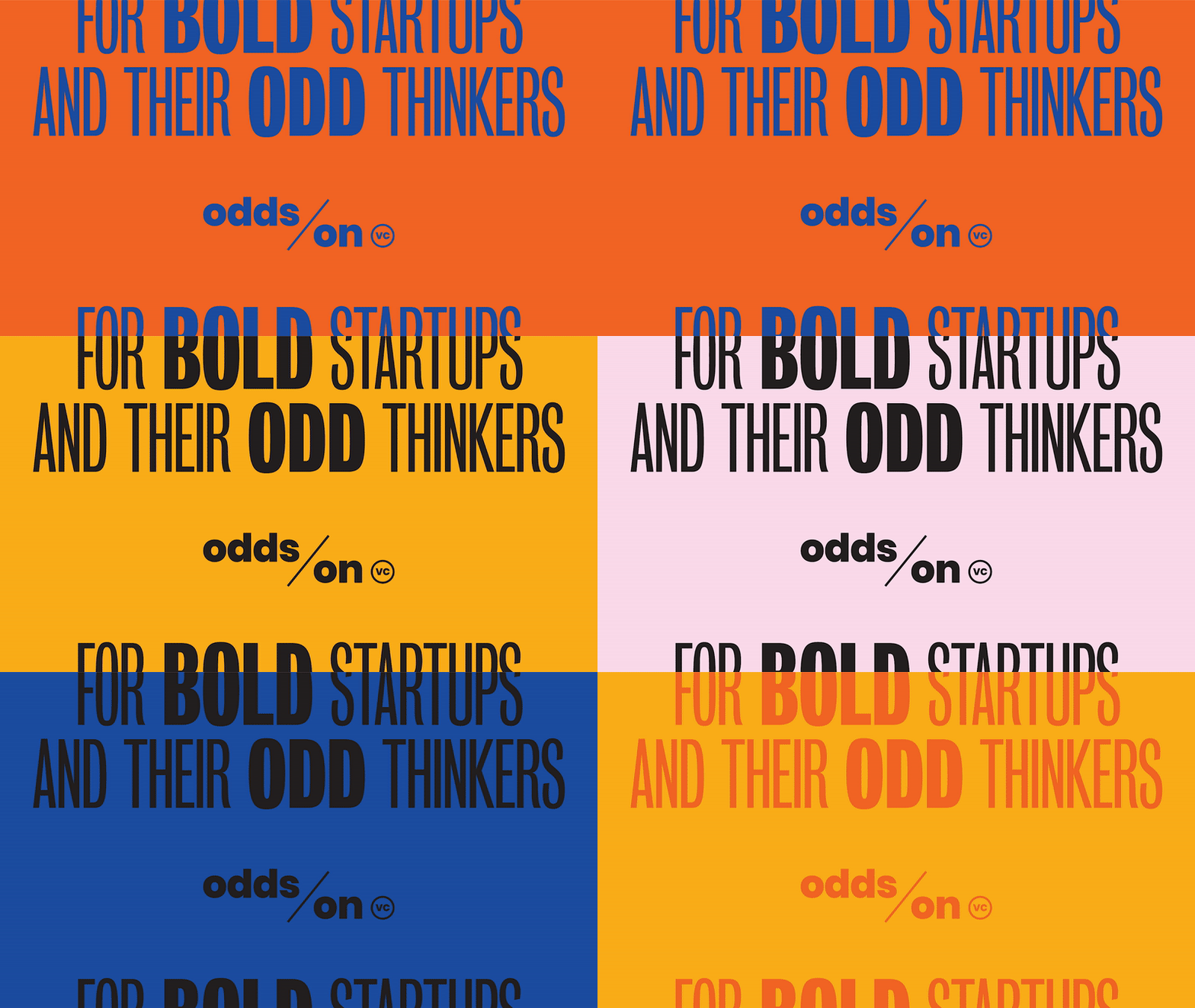

“Odds On VC” ticked all the boxes on our naming wishlist: clever, easy to say and spell, ownable, and reflective of the fund’s purpose. The name alludes to how the fund proudly rolls the dice on untested, green founders, and how it welcomes strange and experimental ideas. “Odds On” as a phrase also opens up all kinds of playful messaging angles around “betting on” and “going all in on” student founders with bold ideas. And the beautiful repetition of the “o”s and “d”s make the name visually stunning.
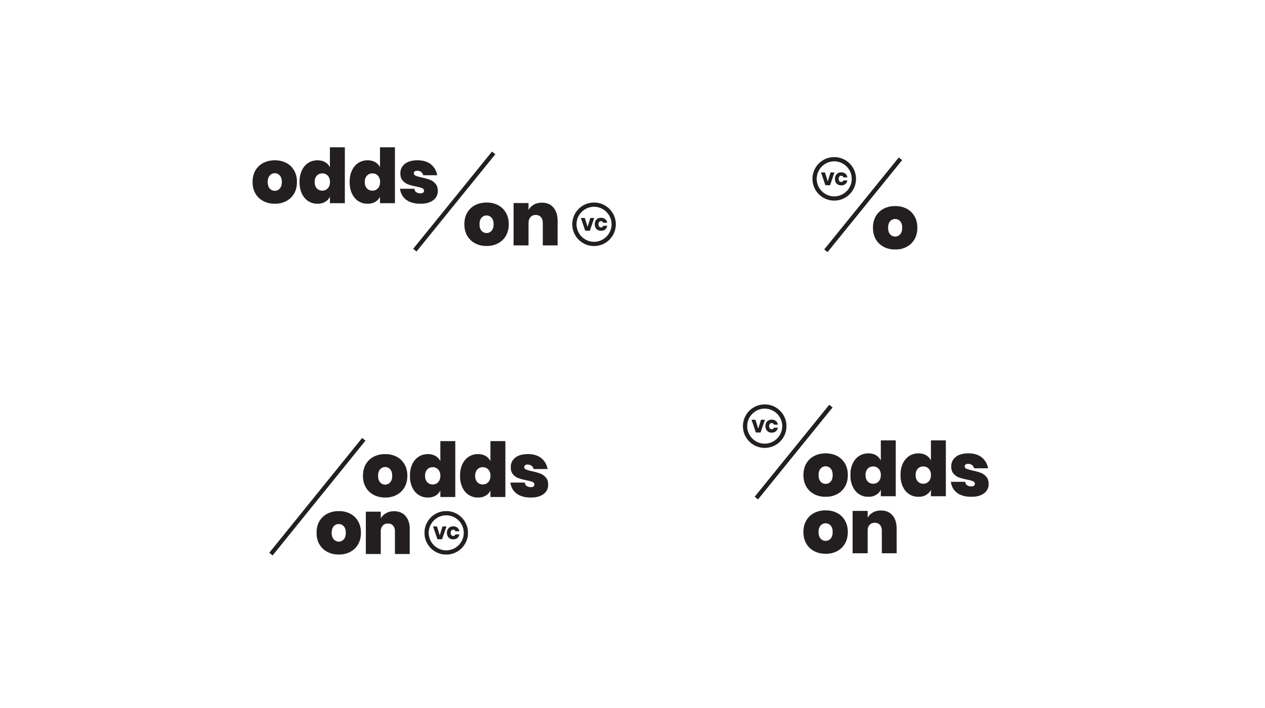
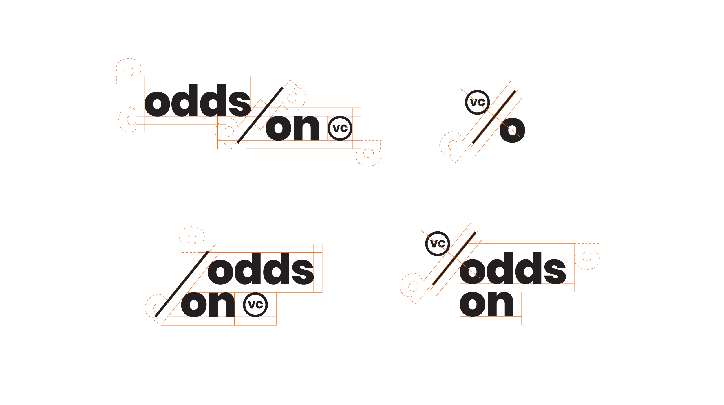
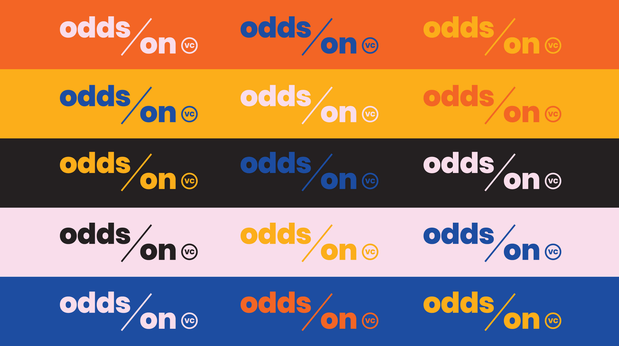
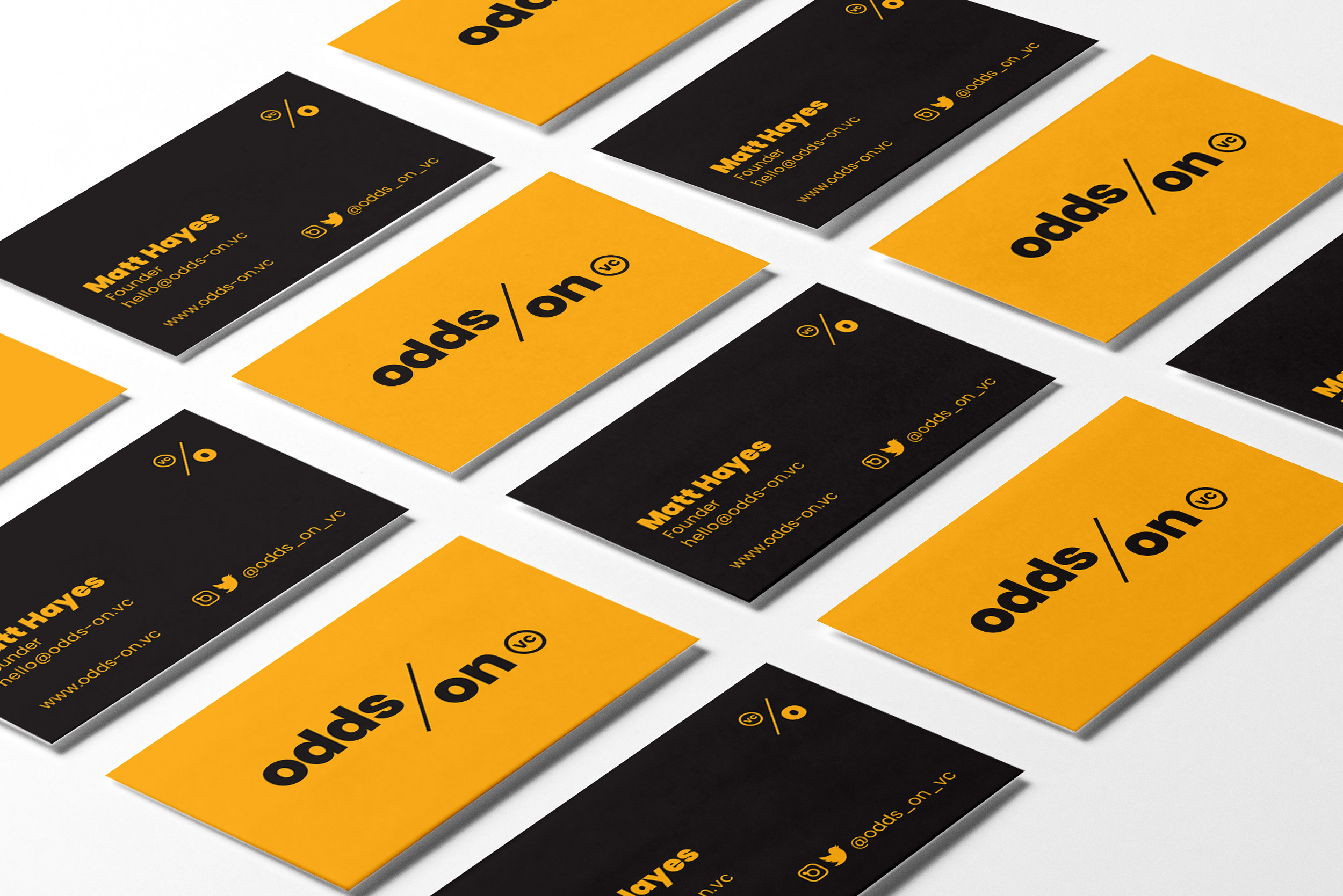
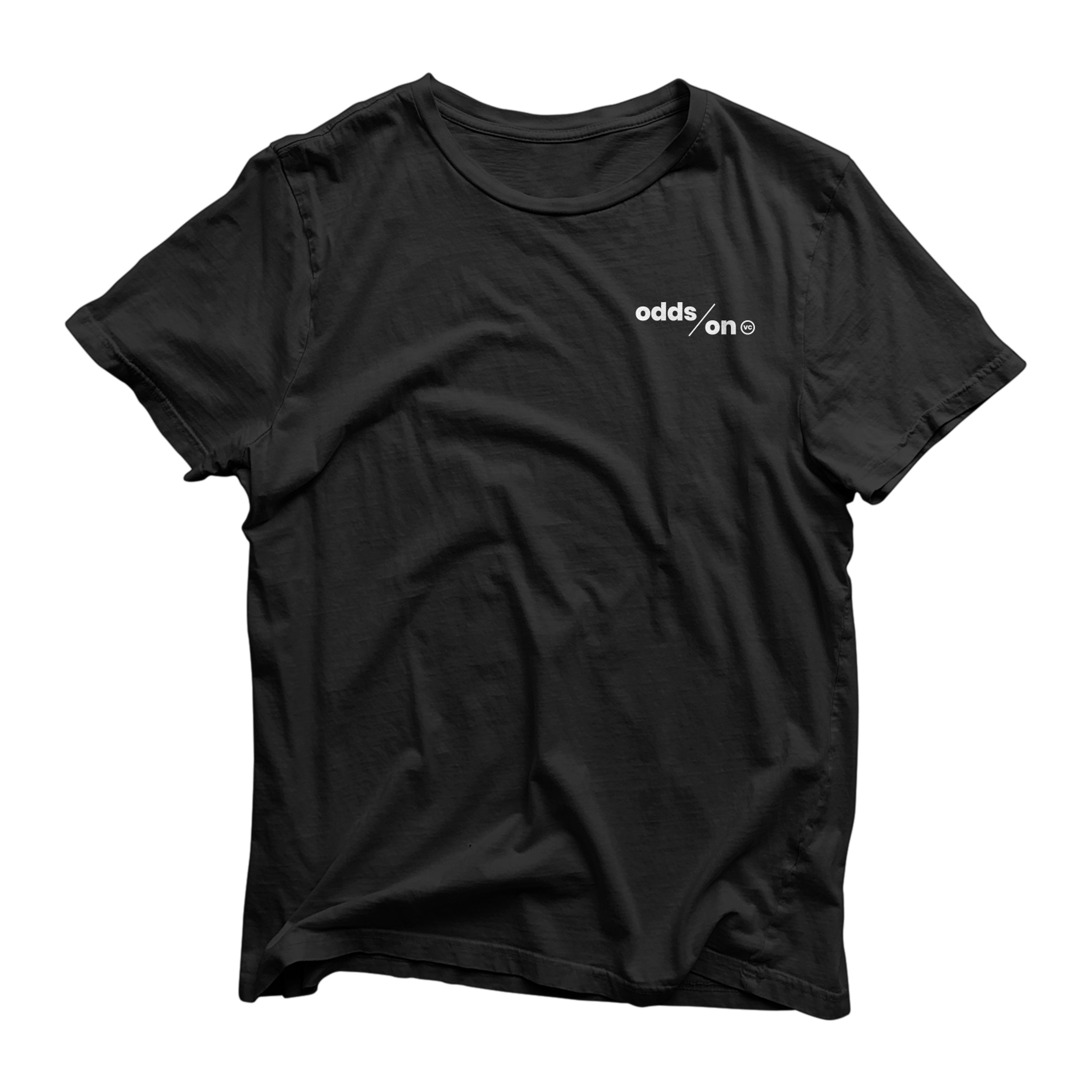
We couldn’t miss the opportunity to turn the Os in Odds On into a percentage symbol. The icon reflects Odds On’s mission to bet on first-time founders and their bold ideas, upping their odds of achieving success and making their stamp on the world.The logo elements are variable depending on the use case and orientation.
The typeface used for the words mark is Poppins, designed by Jonny Pinhorn and Ninad Kale.
Part of our work involved helping Odds On define and declare their fund’s purpose through brand positioning and messaging.
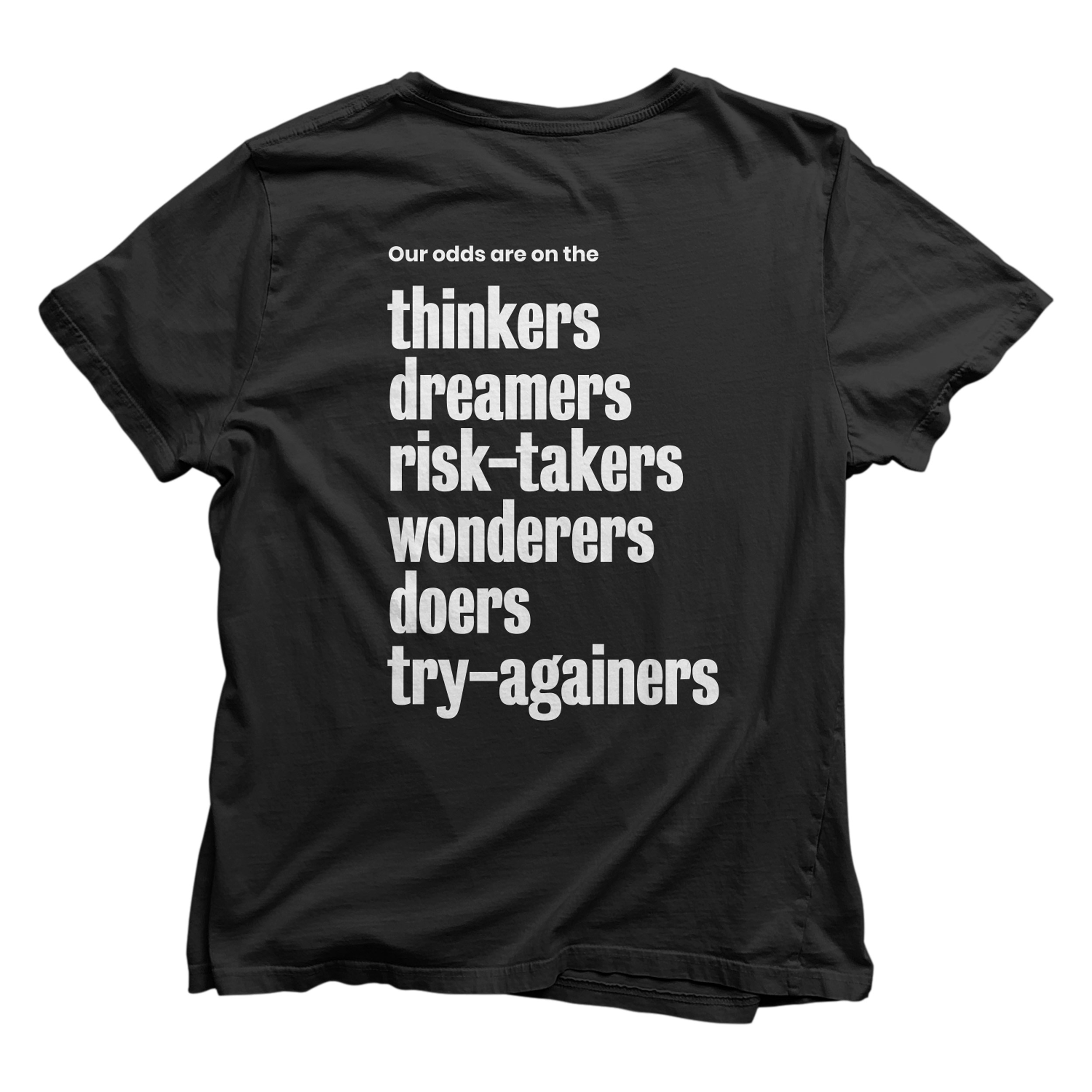
We understand that in order to win big, you often have to take bigger risks. We see the incredible value in founders and teams that think outside the norm. Our odds are on those who test the status quo, and seek better answers to the big questions. Risky and experimental are what we’re hungry for. We want dark horses with bright ideas.
We’re student investors backing our peers. Brave startups. Bold ideas. Unflinching work ethic. We’re here to bet on strategy-focused founders who are putting their all on the line. We welcome founders of all educational backgrounds. What matters is the determination and courage to experiment, learn, pivot and grow.
Some of the best innovations across history have been some of the most outlandish at the start. Change never seems better, especially to the old guard. That’s why we’re enabling the next generation of founders to challenge the way things are. A better product, a better business, a better world just needs one rogue dreamer with the right tools. We’re equipping underdogs to experiment,
test and maybe prove their best ideas.
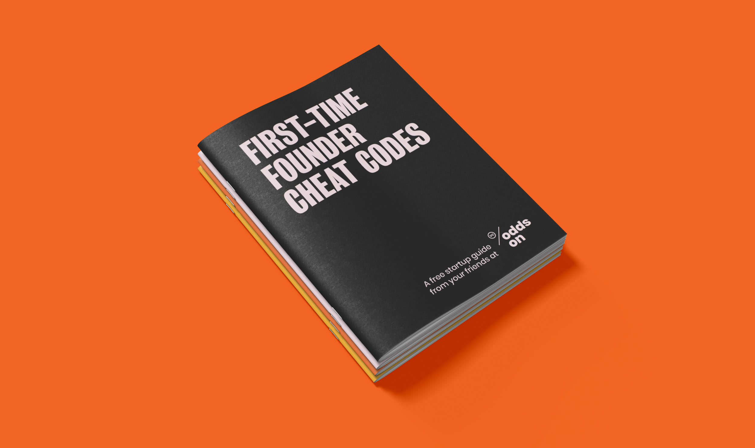
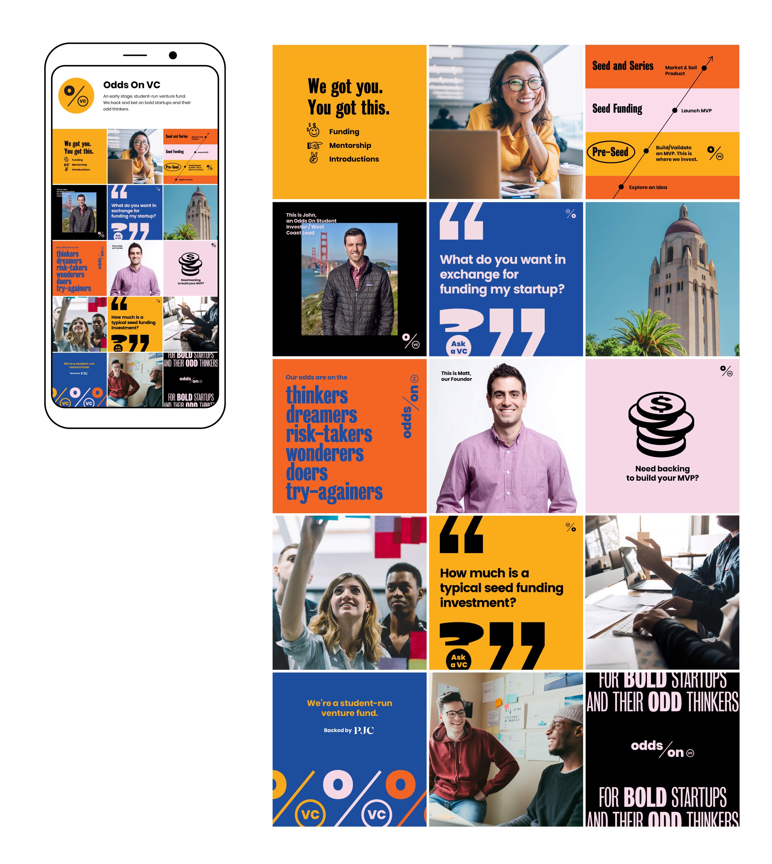
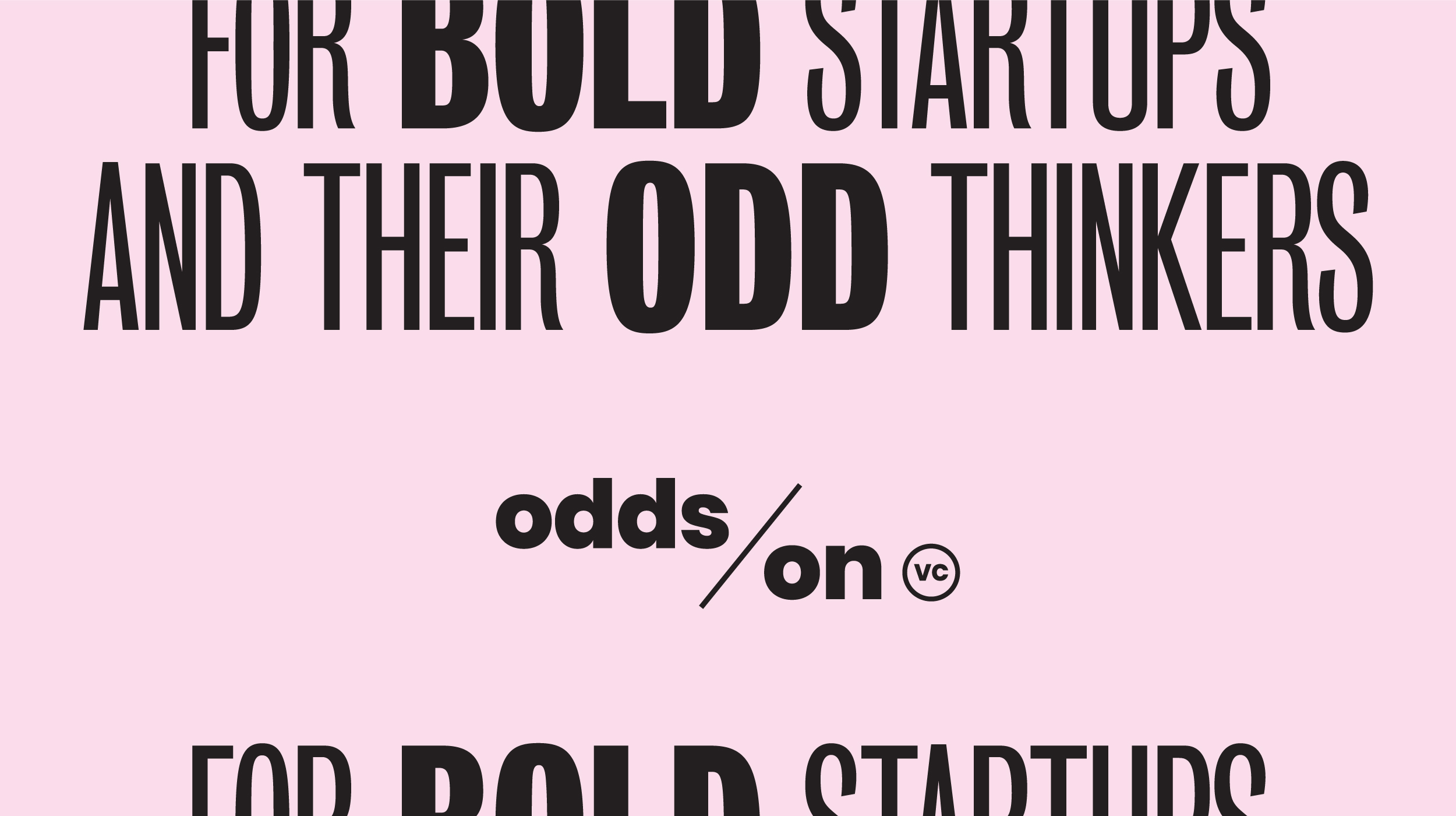
The Odds On VC brand identity overall is bold, experimental, yet optimistic. The foundational aesthetic elements support this personality, with lively yet unexpected colors and playful yet stark typefaces.
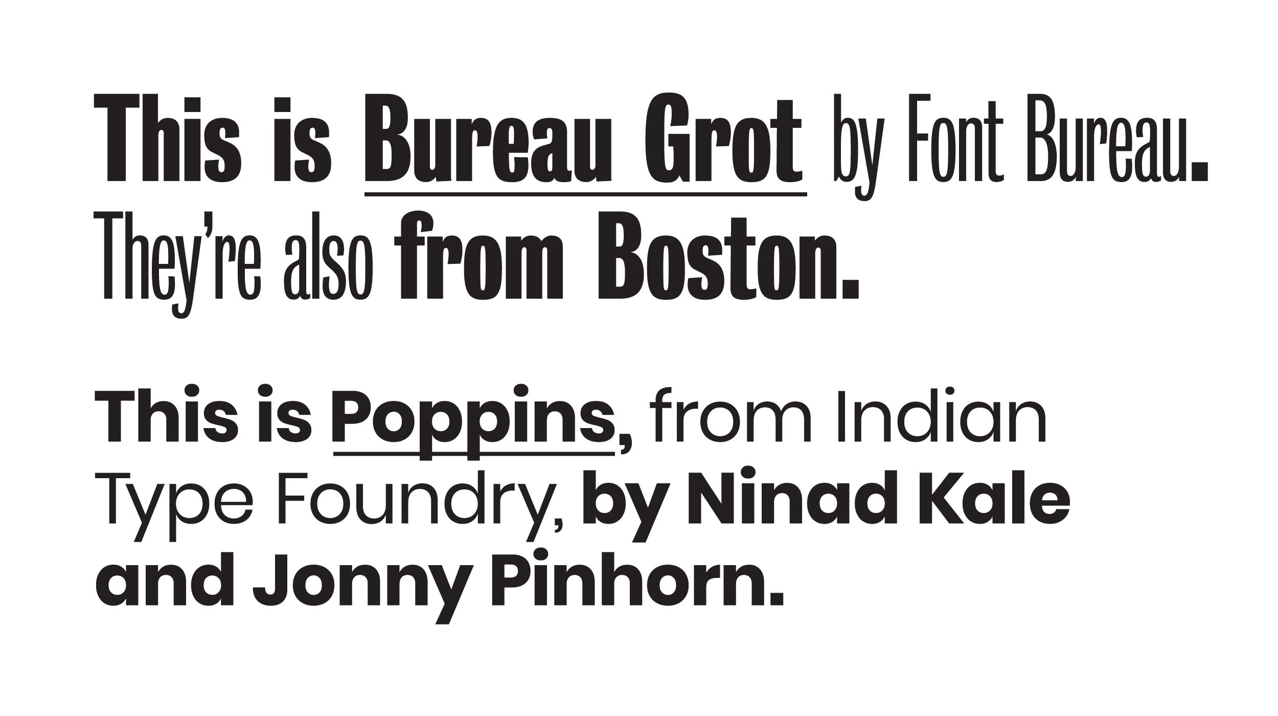
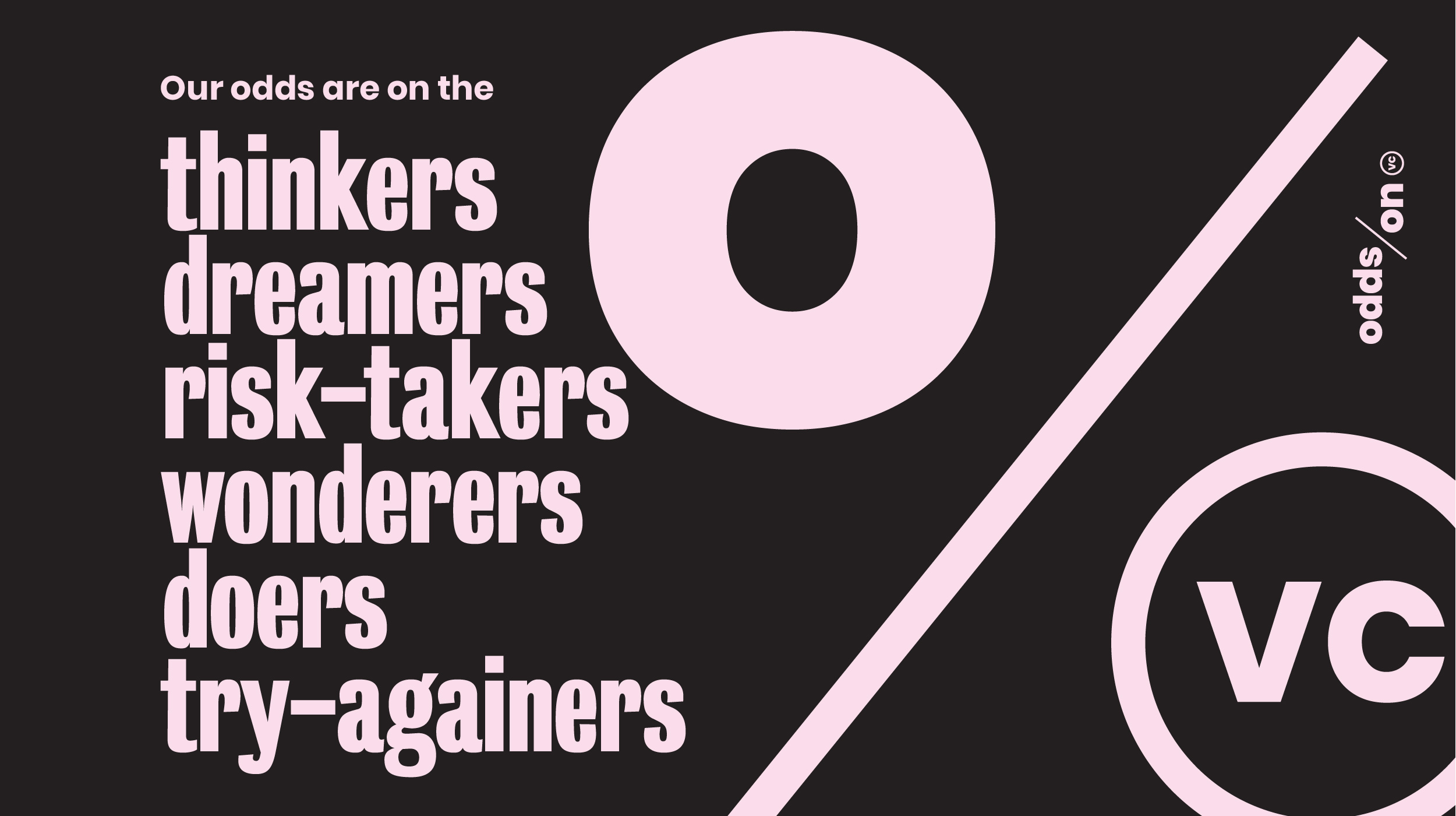
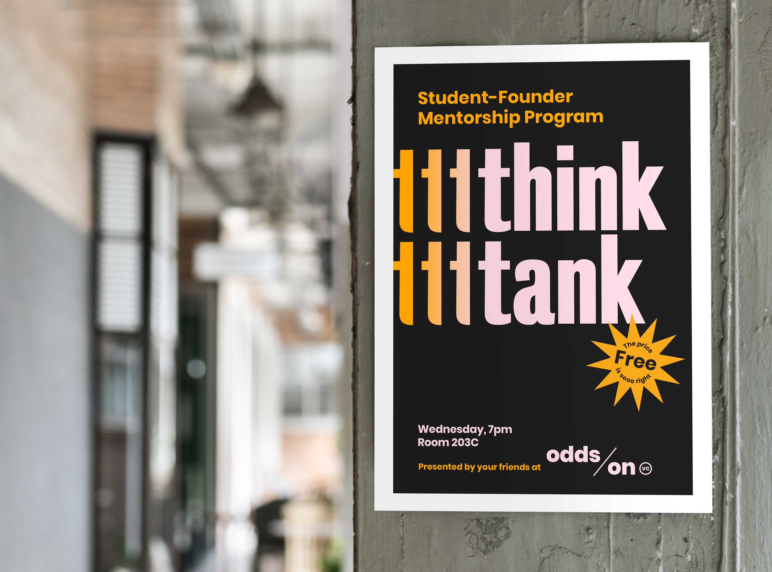
Our layouts use the bold yet playful Bureau Grot typeface by Font Bureau. And body copy and subtext is set in the geomotric sans Poppins, by Ninad Kale and Jonny Pinhorn.

– Becca Norton, PJC and Odds On
