Looking for something?
Datalily (formerly CXD Studio) was founded in Boston by Gabby Pinto and Katherine Boyarsky a few years ago, offering a full suite of marketing services to SaaS and B2B brands like Hubspot, Doordash, and Vimeo. But quicker than you can say “return on investment”, they realized data-driven marketing was their specialty. They had become lovingly known as “The Report People” to clients who sought them out for their unique data-science capabilities. They reached out to our team at Hoodzpah to help them rebrand their studio to better embrace this positioning as newly dubbed Datalily. We worked with them for three months developing a new logo and visual identity that finds the sweet spot between data and creativity. As a fellow creative studio, Datalily was a dream client. They were collaborative, imaginative, and trusting. Need original research or a stunner of a data report for your B2B brand? Hit them up.
— Logo and logo animations
— Typography and color
— Social media templates
— Merch
— Web design
— Brand guidelines
Art Direction: Jennifer Hood
Design: Jennifer Hood, Amy Hood, Lua Cieza, Tara Victoria
Animation & Motion: Ethan Silva of Bad Lucky Studio
Webflow Development: Trust Design Shop
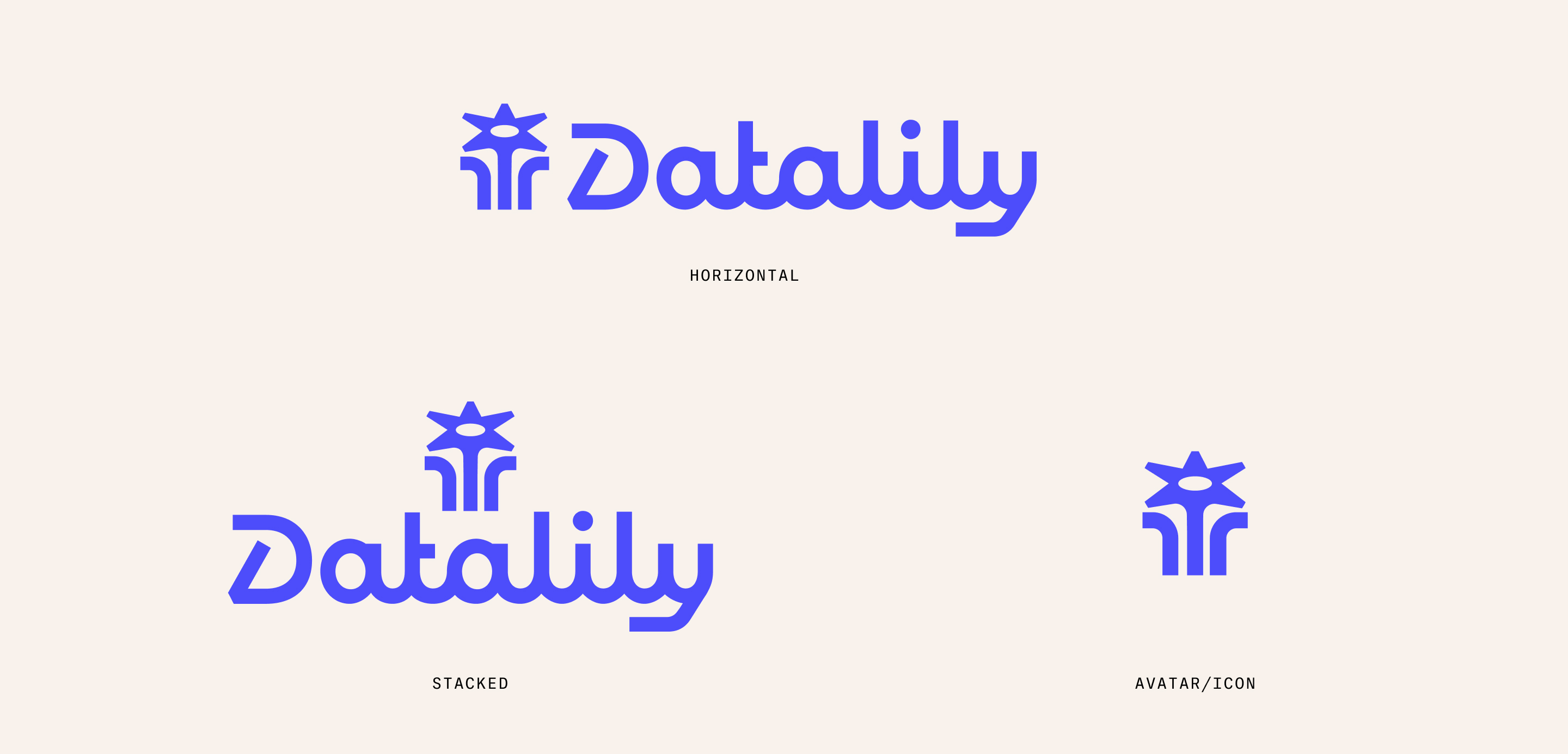
Datalily (formerly CXD Studio) is a rare kind of studio. They have a capable team of data scientists conducting original research to create content for clients that is valuable and insightful. And they also have the creative capabilities in writers, designers and marketers who know how to shape that data great looking content that converts. Our whole goal with this rebrand was to highlight this duality of data and creativity, starting with the logo. The custom wordmark features a monoline script with precise rhythm in the verticals and rounds. For the icon, a bar chart blooms charmingly into a lily.
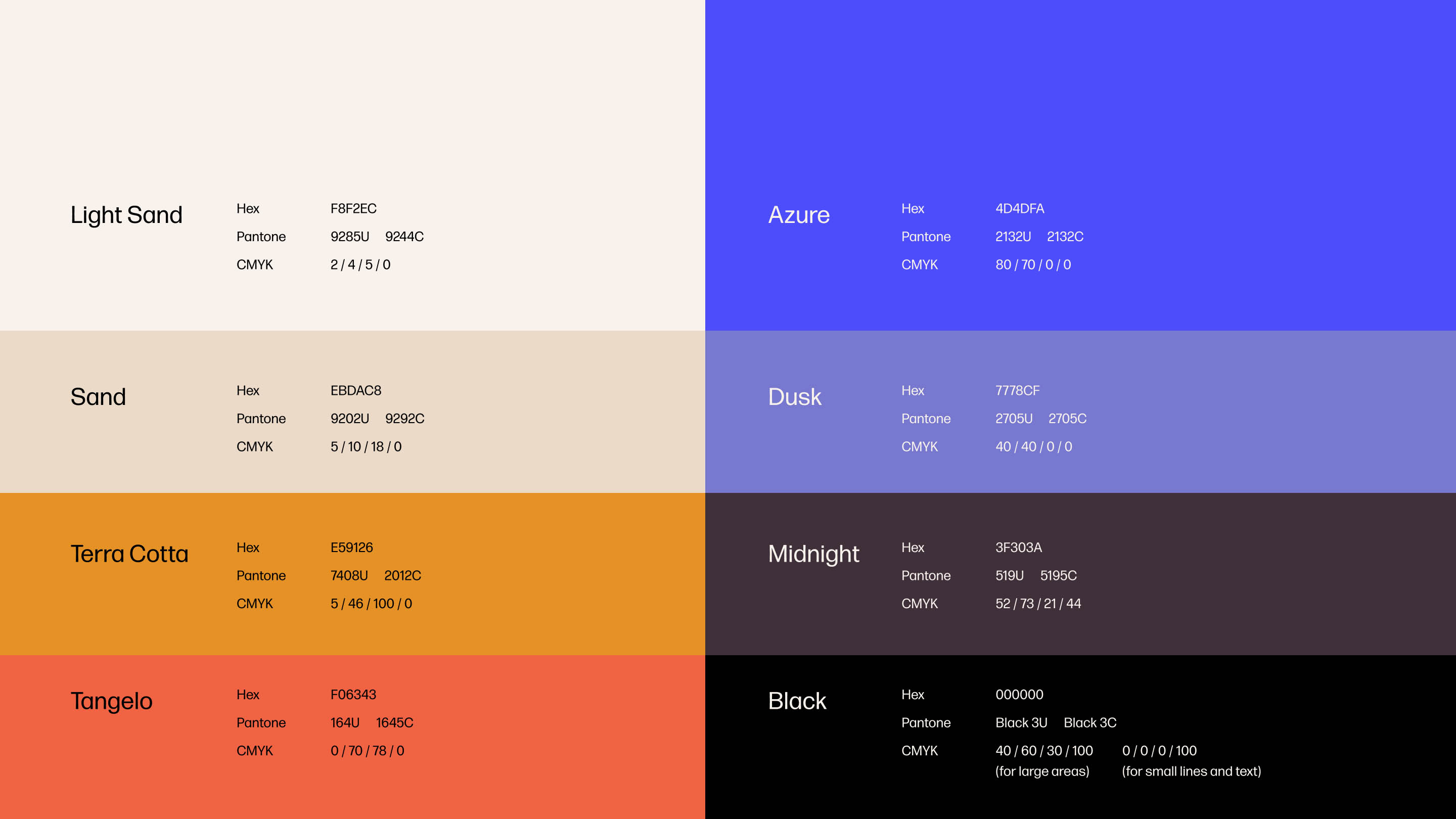
To create a through-line from the old branding to the new, we adapted rather than abandoned their previous brand colors. We retained their original vivid blue, then retuned their cooler supporting palette into a warmer collection of dusky hues.
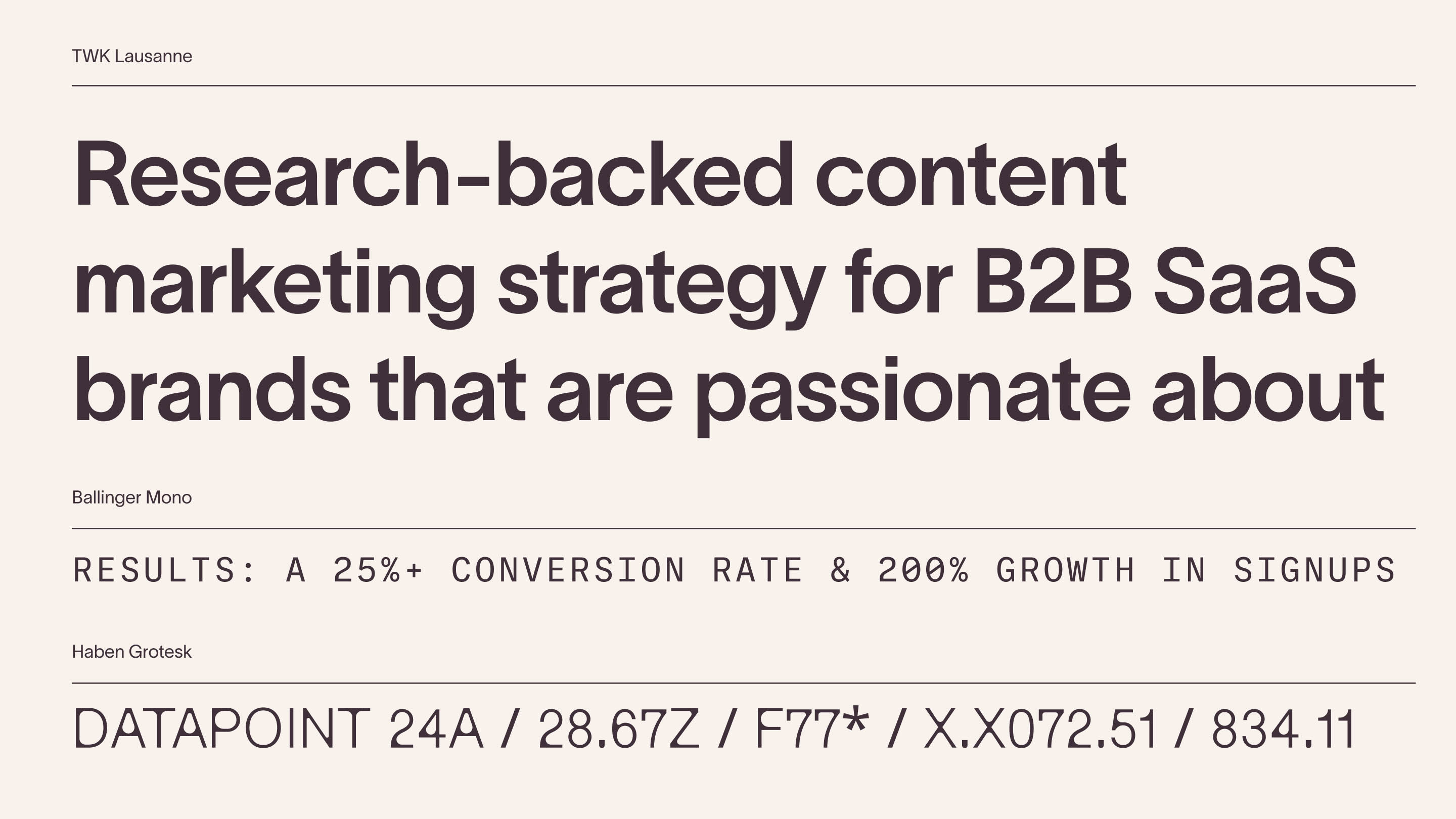
A well-matched family of typefaces anchor the visual identity:
1. The confident and sophisticated TWK Lausanne for headlines and body copy.
2. Ballinger Mono, which adds a data-driven vibe to secondary headlines.
3. Haben Grotesk, used sparsely for personality in our data-visualization illustrations.
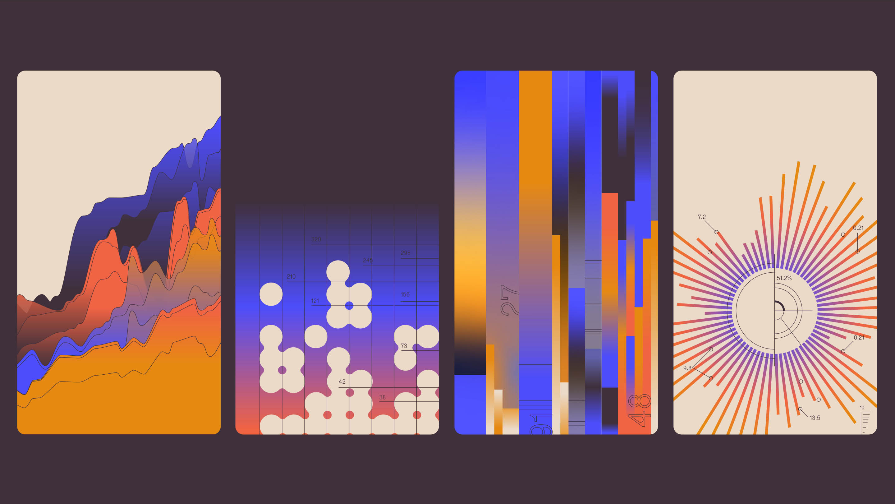
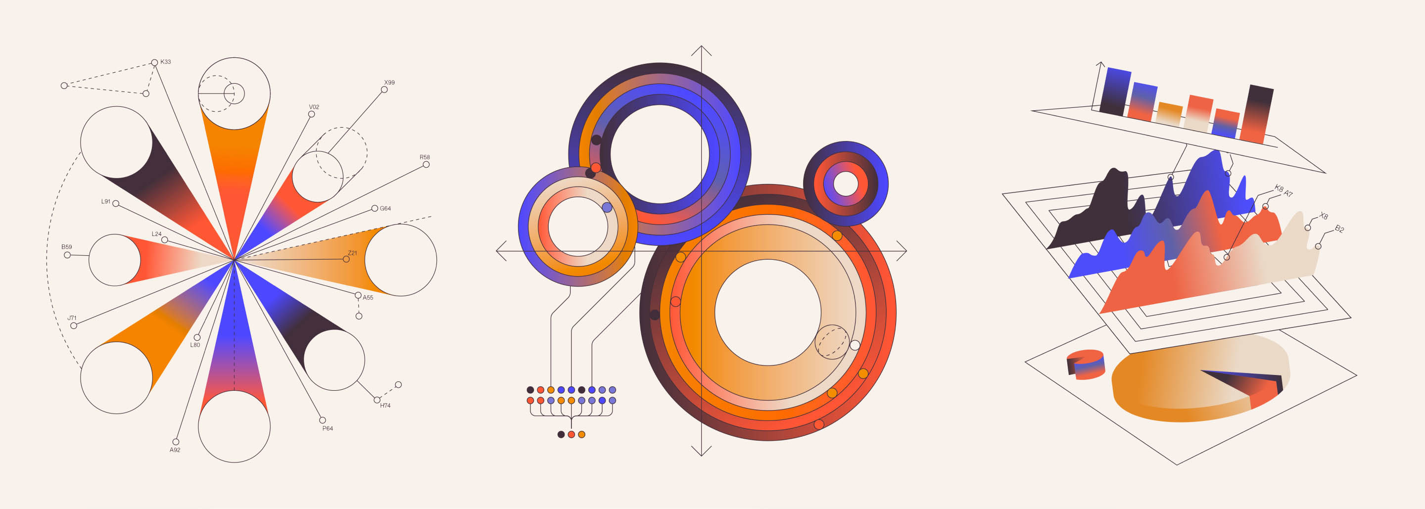
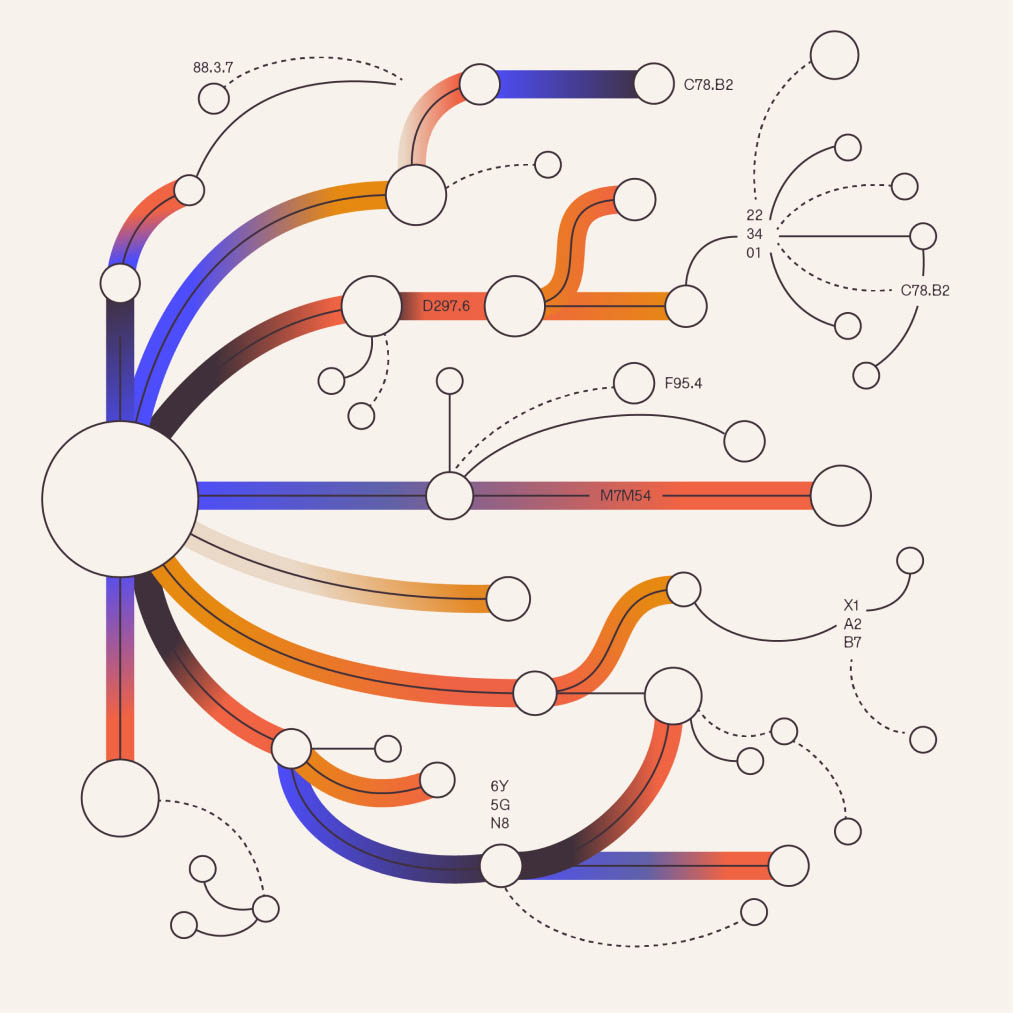
To further drive home the story of creative content rooted in research, we developed a unique illustration style of abstract and vivid data visualizations.
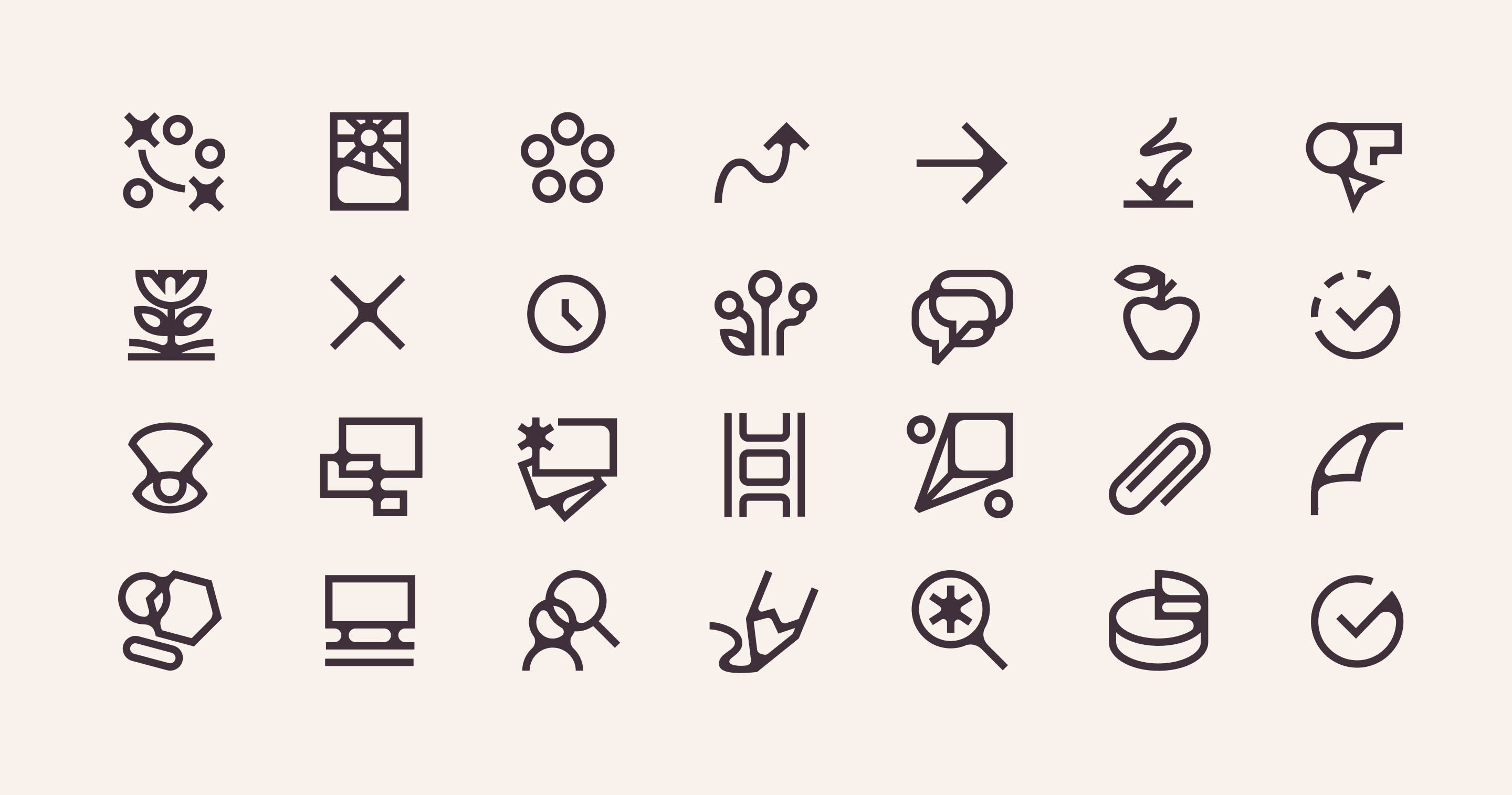
Modern creative studios live first and foremost on that big wide expanse called the internet. We knew the website was going to be a critical spot to show off Datalily’s new brand. Stylized data visualizations herald the studio’s purpose, with slick animation adding extra flair. We developed a custom icon set for the website that feature rounded, blurpy corners reminiscent of the logo and brand illustrations.

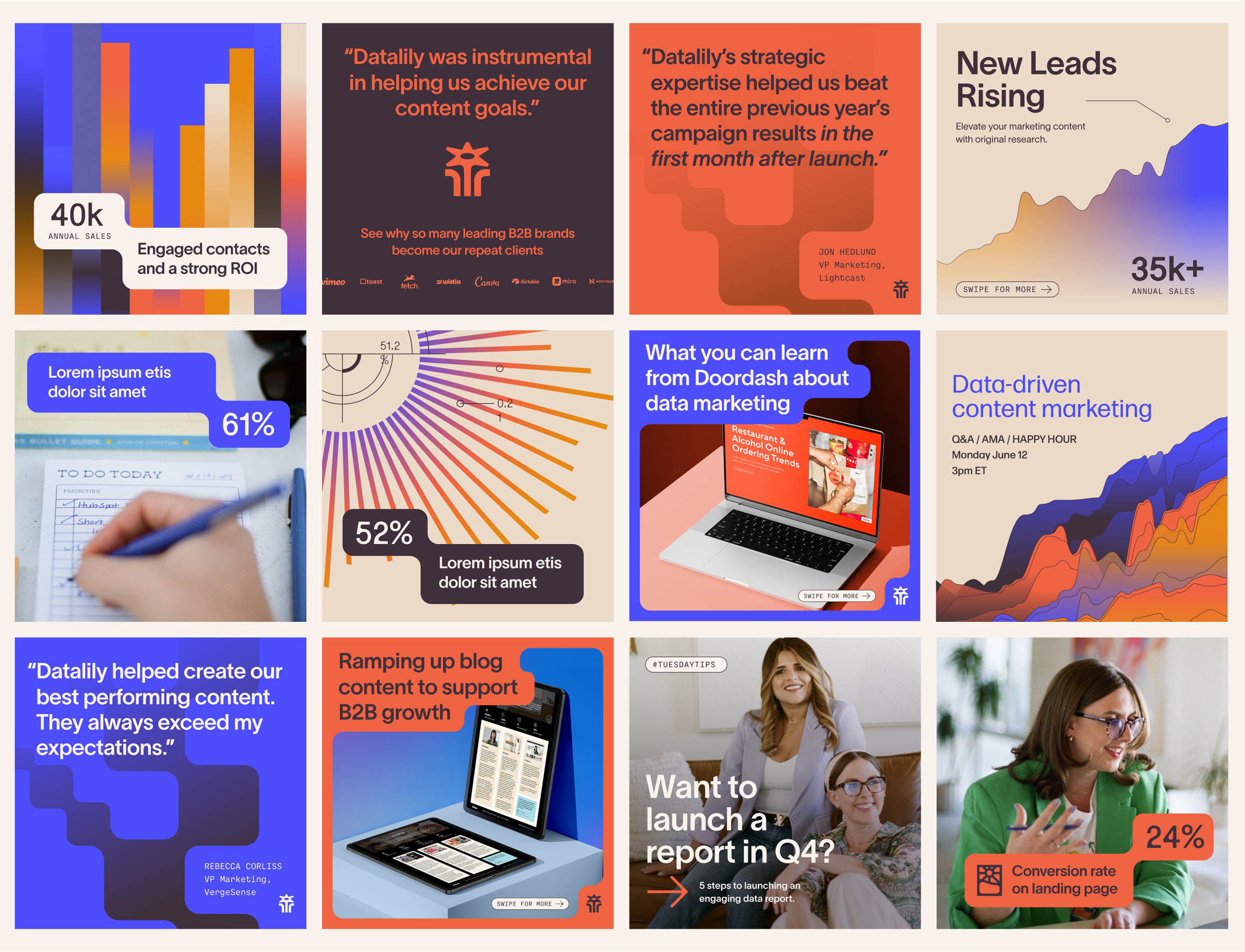
A content marketing studio’s tool belt wouldn’t be complete without a social media template library. The rounded-cornered blurbs, vibrant colors, and gradient-rich illustrations come together in a suite of mix-and-matchable assets Datalily can continue to remix.
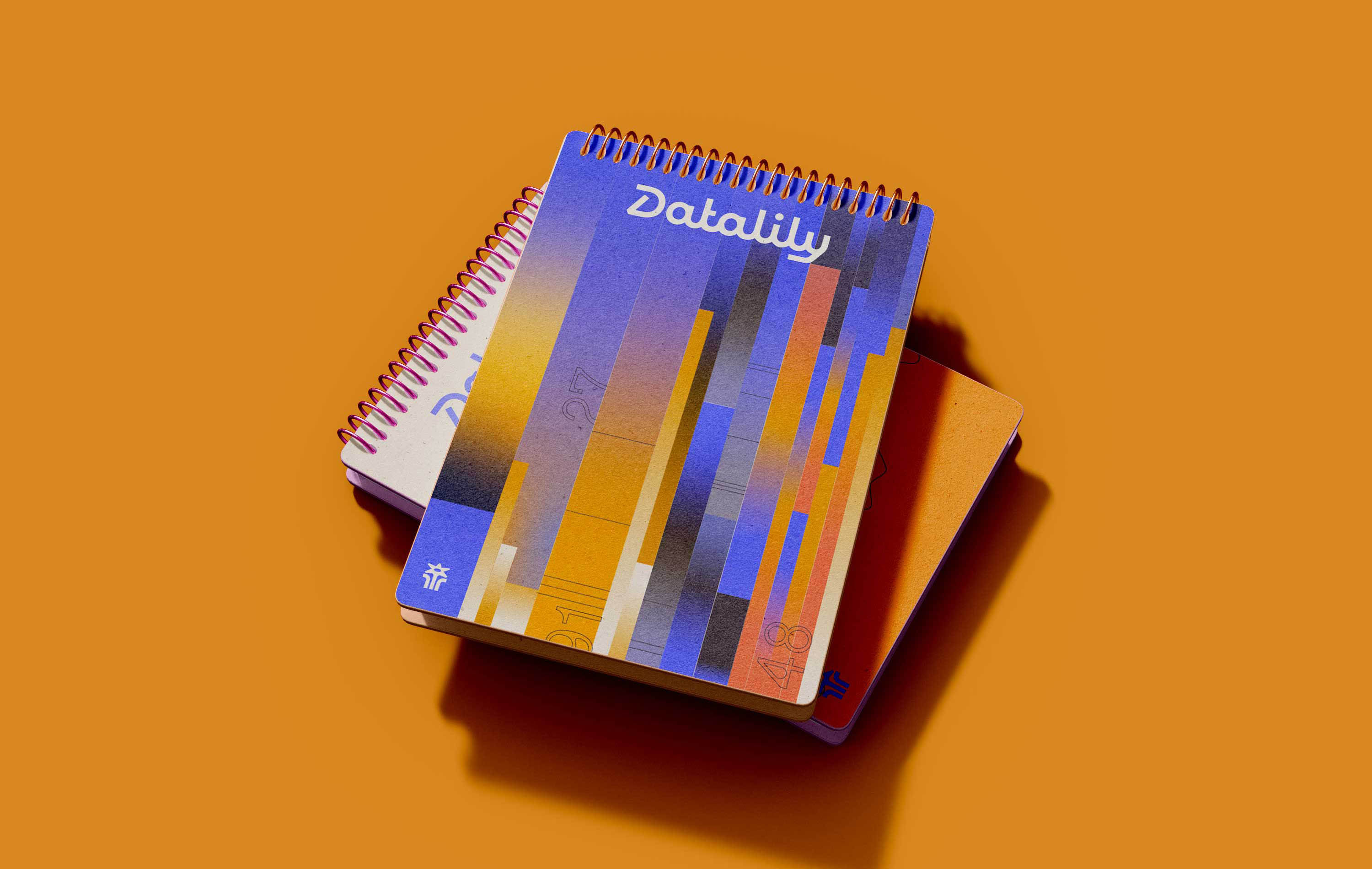
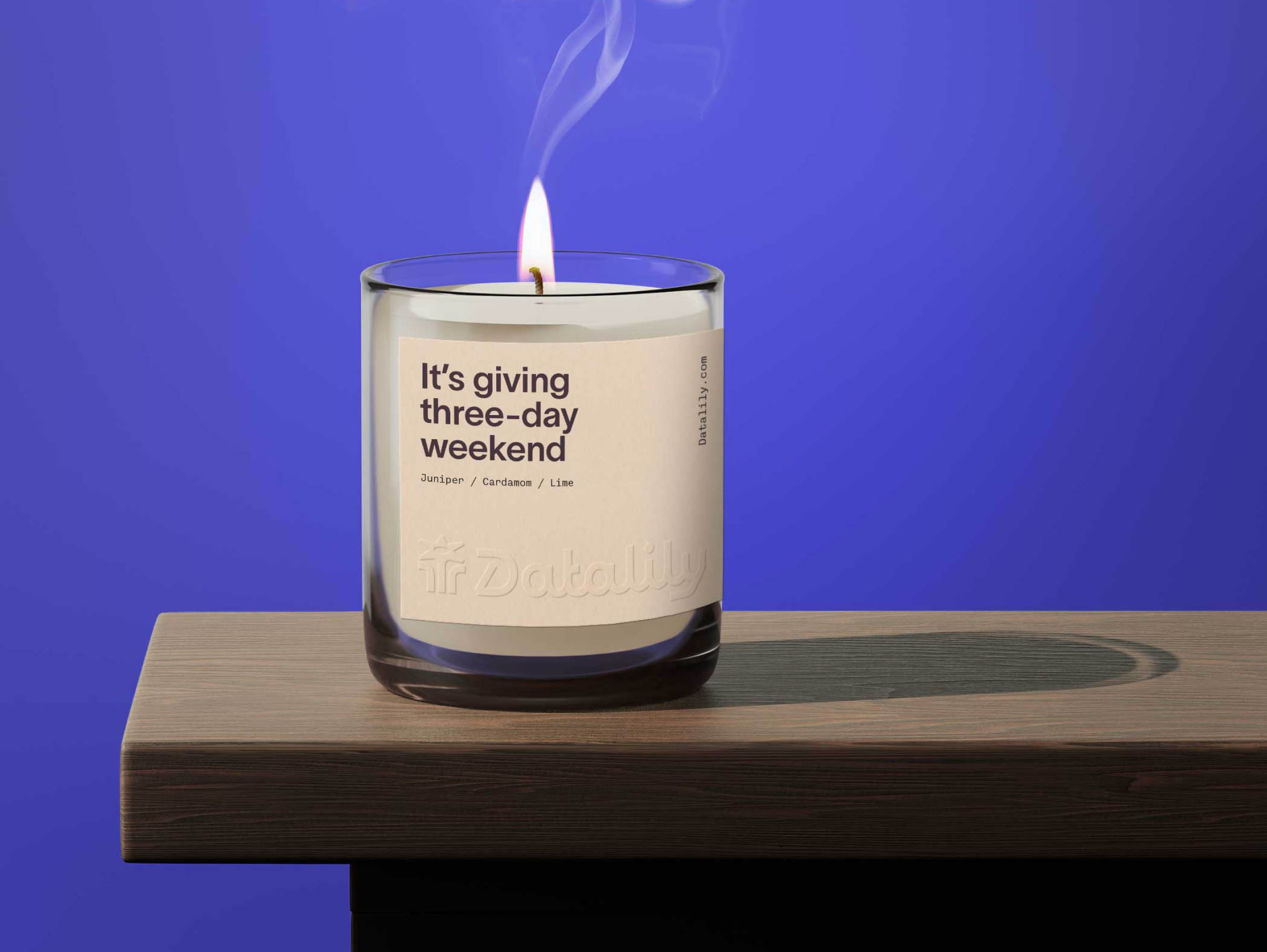
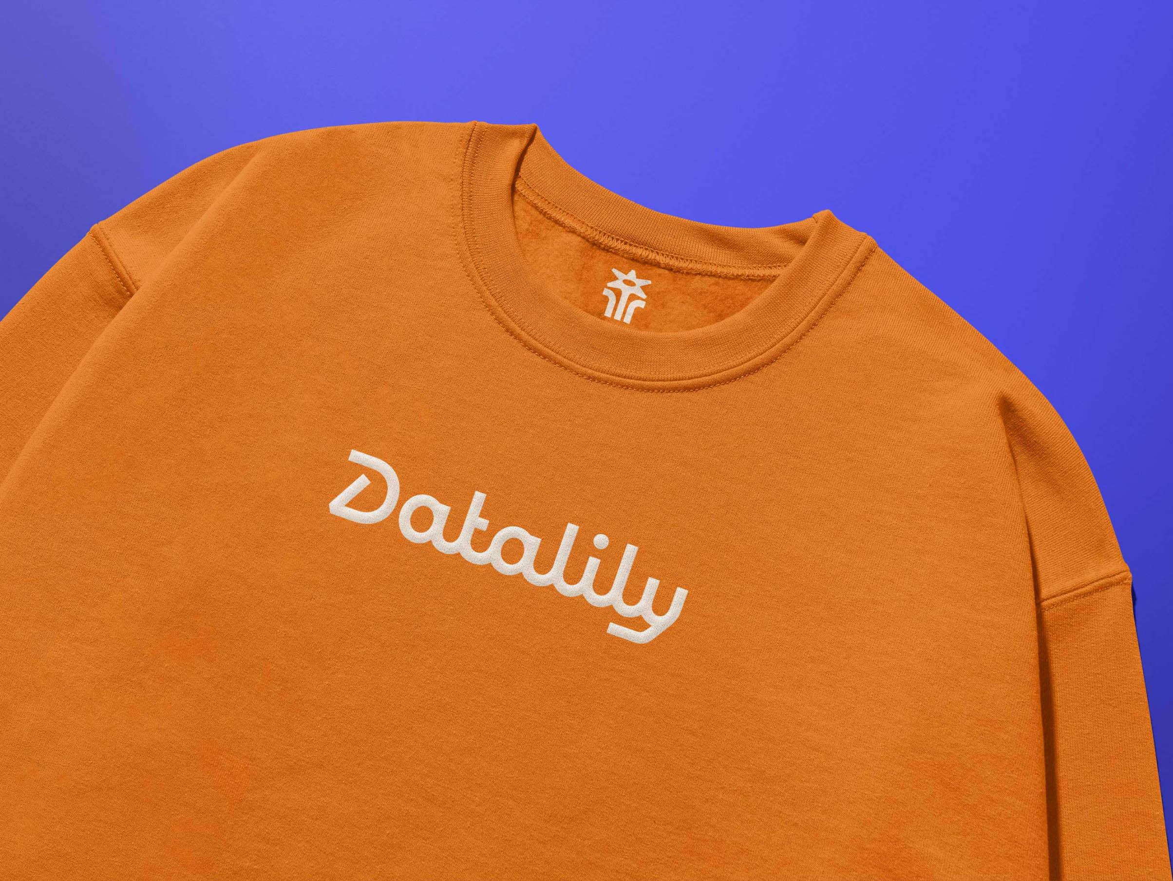
Sweatshirts printed with puff paint, a weekday-coded candle, and a notepad to hold a content marketers best ideas and deepest trade secrets.
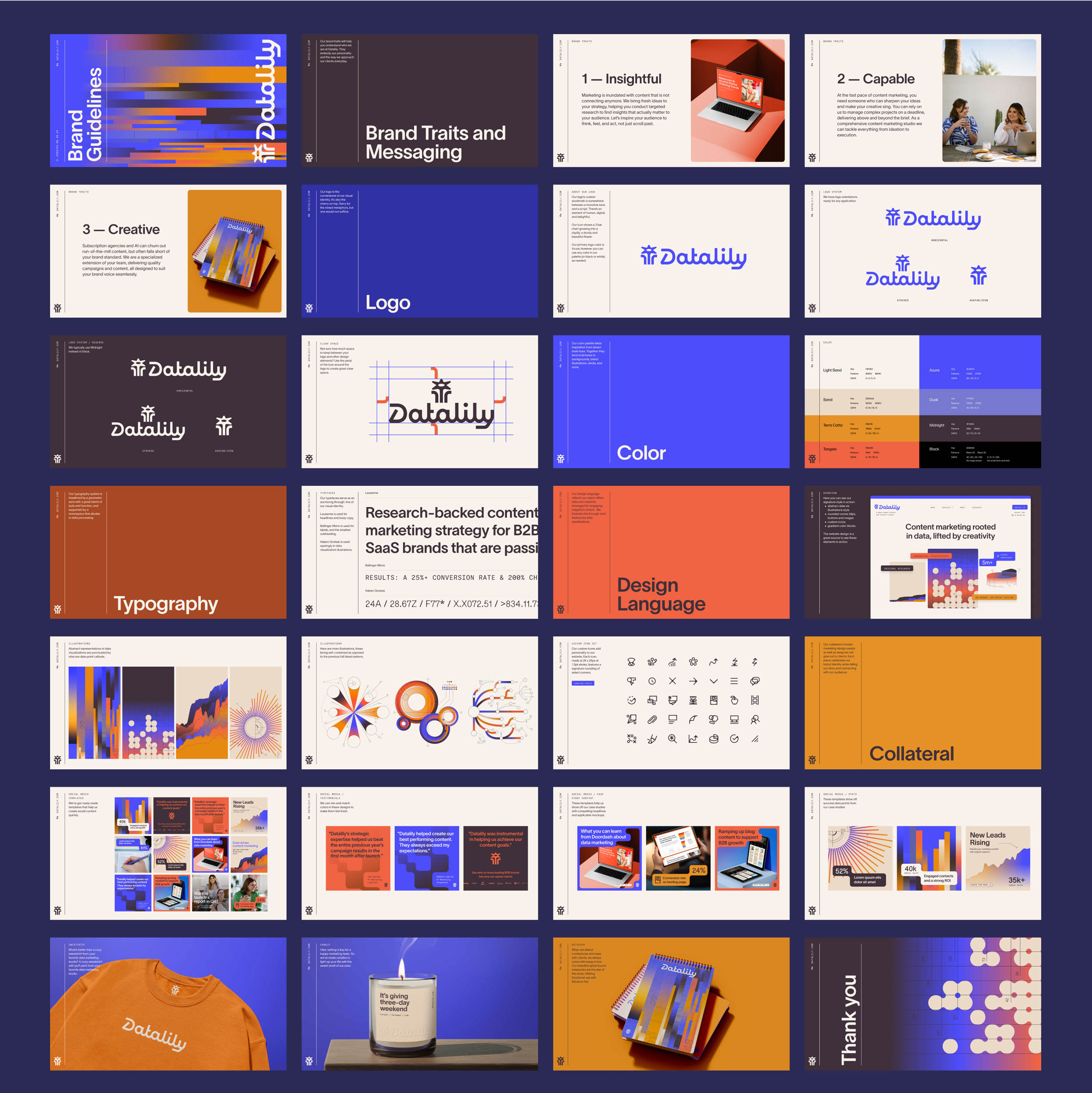
Last stop on this line? Brand guidelines: a final source of truth bringing together all the pieces that make up the Datalily brand.
