Looking for something?

Fanhood is incisive, curated content and engaging community revolving around all things NBA. In depth articles by writers from global brands like ESPN are delivered to your inbox twice a week. It’s a social club for fans, not a fan club. Expect elevated sports experiences and deep dives both online (newsletter & social media) and offline (events). Fanhood soft launched with a newsletter focusing on basketball. They’ll soon delve into all arenas of sport.
Hoodzpah was brought on board to create a visual identity and brand system that the Fanhood team could take and run with; something design savvy and apart from traditional sports branding tropes. After a thorough discovery of the Fanhood purpose, voice, target demographic, and competitive landscape (in sports journalism, fan zines, events, etc.), our goal was to create an identity system that felt elevated, curated, yet still entertaining. The identity appeals to the intersection of tastemakers and sports fans, while not alienating casual fans.
Jennifer Hood
Amy Hood
— Logo System
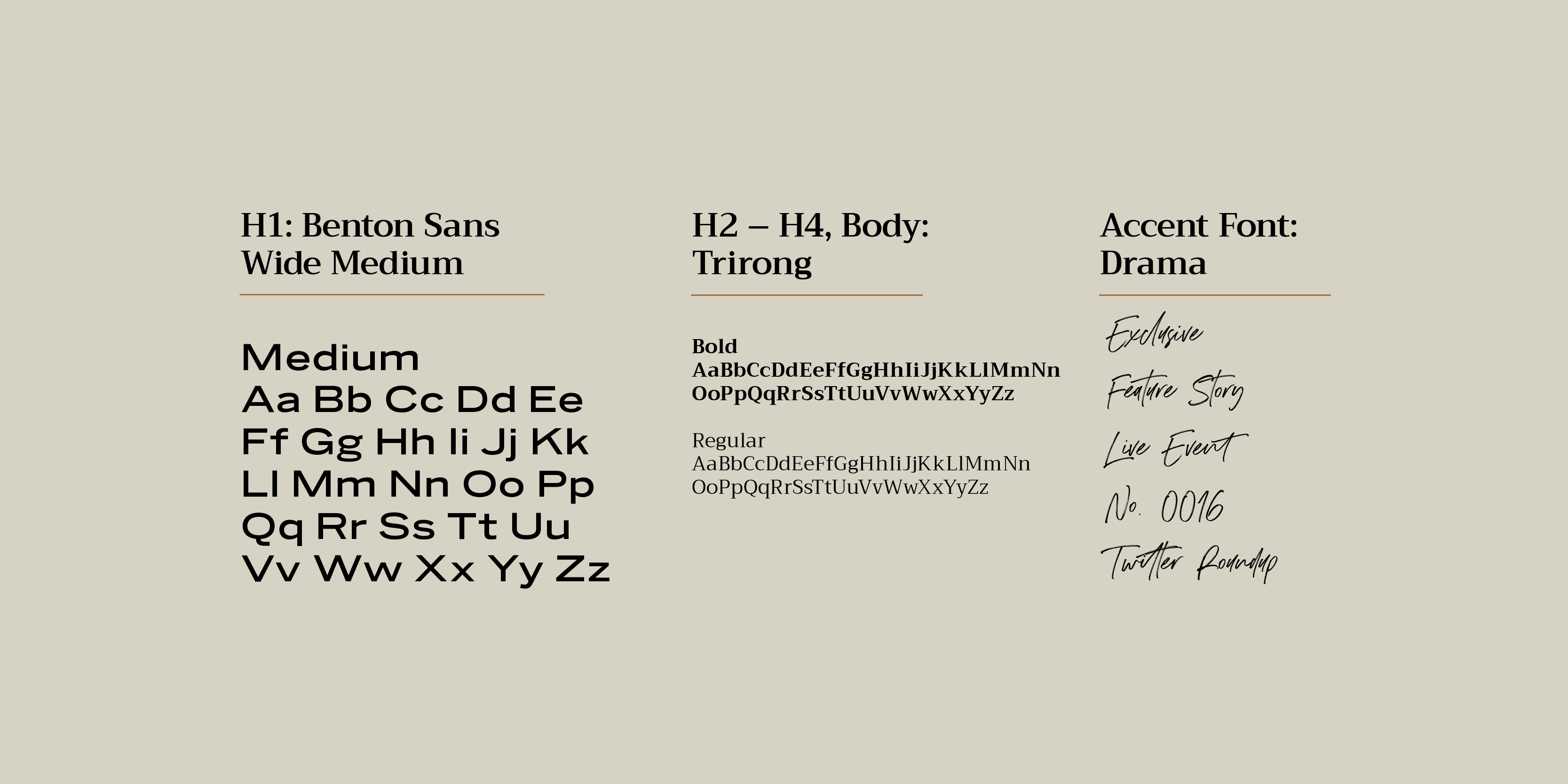
— Typography, Color
— Illustration
— Brand Guidelines
— Layout & Social Templates
— Core Messaging Audit
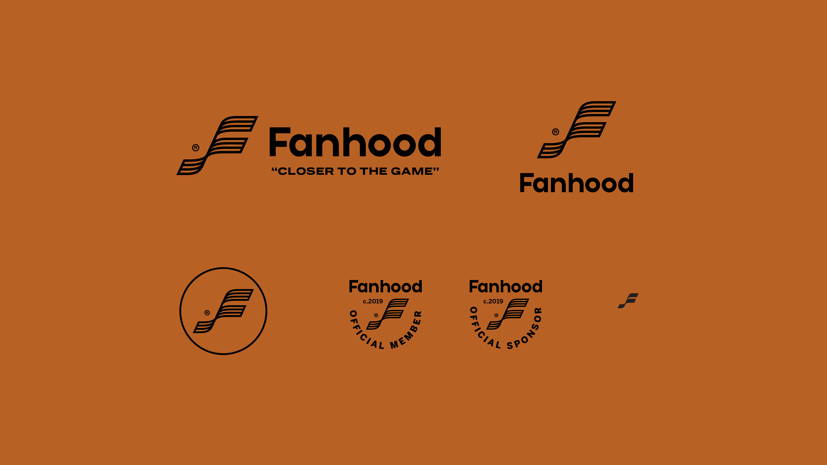
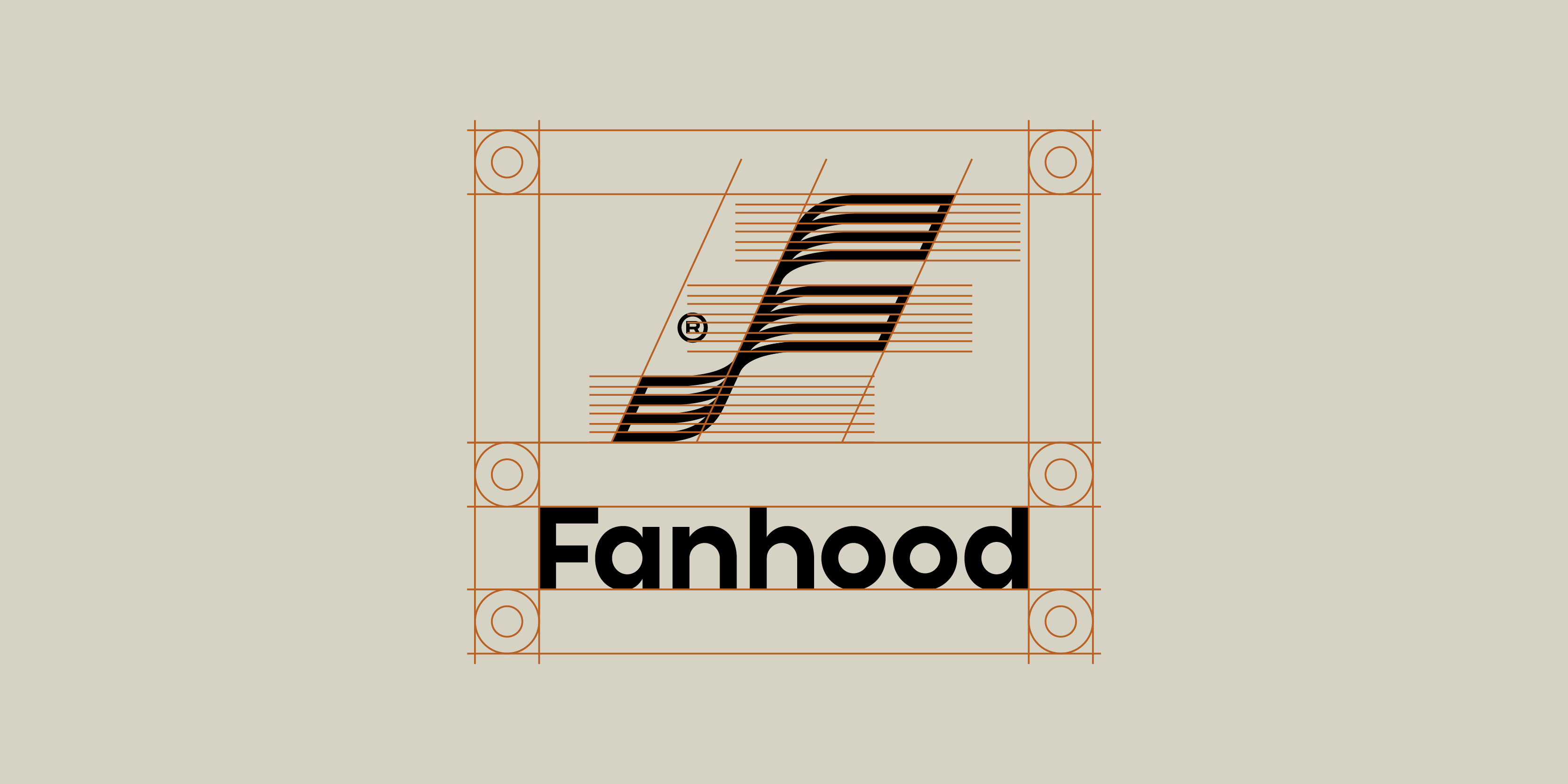
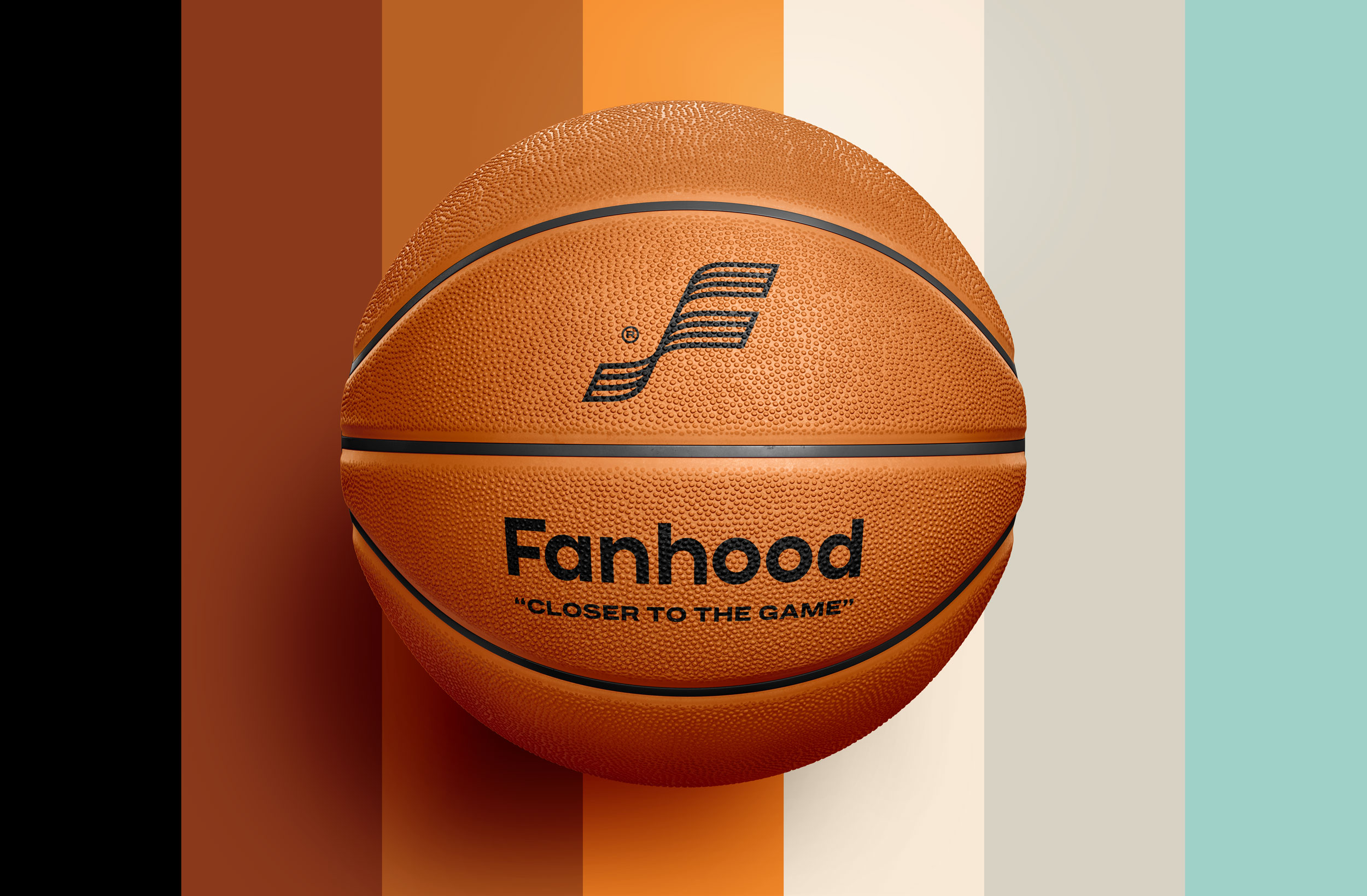
The Fanhood logo features custom sans serif lettering that feels retro but clean. The icon is a waving banner monogram, a nod to the fact that sports is more than just a game, it’s something that gathers many people together under one banner.
We’re experts, insiders, investigators. We take big concepts and break them down into interesting, relevant, tasty portions. We cover the overlooked nooks, untouched stories, and the innermost machinations of your favorite game and its players. And we serve it up with heart and humor. Our short form content goes deeper into the politics, economics, culture, and science of the game.
We’re lifelong fans just like you. We’re steeped in the culture of the game. We care about relationships and building a positive, engaging community. We don’t just know the game, we love the game, be it futbol, football, basketball, baseball or hockey. We crave shared experiences.
We want to bring fans together to create experiences and memories that will make their week, and last them a lifetime. Stats are great and all, but nothing beats the contagious energy of watching a game live with fellow fans. We vow to uphold this torch of good times through curated events that get you closer to the game and players in ways you never imagined possible. We’re creating a new forum for watching games. Something beyond your sofa or the stadium.
Our content and curated experiences reflect our esteem for style, design and the unique culture of sports. We’re not the person who just drives a car for function, or picks a shirt because it’s sensible. We want our members to feel inspired by the way they experience our sports brand, from the design of our newsletter to the vibe of our Playoff Party.
― Smart / Expert / Discerning
― Gregarious / Passionate / Inclusive
― Relateable / Funny / Emotional
― Tastemakers / Ambitious
― Curated / Quality / Niche
― Independent
― Condescending / Arrogant / Elitist
― Ridiculous / Silly / Cliquey
― Sarcastic / Mean / Crass
― Basic / Traditional / Expected
― Rehashed / Click-bait
― Mass Media
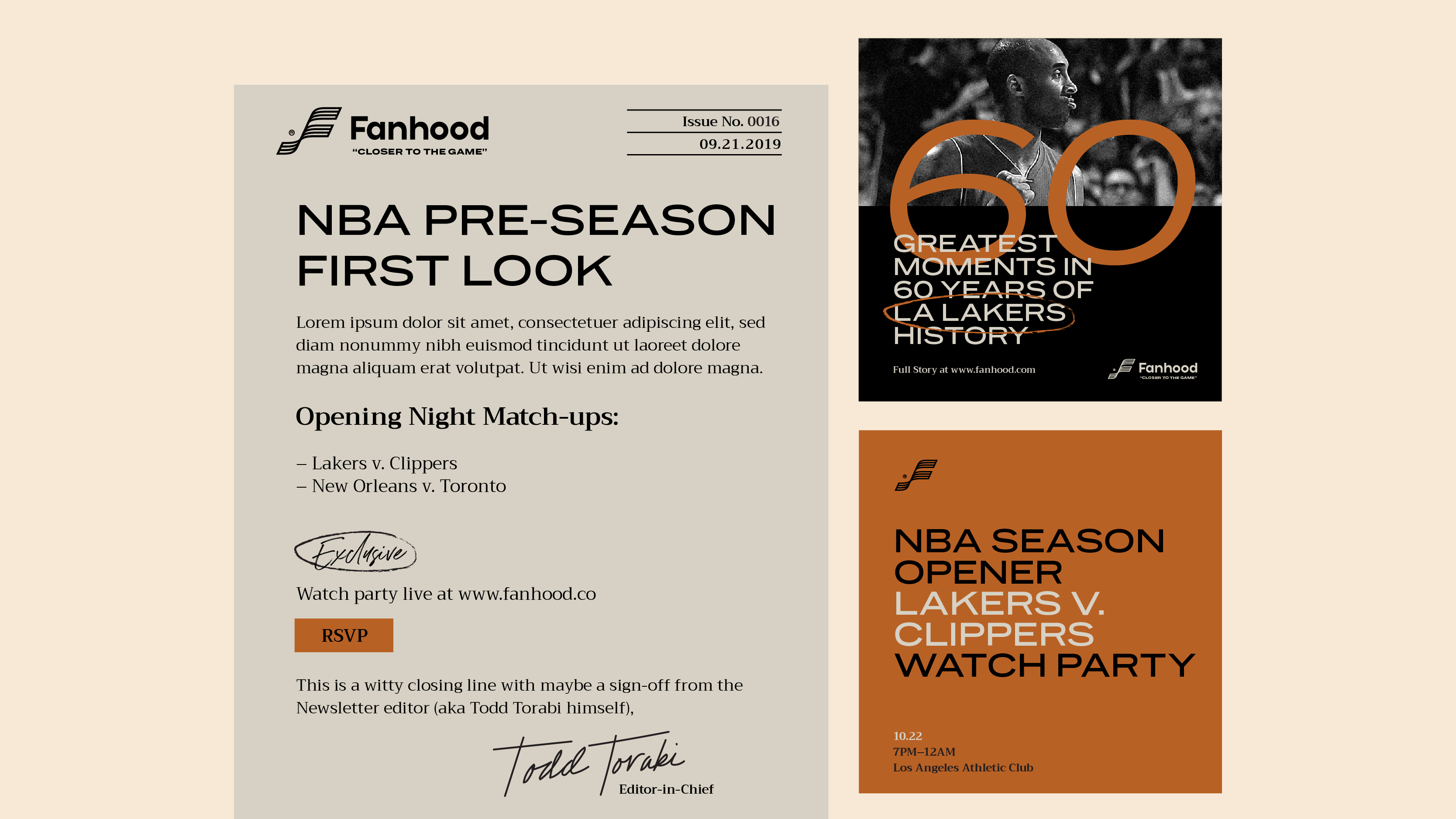
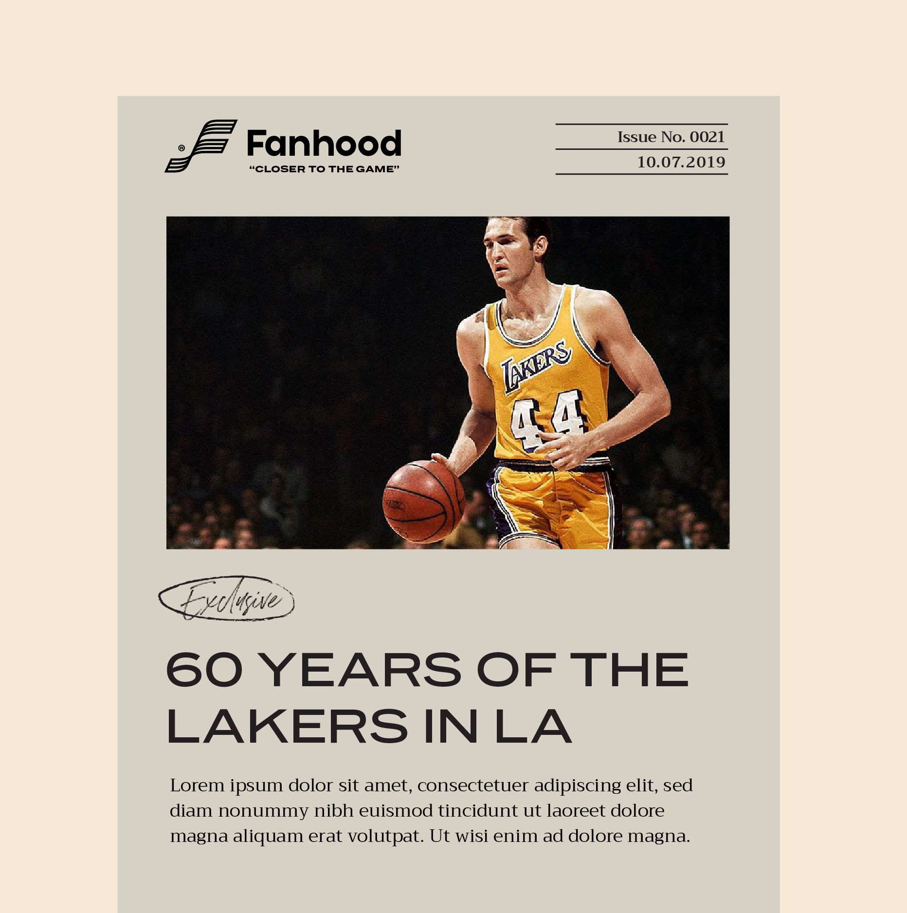
We gave the Fanhood team a design toolkit to pick up the torch and carry on the race without us. We set the Newsletter layouts with typography, spacing, and sizing all called out. We also gave them examples of how the typography and layout could work on social media graphics. Easy guidelines that make creating content a cinch.
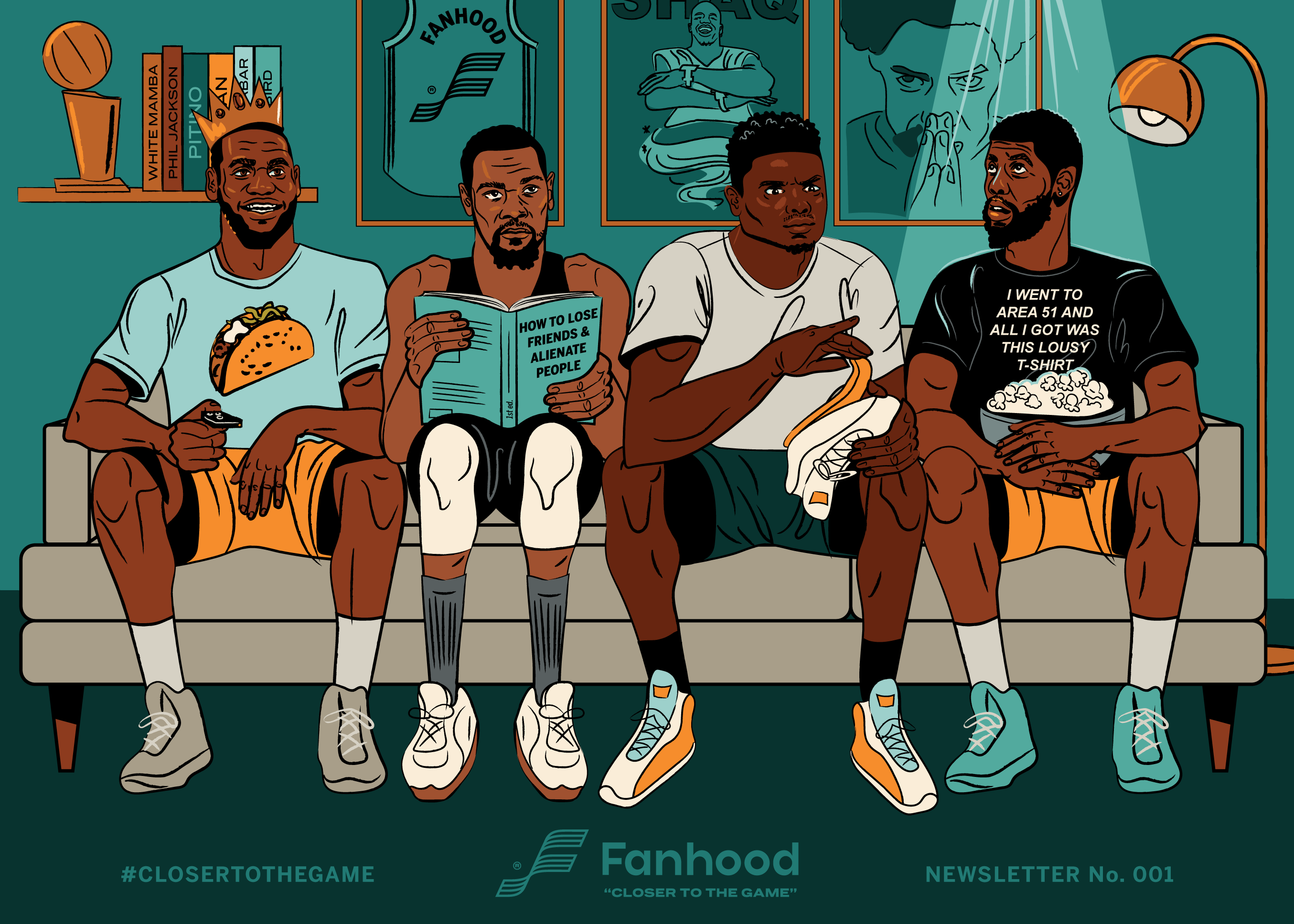
To make the Fanhood newsletter feel elevated and custom, we illustrated a custom footer featuring players and current events. The illustration will rotated regularly and feature easter eggs for true fans. The inaugural footer illustration is NBA focused featuring Lebron wearing a Taco Tuesday shirt and a crown, Kevin Durant reading a self help book, Zion examining his blown out shoe, and Kyrie Irving (who is apparently a true believer) wearing an Area 51 shirt about to get beamed up.
Sign up for the Fanhood newsletter to stay up to date on all things basketball!
Instagram: @fanhoodhoops
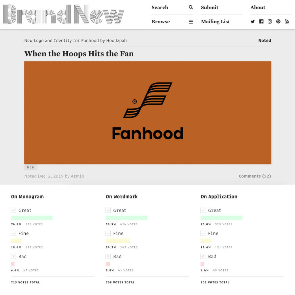
Check out Armin’s review of the Fanhood brand system on Under Considerations’s Brand New blog!
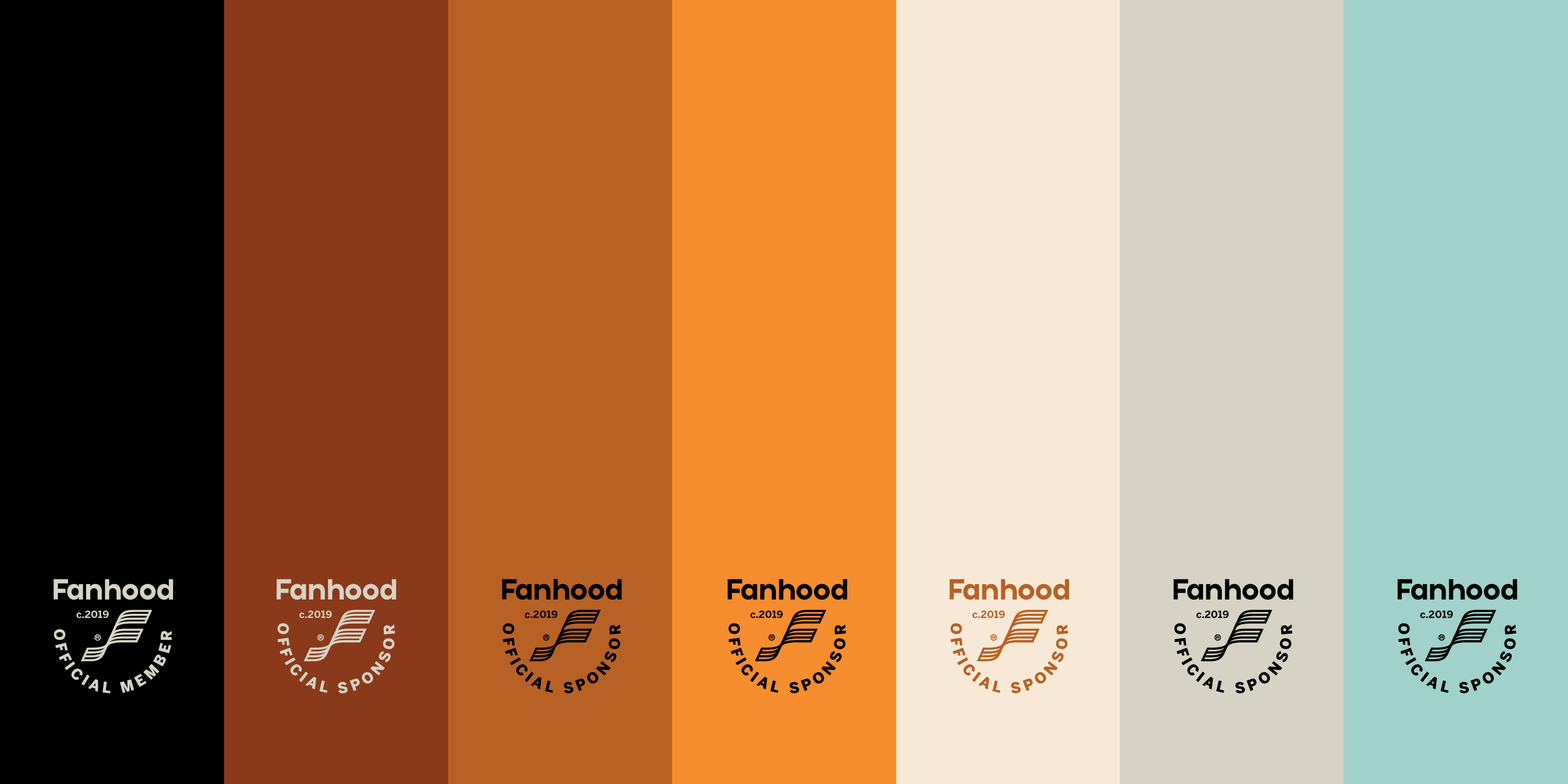
“Visually, I really like the monogram and the texture it generates as all the thick lines come together. The wordmark is nice too, with the short ascenders, tall x-height, and very round-y structure. The color palette is quite nice too, stepping away from the vibrant color trend and going with a more vintage aesthetic that is well complemented by the typography’s similar vibe. The bonus script font is a nice touch that plays out really well in application as a kind of archival accent. Overall, as a basketball fan and a design fan, this is an instant sign-up, so mission accomplished.”
– Armin Vit
