Looking for something?
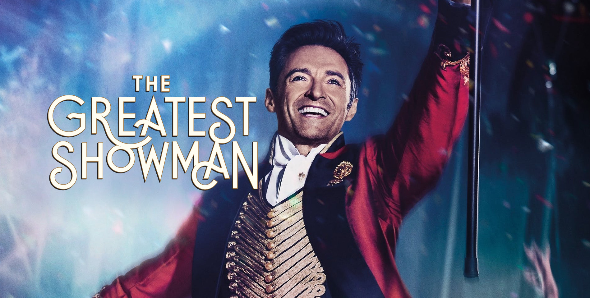
We were so excited when Neri Rivas, Creative Director at 20th Century Fox, connected with us to help on title logo explorations for The Greatest Showman. If you’ve seen all the campaigns and design for Deadpool, then you’ve seen his vision executed through his talented team. Neri came to us looking for a movie logo that was true to The Greatest Showman‘s history, yet executed in a modern way. The movie is about P.T. Barnum, the world famous 19th century promoter and showman behind hoaxes, circuses and spectacles. But the film is told in a very contemporary way (it’s a musical), and the logo needed to reflect that. We had to find a sweet spot style that avoided the circus font trope, and employed a stark and sudden quality that movie logos require.
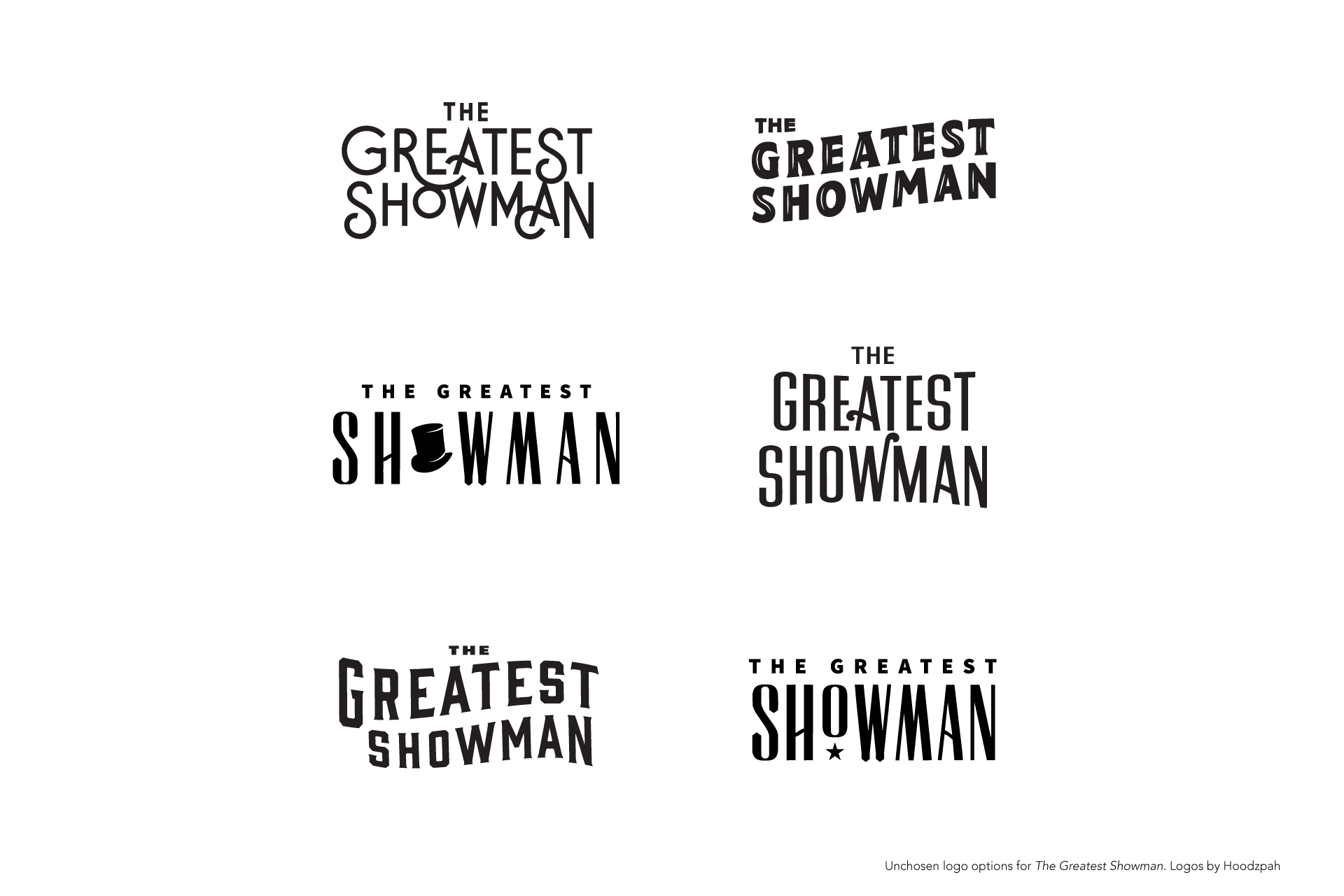
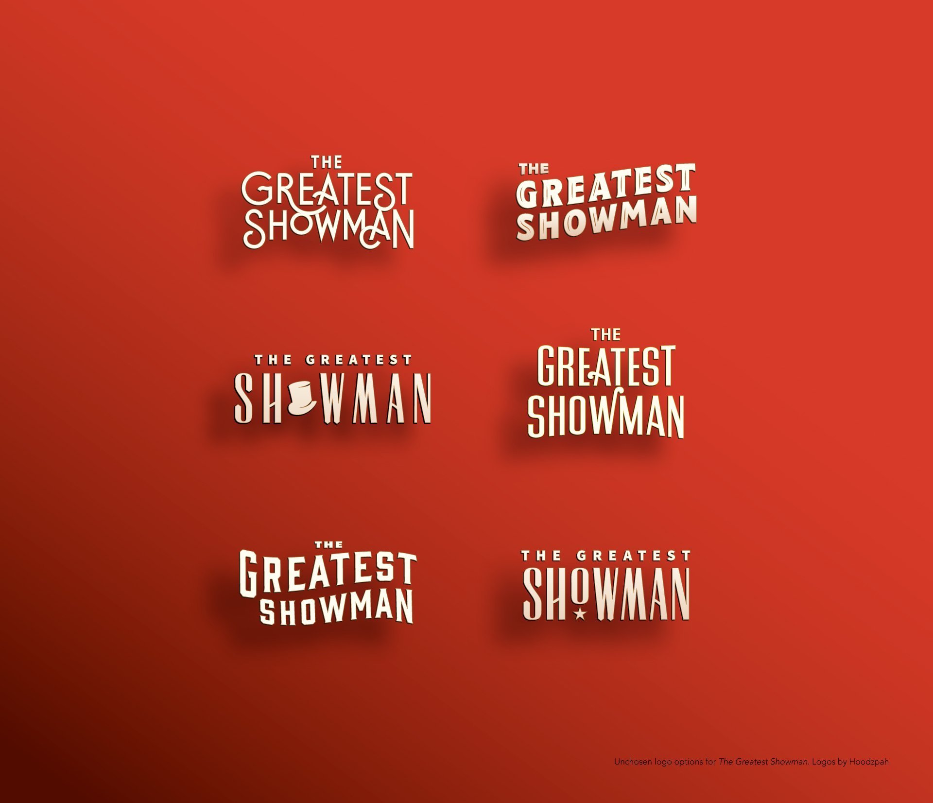
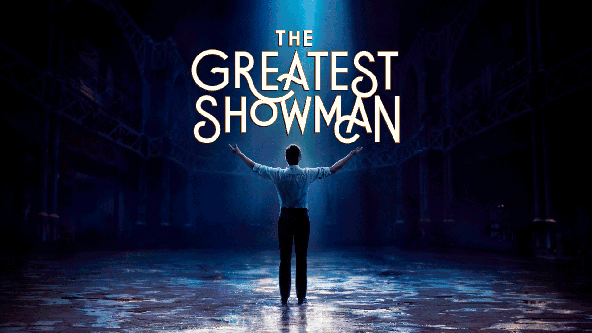
We explored various movie logos for the film. Here’s a smattering of the best ones. The one shown at top of this post (and top left in bottom images) was custom lettering. At the end of the day our concepts didn’t make the final cut, but it gave us a lot to brag about to our grandma and acquaintances. And we’re grateful for that.
Neri Rivas of the 20th Century Fox Team
Jennifer Hood
— Title Treatment
